Quantcast
Channel: USA – Dezeen
Viewing all 2531 articles
Browse latest View live

Rammed-earth counter anchors Flamingo Estate pop-up in Los Angeles

$
0
0
Flamingo Estate's Harvest Shop pop-up features rammed-earth counter

Vibrant green walls surround a chunky rammed-earth counter in this garden-themed pop-up shop in LA that creatives Alex Reed and Dutra Brown have designed for lifestyle brand Flamingo Estate.

Flamingo Estate's Harvest Shop pop-up takes over a retail unit in Platform, a high-end shopping centre in LA's Culver City area.

The shop offers an array of the brand's holistic products for the body and home, along with its range of pantry foods, which includes items such as extra-virgin olive oil, honey and dark chocolate.

Many products are made with ingredients grown on the grounds of Flamingo Estate, which is tucked away in the hills of the nearby Eagle Rock neighbourhood. Its sprawling garden is host to 150 different species of flowering plants and shrubs, as well as a fruit orchard, vegetable beds and a hive of bees.

Flamingo Estate's Harvest Shop pop-up features rammed-earth counter
A rammed-earth counter sits at the centre of Harvest Shop

This lush landscape became a key point of reference for the pop-up's designers, locally-based creatives Alex Reed and Dutra Brown.

Together they sought to fashion a space that resembled "a small, secret corner of the estate itself...as if it was lifted from the earth and brought to the store".

Flamingo Estate's Harvest Shop pop-up features rammed-earth counter
An abstract sculpture perches on one end of the counter

At the centre of the shop is a monolithic counter crafted from rammed earth. The bottom of the counter is inset with different-coloured fragments of stone, while the top features a cluster of white-tile blocks and platforms on which products are presented.

To ensure the tiles could be used again post pop-up, a simple mixture of mud and earth was used as grout.

A corner of the counter is dominated by an amorphous sculpture that Reed and Brown created using scagliola – a type of plaster typically made from gypsum, glue and pigments.

Interiors of Flamingo Estate's Harvest Shop pop-up
A mural depicting trees and rolling hills acts as a backdrop to the counter

"For Flamingo Estate's first physical location, we looked to the company's 'hands-in-the dirt' ideals of what is luxurious and covetable today," the pair said.

"We've utilized our respective expertise to design and build a project centred around materiality – this collage of organic material and sculptural form, together with provenance and fantasy, celebrates what we love about Flamingo Estate."

The garden theme continues onto Harvest Shop's walls, where LA-based artist Abel Macias has painted a rich, green mural.

"Richard [Christiansen, owner of Flamingo Estate] and I talked about a concept based around Snow White, the enchanted little forest that she lives in that's sort of dark but very magical and green in a way," explained Macias.

"We came up with this landscape that's rolling hills and swirly trees, keeping everything in the tonal green world so that it feels verdant and very lush [in the store]."

Emerald-coloured paint covers a wall on the opposite side of the shop, which is mounted with rows of glass jars filled with various natural ingredients.

Interiors of Flamingo Estate's Harvest Shop pop-up
Another wall is mounted with rows of glass jars

Flamingo Estate is overseen by creative director Richard Christiansen. Beyond the estate's garden lies a Spanish colonial-style house that, since the beginning of 2020, has operated as a chic retreat for creative people in Los Angeles.

Its Harvest Shop pop-up isn't the only retail project to have made use of rammed earth. Last year, Mexican architect Frida Escobedo applied rammed-earth bricks to the walls of an Aesop store in Brooklyn, New York, to emulate the facade of the brownstone townhouses seen around the area.

Photography is by Christian Hogstedt.

The post Rammed-earth counter anchors Flamingo Estate pop-up in Los Angeles appeared first on Dezeen.


Five proposals to protect Washington DC's Tidal Basin from climate change

$
0
0
Tidal Basin Ideas competition

A bridge to the White House and man-made islands are among the conceptual proposals five architecture studios have developed for preserving Washington DC's Tidal Basin reservoir and the National Mall.

DLANDstudio, GGN, James Corner Field Operations, Hood Design Studio and Reed Hilderbrand all created schemes to reimagine the site for Tidal Basin Ideas Lab – organised by National Trust for Historic Preservation, Trust for the National Mall, the National Park Service and architecture firm SOM.

Tidal Basin threatened by crumbling sea wall and flooding

Set between the Potomac River and the Washington Channel, the Tidal Basin is intended to capture 250 million US gallons of water (946 million litres) from the river and release it into the channel twice a day. It is now threatened by a crumbling sea wall and flooding caused by rising sea levels.

The scope of the ideas lab also encompasses the neighbouring National Mall, America's most visited national park, which is home to some of the capital's most famous landmarks including The Lincoln Memorial, The Washington Monument, The Jefferson Memorial and Martin Luther King Jr Memorial.

"As part of 'America's front yard', the Tidal Basin is home to some of the most iconic landmarks and traditions in the nation's capital," said National Trust for Historic Preservation's Katherine Malone-France.

"Yet current conditions do not do justice to a landscape of such significance," she explained.

"These ideas explore ways to sustain this cultural landscape and its richly layered meanings for generations to come. This isn't preservation as usual: this is preservation as innovation."

Read on for the five concepts:


Tidal Basin Ideas competition

James Corner Field Operations

James Corner Field Operations, the landscape architecture studio behind New York's High Line park, has proposed creating an earthwork levee to build up the site surrounding the basin and form a path around it.

Called Protect and Preserve, this is one of three options it developed for the project. Among the others is a proposal for  a series of islands on the water to protect monuments.


DLAND studio

DLAND studio's interventions to mitigate the effects of rising sea levels include a "green security wall" to protect monuments, an elliptical reflecting pool that would change the curvilinear shape of the basin and a bridge across the basin between Jefferson Memorial and the White House.

"The proposed design radically re-imagines the land of the Tidal Basin area in form and function, as a phased response to the sweeping, inevitable wave of climate change-driven transformation," said the Brooklyn-based studio.


Tidal Basin Ideas competition

GGN

Seattle landscape architecture firm GGN has proposed a scheme that would be developed in increments up until 2090. This will include building up the ground level to protect against water changes, and creating tidal marshes for natural habitats and boardwalks for people.

"Growing numbers of visitors will have more options for spaces to gather, which will ease pressure on the currently over-trodden landscape of the Basin edge," GGN said.


Tidal Basin Ideas competition

Hood Design Studio

This creative approach by Oakland's Hood Design Studio reimagines the site in a four-part novella shown in a comic-like strip.

Relocating the site's well-known cherry trees, a future in which the basin is intentionally flooded, and a monument to the "hush harbors" wetlands where enslaved people secretly met to worship are among the suggestions.


Tidal Basin Ideas competition

Reed Hilderbrand

The Cherry Walk bridge, which would lead through the site of the relocated cherry trees, is among Reed Hilderbrand's main proposals – others include a bridge to the city and a new land form to protect against rising water.

The landscape architecture studio, which is based in Cambridge, Massachusetts, developed the proposal based on the 1902 McMillan Plan for Washington DC's parks and monumental core.

The post Five proposals to protect Washington DC's Tidal Basin from climate change appeared first on Dezeen.

About Time: Fashion and Duration exhibition at The Met celebrates 150 years of fashion

$
0
0
About Time exhibition at The Met

Set designer Es Devlin has created two clock-like gallery spaces for the latest fashion exhibition at New York's Metropolitan Museum of Art, which compares design over 150 years.

The Met's Costume Institute opens About Time: Fashion and Duration at the museum's Fifth Avenue location on 29 October –  the original planned opening in May 2020 was postponed due to the coronavirus pandemic.

Featured fashion dates back 150 years to 1870 to coincide with The Met's 150th anniversary. Rather than presenting designs chronologically, the exhibition mixes up the timeline in order to compare the cyclical nature of fashion across the years.

Gallery in About Time exhibition at The Met
Above image: the all-bacl Clock One gallery space. Top image: the mirrored Clock Two gallery space

"About Time: Fashion and Duration considers the ephemeral nature of fashion, employing flashbacks and fast-forwards to reveal how it can be both linear and cyclical," said The Met director Max Hollein.

"The result is a show that presents a nuanced continuum of fashion over the museum's 150-year history."

Devlin, who has created stage sets for musicians The Weekend and Katy Perry, worked with The Met's Design Department to create a time-travelling-themed exhibition.

Gallery in About Time exhibition at The Met
White markings or light divide galleries into 60 "minutes"

It is located in two galleries in the museum's Iris and B Gerald Cantor Exhibition Hall that are in a circular formation like a clock. Called Clock One and Clock Two, they have different material finishes. The former is nearly all black, and the latter is covered in mirrors.

White markings on the floor or thin white lights punctuate both spaces, resembling the marks on a clock face.

These marks split the galleries into 60 segments or "minutes". Each minute showcases two garments – one that follows time chronologically and another from a different time period to showcase similarities or differences in form.

Mirrored gallery in About Time exhibition at The Met
One of the spaces is covered in mirrors

Examples include an 1870s black silk faille princess-line dress paired with a 1990s Alexander McQueen skirt and a mid-1890s silk satin dress with puffed sleeves contrasted by 2004 Comme des Garçons ensemble.

"Fashion is indelibly connected to time," said Andrew Bolton, the Wendy Yu curator in charge of The Costume Institute.

"It not only reflects and represents the spirit of the times, but it also changes and develops with the times, serving as an especially sensitive and accurate timepiece."

Exterior of About Time exhibition at The Met
It is located in two galleries in the museum's Iris and B Gerald Cantor Exhibition Hall

There are 125 fashions in the exhibition with a number sourced from The Costume Insitute's collection. It includes work from well-known contemporary and historic designers and brands like Virgil Abloh, Azzedine Alaïa, Jonathan Anderson, Iris van Herpen, Karl Lagerfeld and Vivienne Westwood.

First announced last year, The Met's About Time exhibition is based on French 20th-century philosopher Henri Bergson's idea of time as la durée, or duration – something which can be measured through images but never perceived as a whole.

The Met closed its main building on Fifth Avenue, as well as its Met Breuer and Met Cloisters locations, in early March in response to the emergence of outbreaks of coronavirus in New York City.

In lieu of the spring opening, the museum created a virtual version of About Time: Fashion and Duration on Youtube.

Spring/summer 2020 haute couture by Viktor + Rolf in the About Time exhibition at The Met
Garments include this spring/summer 2020 haute couture by Viktor + Rolf

The annual Costume Institute Benefit, also known as the Met Gala, was due to take place in May 2020 to coincide with the original opening of the exhibition. It was also cancelled due to the pandemic.

The Met's Costume Institute organises a spring exhibition every year. Last year's exhibition Camp: Notes on Fashion celebrated the "resurgence of camp", while the 2018 showcase Heavenly Bodies was themed on religion.

Others have included a retrospective of Comme des Garcons founder Rei Kawakubo, a study of handcraft and machine production and an exploration of China.

About Time will run from 29 October 2020 to 7 February 2021. See Dezeen Events Guide for an up-to-date list of architecture and design events taking place around the world.

The post About Time: Fashion and Duration exhibition at The Met celebrates 150 years of fashion appeared first on Dezeen.

Six designs to encourage voting in 2020 US presidential election

$
0
0
Time cover

As the US presidential election on 3 November approaches, we've rounded up six designs that aim to motivate people to vote, including Instagram gifs, brass pins, billboards and magazine covers.


Postcards for Democracy by Beattie Wolfe and Mark Mothersbaugh

Postcards for Democracy by Beatie Wolfe and Mark Mothersbaugh

Singer-songwriter Beatie Wolfe teamed up with artist Mark Mothersbaugh to launch Postcards for Democracy in support of the USPS amid a crisis that saw delays in delivery that could have impacted people's ability to vote.

Wolfe and Mothersbaugh asked participants to mail postcards to a set address, which would then be used as part of a wider exhibition.


View this post on Instagram


A post shared by TIME (@time) on

TIME cover by Shepard Fairey 

For the first time in 100 years, TIME replaced its title on the cover. The magazine ran with the word VOTE above an illustration by American artist Shepard Fairey of a woman wearing a bandana also bearing the word vote.

"Even though the subject in the portrait knows there are additional challenges to democracy during a pandemic," said Fairey, the person is empowered to use their "voice and power by voting".


Otherward O_E billboard

Billboard by Otherward

This black and white billboard designed by New York design agency Otherward requires viewers to fill in the gaps to create the word vote.

Otherward's billboard was one of over 70 created across the country as part of artist-led For Freedoms 2020 Awakening – an initiative that uses artworks to encourage civic engagement.


Vote for Democracy by Rafael de Cardenas

Gifs by Rafael de Cárdenas and Ohlman Consorti

New York-based Rafael de Cárdenas teamed up with Paris-based design agency Ohlman Consorti to make election-focused gifs that are easily shareable on social media.

The black and white moving images show the election date or the word vote mixed with a looping shape.


Election Pins by Kara Hamilton & Salon Design

Election Pins by Kara Hamilton & Salon Design

Canadian Artist Kara Hamilton and Salon 94 Design teamed up with luxury retailer The Webster to create five voting-themed brass clothing pins.

They include two fingers that form the letter V, Lady Liberty crown with vote written beneath and the letters US wrapped in chains. All proceeds go to FairVote and Earthjustice Action.


North Carolina mail-in voting envelope by Center for Civic Design

North Carolina mail-in voting envelope by Center for Civic Design

Center for Civic Design redesigned the mail-in envelopes for North Carolina to make them clearer so the chance of votes not counting is reduced.

"The election process is complicated; it's hard to convey that process to people," Center for Civic Design's Christopher Patten told Dezeen in an interview.

"Election departments don't always know how to communicate with voters or write instructions or communications that they understand or can interact with."

The post Six designs to encourage voting in 2020 US presidential election appeared first on Dezeen.

Generate creates digital library of timber building systems to "revolutionise the construction industry"

$
0
0
Tallhouse by Generate

Architecture studio Generate has developed the Tallhouse library of timber-based building systems to help architects build affordable housing and reduce construction-related carbon emissions by up to 50 per cent.

The architecture, engineering and construction company developed the online catalogue to provide architects with pre-engineered, timber-based construction systems that they can adapt for large-scale projects.

It includes four timber-based designs: a steel and cross-laminated timber (CLT) structure; a mass timber post, beam and plate structure; a light-gauge metal and CLT structure; and a full CLT plate honeycomb structure.

These designs can each be used as a "kit of parts" for buildings ranging from eight to 18 storeys.

By allowing architects to build quickly, sustainably and cost-effectively, Generate said Tallhouse could "revolutionise the construction industry".

Tallhouse by Generate
Generate imagined a Tallhouse system integrated into a building in Boston

"Generate partners with architects and developers to digitally integrate these systems into their residential and commercial projects," Generate CEO John Klein told Dezeen.

"Working with pre-vetted, replicable systems enables significant acceleration in project delivery, while permitting architects to spend more time on the creative process of design, resulting in the delivery of at once higher-quality and cost-effective projects."

Boston-based Generate developed Tallhouse with Buro Happold Engineering, Niles Bolton Associates, Consigli Construction, Code Red Consultants, Olifant Market Development, Urbanica Development and Arup Engineering.

The project was conceived in response to a shortage of affordable housing and with an aim to reduce carbon-output in Boston. With buildings accounting for 40 per cent of all greenhouse gas emissions, Tallhouse offers digitally available designs with low carbon footprints.

Tallhouse by Generate
The project aims to reduce building-related carbon output in Boston

"By 2050, Boston expects to build 300,000 housing units, and 400,000,000 square feet (37,161,216 square metres) of commercial buildings," Generate explained.

"In parallel, the city intends to have reduced its carbon footprint by 80 per cent in 2050 – an unachievable goal if the status quo of carbon-emitting structures is preserved."

The four systems are based on heavy timber because it is more environmentally friendly than other materials – largely because it does not create as many carbon emissions in manufacturing and it also acts as a carbon store.

The systems can offer large reductions in carbon emissions, according to the team.

"Whole-building greenhouse gas emissions savings ranged from 14 to 52 per cent for structural solutions that use heavy timber compared to typical steel and concrete reference cases," said Buro Happold Engineering principal Julie Janiski.

Modular bathroom and kitchens in Tallhouse by Generate
Each design comes with integrated systems like modular bathroom and modular kitchens

Klein said Tallhouse's "pre-vetted" library, which is code-compliant, also allows architects avoid the complications involved when using timber in construction.

"Novel construction technologies, like mass timber, take time to become widely adopted and integrated into the built environment," he added.

"Lack of familiarity with materials, codes, detailing and overall design considerations require increased upfront considerations from design teams," he added. "Having code, carbon and building quantity data digitally accessible allows architects to eliminate the upfront R&D, and focus more on design."

Each Tallhouse design is evaluated by a Carbon Data Analysis tool, called Tally, to provide architects with information on the implications of building materials and systems and help them choose options to produce fewer greenhouse gas emissions.

The systems are intended to be used like a replicable kit of parts that can be integrated into designs. They also come with a prefabricated panelised exterior wall system, modular bathroom and modular kitchens, and prefabricated mechanical, electrical and plumbing assemblies.

Tallhouse is the latest project by Generate to use wood to create more environmentally friendly buildings.

It has also worked with developer Placetailor to design a carbon-neutral apartment block in Boston using a cross-laminated timber kit of parts.

Other ventures exploring the limits of timber construction include a digital model of what would be the world's tallest mass-timber building by Alphabet's Sidewalk Labs.

The post Generate creates digital library of timber building systems to "revolutionise the construction industry" appeared first on Dezeen.

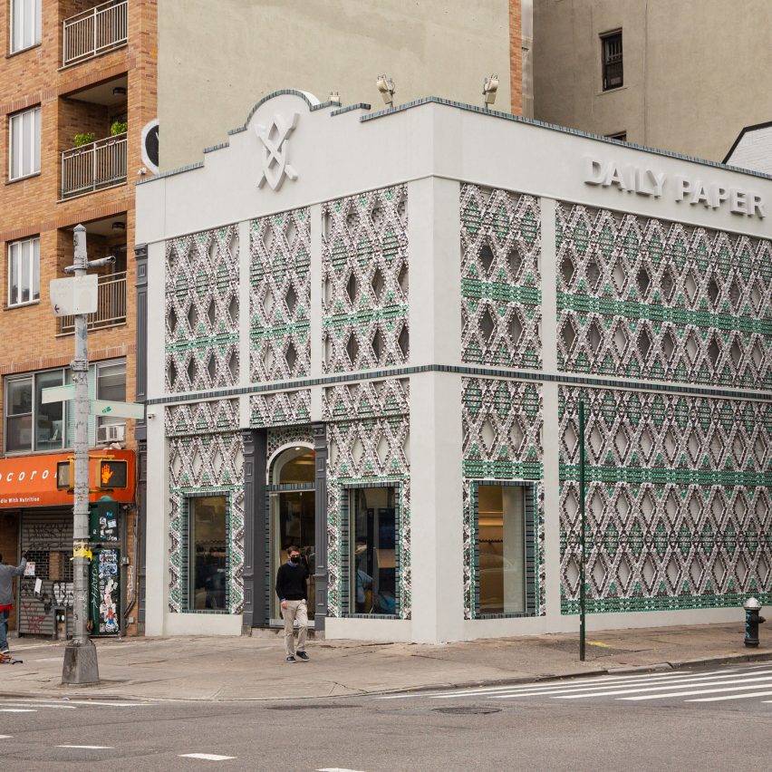
Recycled aluminium cans decorate exterior of Daily Paper's first US store

$
0
0
Recycled cans cover Daily Paper store in New York

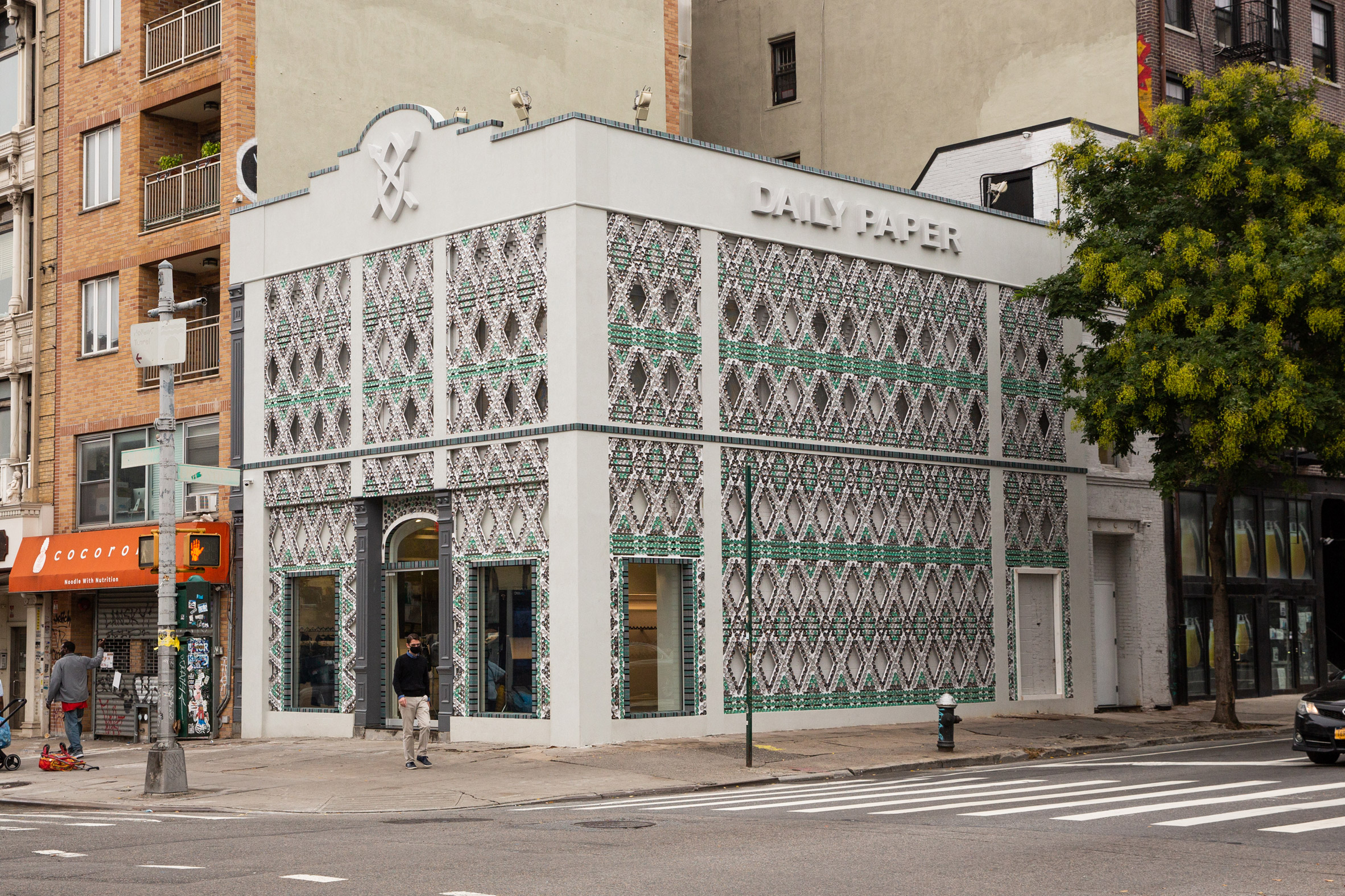
Over 13,000 flattened aluminium cans decorate the facade of Dutch fashion label Daily Paper's inaugural shop in the US, which has opened in Manhattan, New York.

The two-storey Daily Paper store spans 1,140 square feet (106 square metres) and occupies a prominent corner building in Manhattan's Lower East Side.

Recycled aluminium cans cover Daily Paper store in New York
The Daily Paper store occupies a corner plot in Manhattan's Lower East Side

Up until now, the brand has exclusively been based out of Amsterdam, where its founders – childhood friends Hussein Suleiman, Abderrahmane Trabsini, and Jefferson Osei – grew up in the Oud-West neighbourhood.

All three founders are of African descent, with Suleiman's family hailing from Somalia, Trabsini's from Morocco and Osei's from Ghana.

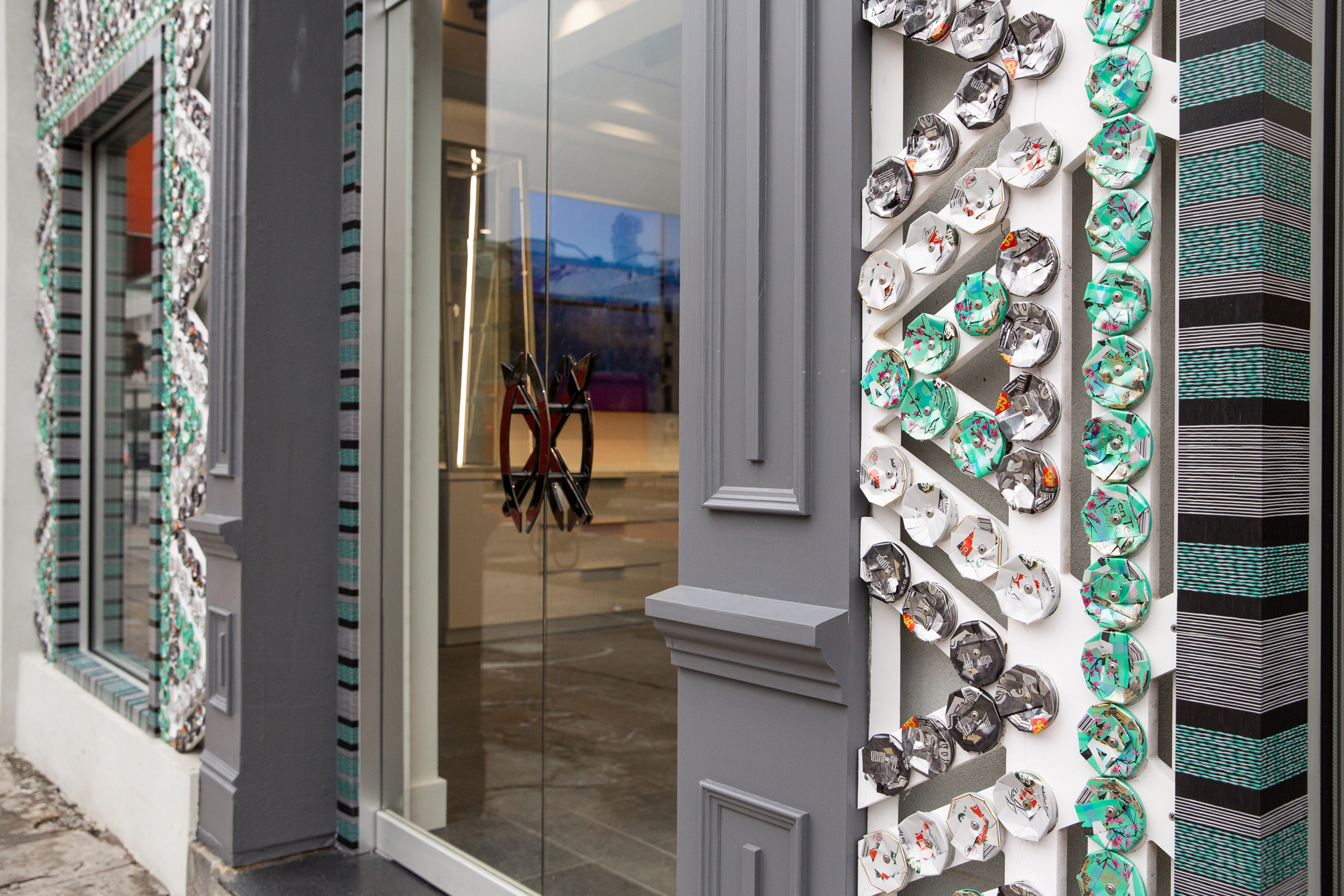
Recycled cans cover Daily Paper store in New York
Flattened drink cans decorate the outside of the building

This has come to heavily inform the look of the store, where Heather Faulding of studio 4plus Design has subtly incorporated references to both Dutch and African culture.

The store building had been boarded up and was almost at a point beyond repair, but it has now been fully restored to feature a more ornately-shaped roof that emulates the form those seen on traditional Dutch townhouses.

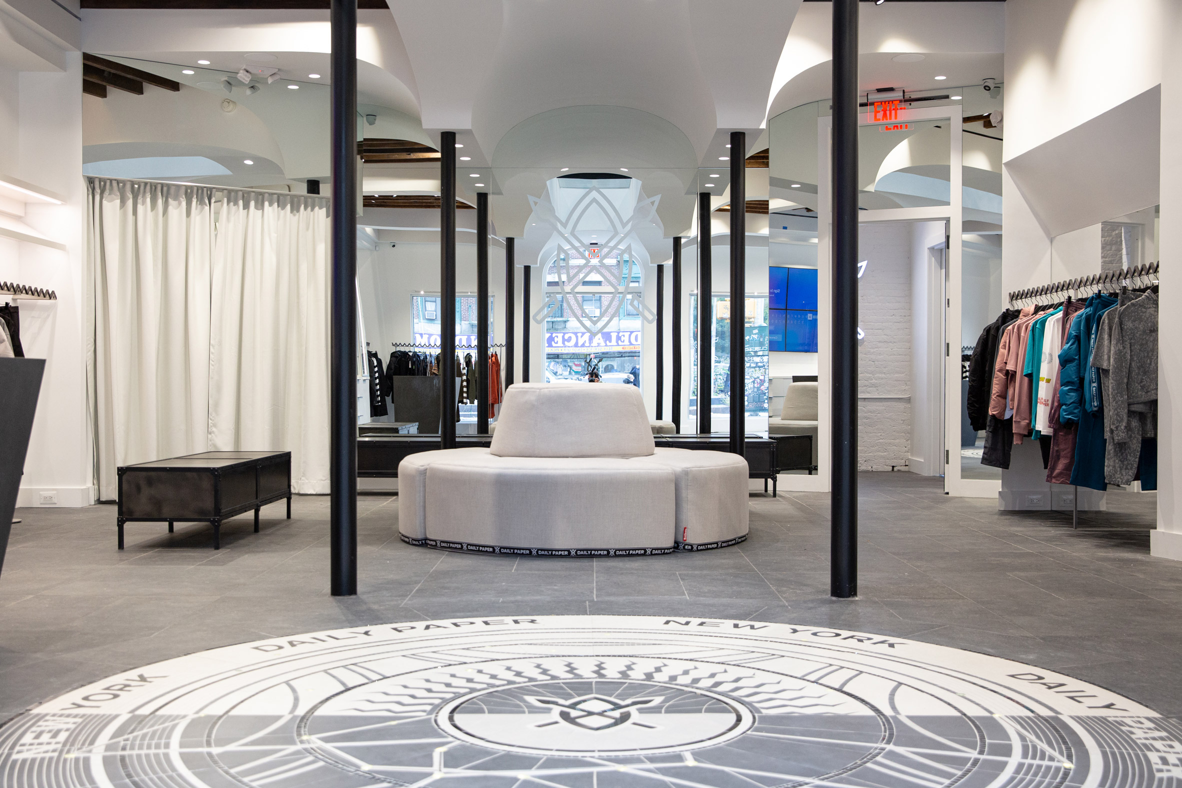
Interiors of Daily Paper store in New York
A floor mosaic features on the store's ground level

Decorating the facade are thousands of recycled white, green and black drinks cans provided by Arizona Iced Tea, which appear to have been squashed.

"In order to create this effect, we estimate a total of between 13,500 and 14,000 recycled cans were used – all manually cut, compressed, glued and screwed on panels," co-founder Osei explained in an Instagram post.

The cans are then arranged in an intricate lattice pattern that's meant to recall traditional East and South African beadwork.

Interiors of Daily Paper store in New York
Surrounding walls are painted white to create a museum-like feel

Upon entering the store, customers are greeted by a huge, circular floor mosaic that denotes the label's name and logo.

Drawing on African cosmology, the mosaic is fitted with small lights that chart the star constellation visible in Amsterdam skies the day that Daily Paper was officially established – 1 April 2012.

The surrounding ground floor has been made to look like a museum, with bright-white surfaces and tall glass cabinets that display accessories.

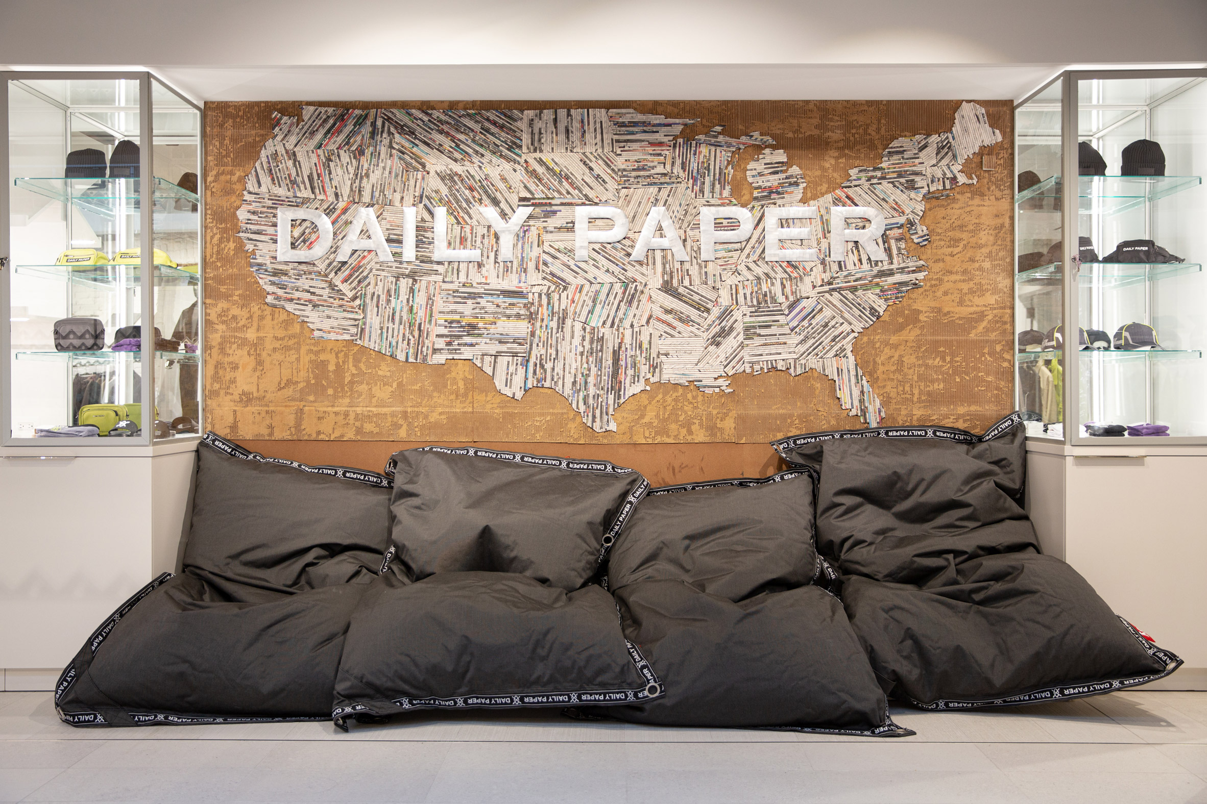
Quirky decor details include a series of Daily Paper-branded bean bag chairs and a map-like wall mural composed of rolled-up pieces of the New York Times newspaper.

Interiors of Daily Paper store in New York
There is also a wall mural and bean bags on the ground floor

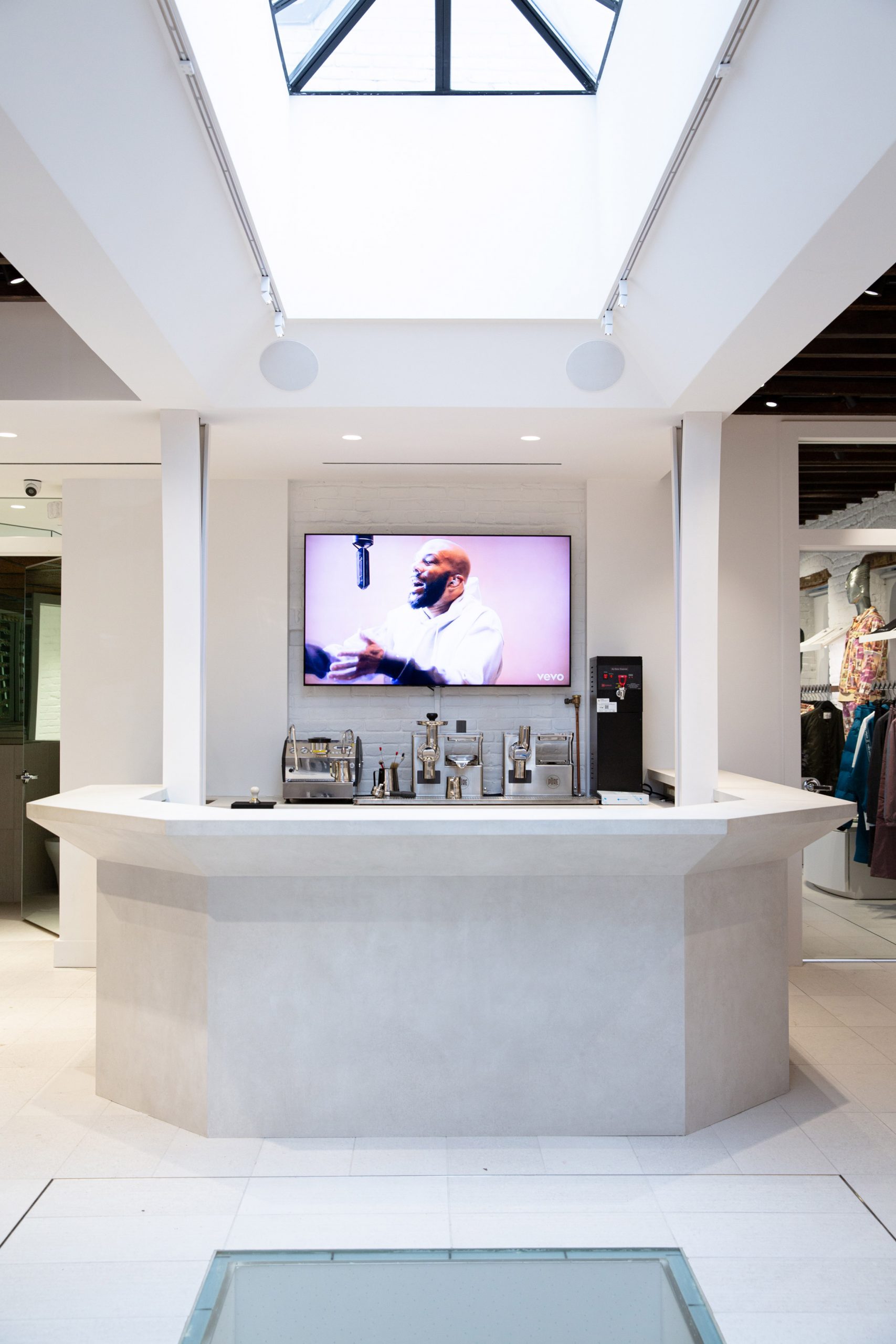
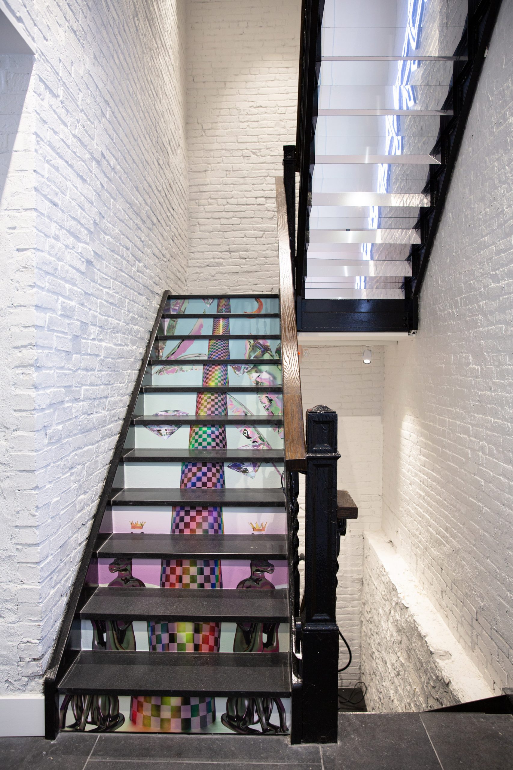
A flight of stairs with vivid artwork incorporated on its risers leads up the store's first floor, where there is a relaxed coffee bar and lounge. A portion of the flooring is made from glass so that customers can glimpse people milling around on the shop floor below.

There's also space to hang out on the building's rooftop.

Staircase inside Daily Paper store in New York
Artwork appears on the staircase that leads to the store's first floor

Daily Paper started life as a lifestyle blog before evolving into the fashion brand it is today, producing Afrofuturism-inspired clothing collections that take cues from different facets of Suleiman, Trabsini and Osei's African heritage.

It isn't the only fashion label that has recently launched its first store in the US – earlier this month Belgian brand Dries Van Noten opened the doors to a store in Los Angeles, the interior of which is filled with work from artists across the world.

Photography is by Alec Kugler.

The post Recycled aluminium cans decorate exterior of Daily Paper's first US store appeared first on Dezeen.

Concrete colonnade links educational facilities at Boys and Girls Club in Mexico

$
0
0
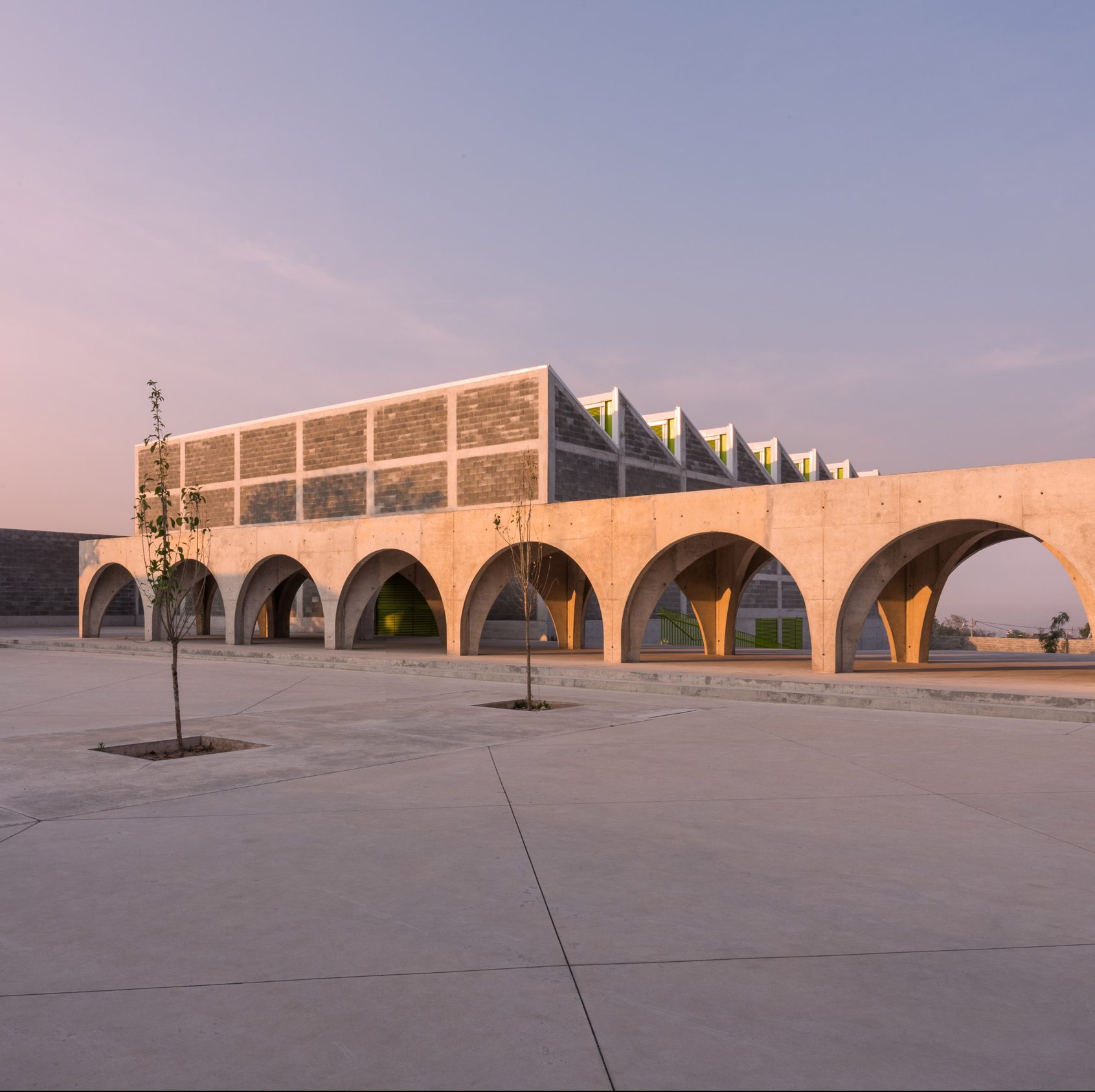
Boys and Girls Club in Mexico by Centro de Colaboración Arquitectónica (CCA)

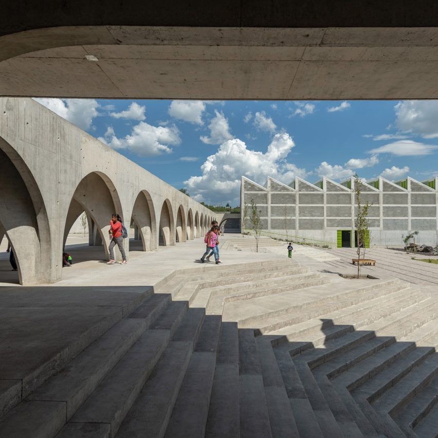
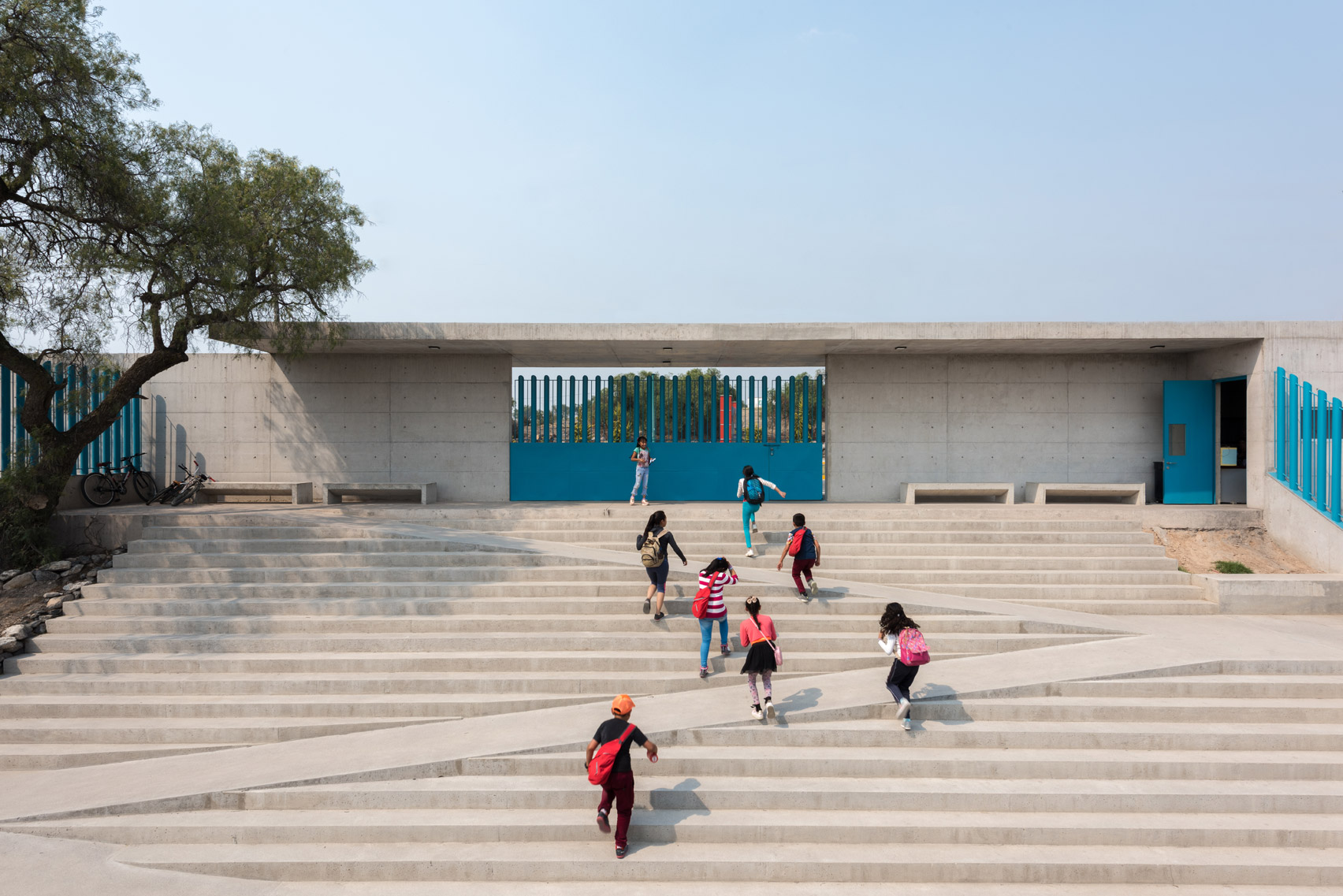
A sweeping colonnade and stepped plazas animate the concrete Boys and Girls Club that Centro de Colaboración Arquitectónica has built for children living in south-central Mexico.

The 3,400-square-metre complex is an after-school club for young people between the ages of six and 18 years who are living in unsafe or low-income neighbourhoods in Tecámac and Ecatepec.

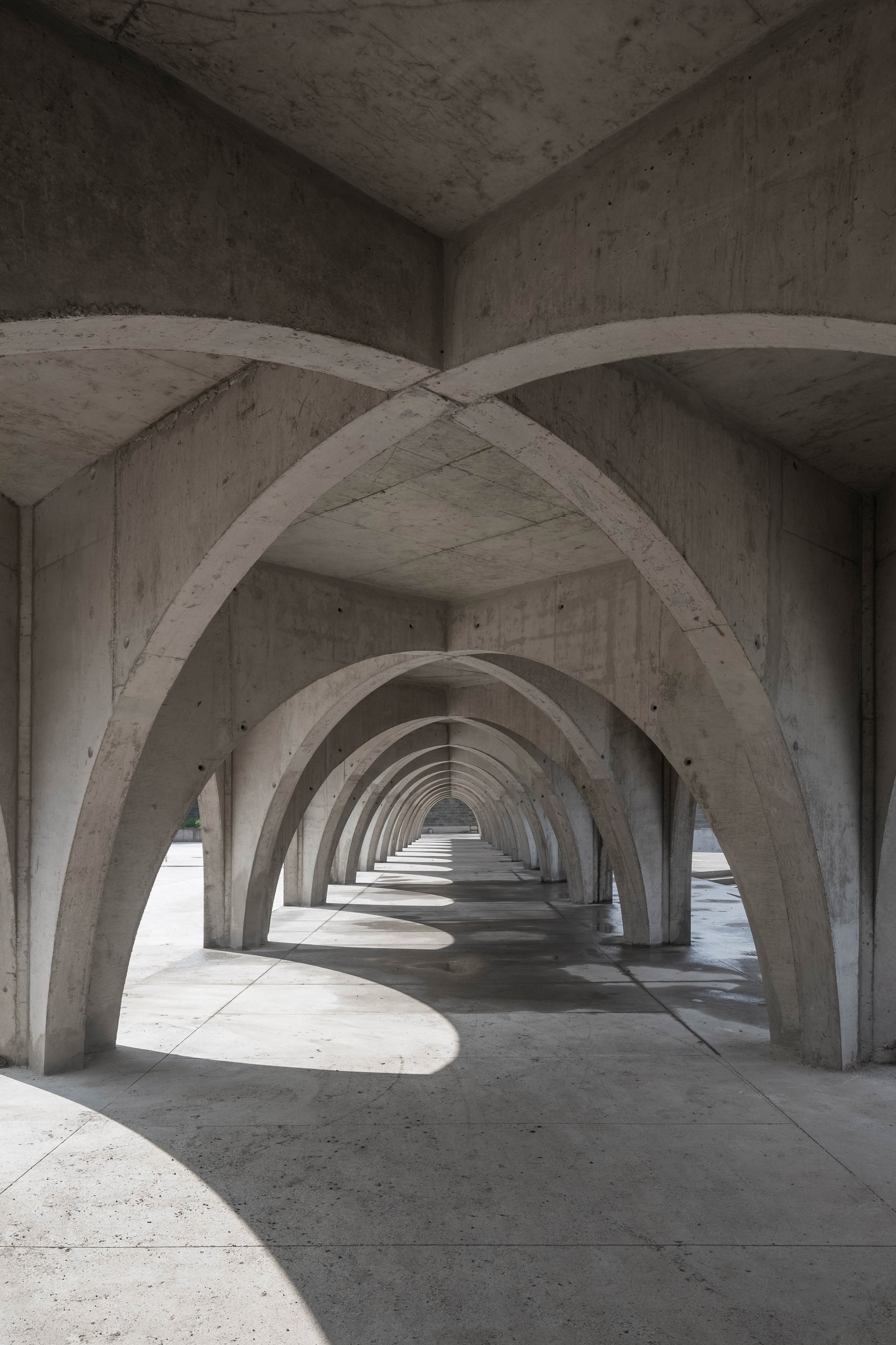
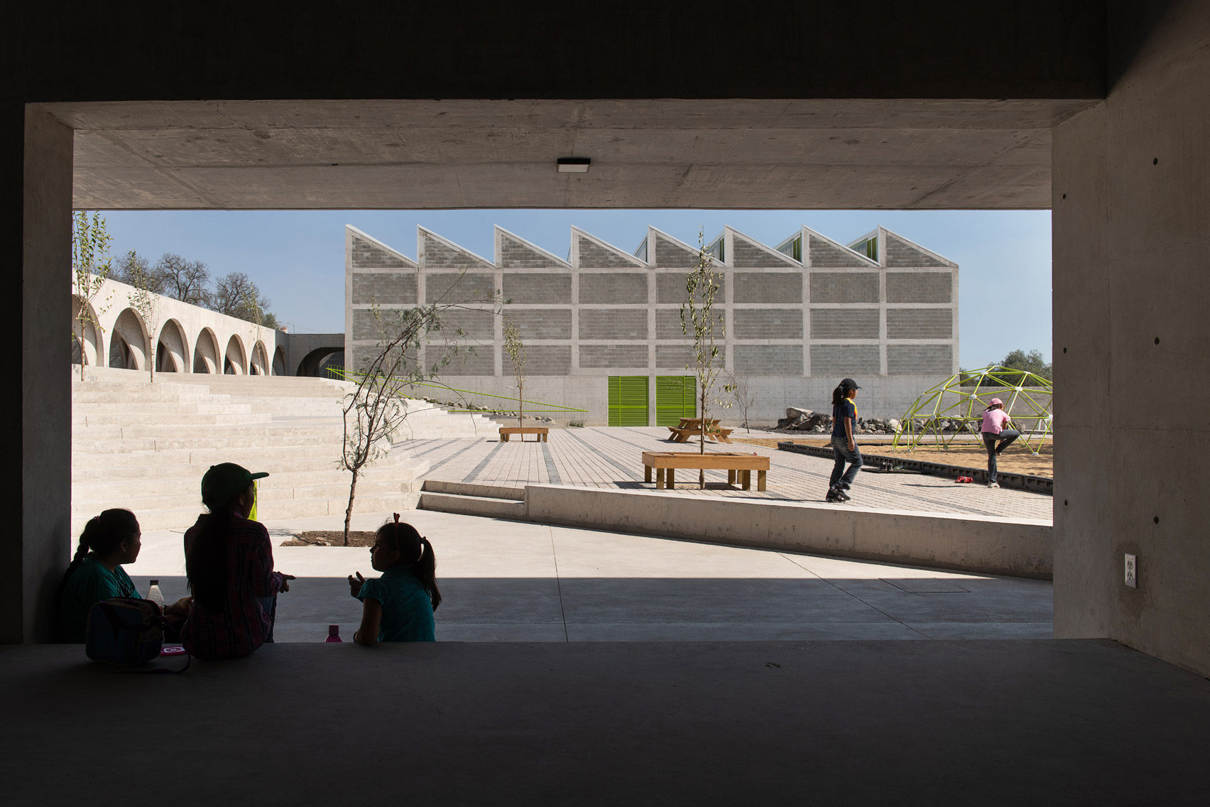
It comprises three buildings that host a mix of recreational and educational facilities, linked by a corridor of 24 arches that Centro de Colaboración Arquitectónica (CCA) said is modelled on human vertebrae.

Boys and Girls Club in Mexico by Centro de Colaboración Arquitectónica (CCA)
A colonnade is the centrepiece of the Boys and Girls Club in Mexico

"This is a space that provides extracurricular educational, artistic, and recreational activities that promote positive values and community integration," the studio explained.

"The three buildings are linked by a long corridor that represents the idea of education as the backbone of the development of society – its 24 arches represent each of the human vertebrae."

Boys and Girls Club in Mexico by Centro de Colaboración Arquitectónica (CCA)
The campus is made from concrete donated to the scheme

CCA's Boys and Girls Club was completed in 2019 and is one of 10 similar campuses in Mexico that are initiated by the Boys & Girls Club of America.

The organisation exists to provide children and young people living in poor or unsafe areas with healthy and safe spaces to play, create and learn before and after school.

"CCA was commissioned by the Boys and Girls Club to build the tenth campus in Mexico, the largest to date, striking a careful balance by designing a building that communicated the association's values with a playful and attractive architecture," the studio told Dezeen.

Boys and Girls Club in Mexico by Centro de Colaboración Arquitectónica (CCA)
There are a total of 24 arches in the corridor

The campus' design evolved from a manual by the Boys & Girls Club of America, which outlines the minimum spaces required to host the organisation's educational programmes.

CCA then adapted this into a group of buildings that could be built from concrete, as the material had been donated by a benefactor of the organisation specifically for the scheme.

Boys and Girls Club in Mexico by Centro de Colaboración Arquitectónica (CCA)
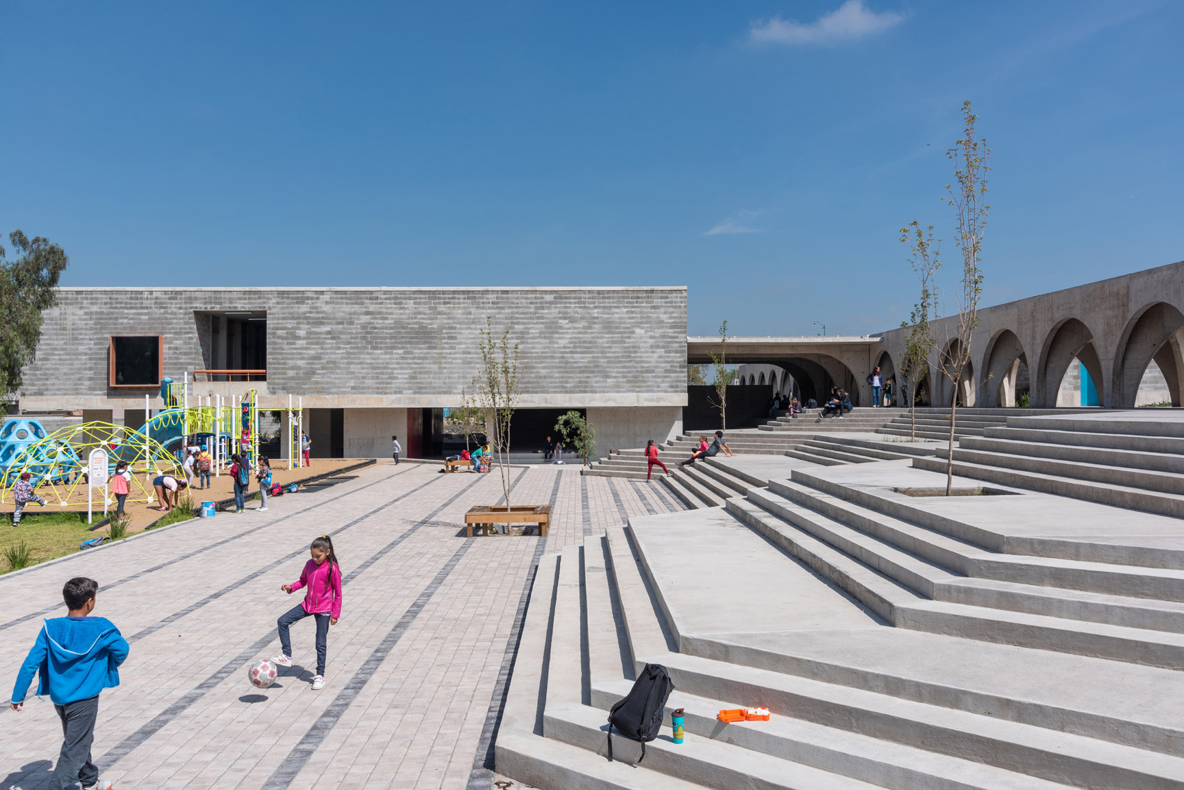
The corridor links the buildings with outdoor play areas

The studio's design comprises an educational building, a two-storey arts centre, and sports hall, all linked by the arched colonnade.

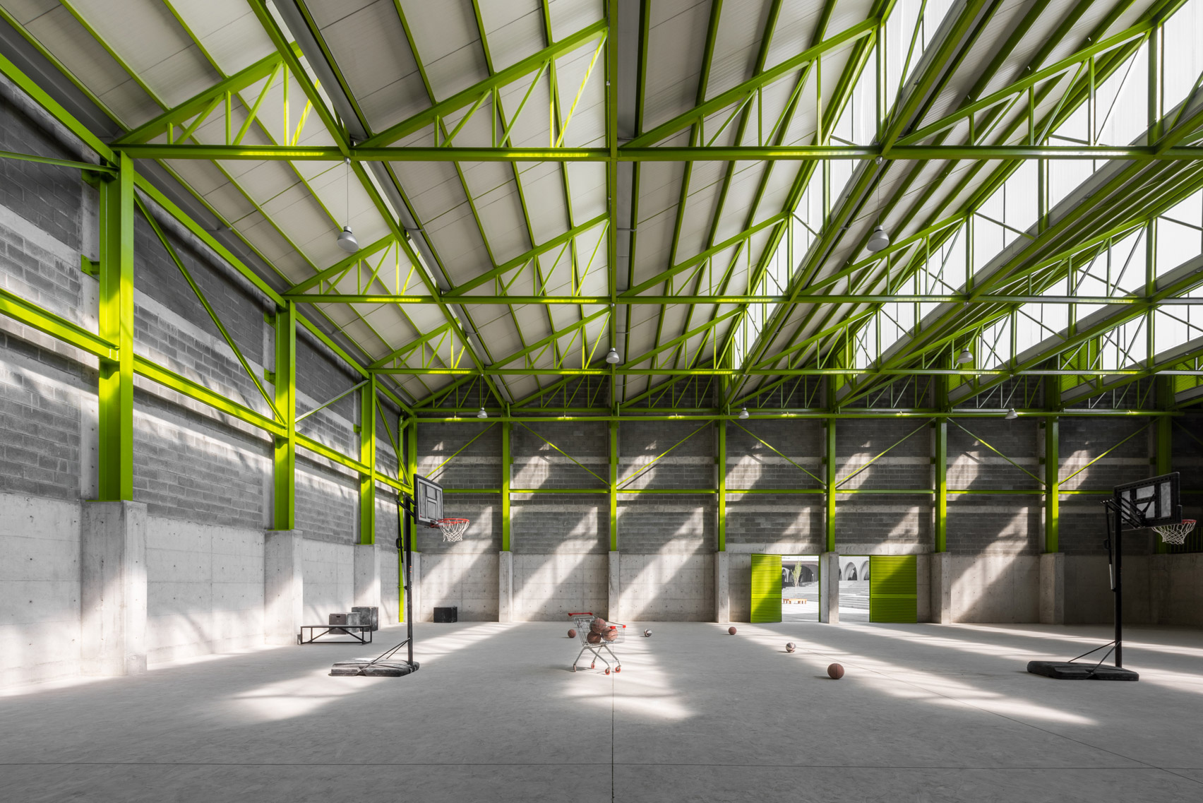
Its sports hall is the most notable building on the campus, capped by a distinctive saw-tooth roof allows daylight down into a large, adaptable hall inside.

Boys and Girls Club in Mexico by Centro de Colaboración Arquitectónica (CCA)
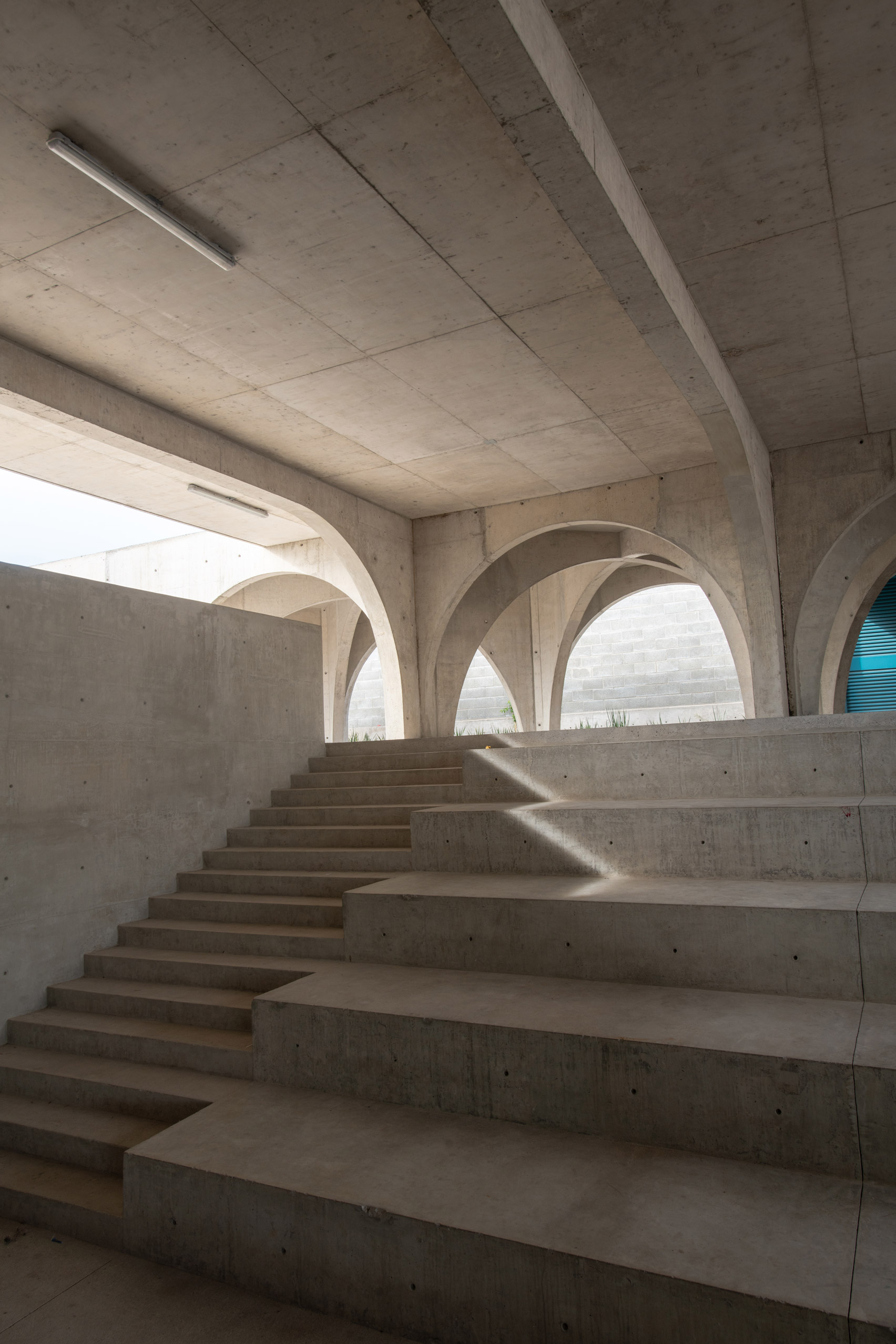
One of the stepped areas incorporates a zigzagging ramp

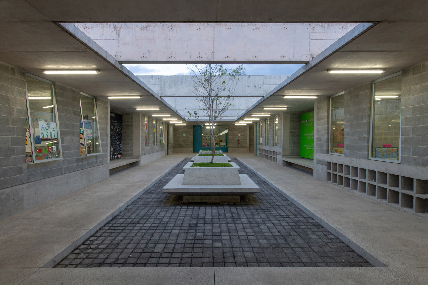
The campus' classrooms are contained in the single-storey educational building, alongside computers areas, a kitchen and a library.

These rooms are ventilated and lit by a courtyard at the centre of the building, which CCA designed to negate the need for windows – making the classrooms private and distraction-free.

Boys and Girls Club in Mexico by Centro de Colaboración Arquitectónica (CCA)
The educational building has an internal courtyard

The final building on the Boys and Girls Club campus is the two-story arts centre, which contains space for exhibitions, an auditorium, a dance studio and a dojo.

Here, there is also a room exclusively for teenagers to relax and attend educational workshops and training sessions tailored to their age group.

Boys and Girls Club in Mexico by Centro de Colaboración Arquitectónica (CCA)
A sports hall is topped by a saw-tooth roof

Wrapping around the Boys and Girls Club are several outdoor plazas, as well as basketball courts, soccer pitches, and gardens.

The plazas offer meeting spaces for visitors and have also been sculpted to the topography to ensure circulation between the buildings is efficient – with one incorporating a zigzagging ramp.

"It was meant to be a meeting point, a space created to generate encounters between individuals, enable them to interact openly and freely in a way that continually enriches their own experiences and enhances that of others," explained the studio.

Boys and Girls Club in Mexico by Centro de Colaboración Arquitectónica (CCA)
The sports hall is used for a mix of physical activities

CCA an architecture studio based in Mexico City that was founded by Bernardo Quinzaños and Ignacio Urquiza in 2008.

Other projects by the studio include a house in Hidalgo with concrete walls, planted patios and pools, alongside a business school on a lush site near Aguascalientes.

Photography is by Onnis Luque, Arturo Arrieta and Jaime Navarro.


Project credits:

Architect: Centro de Colaboración Arquitectónica (CCA)
Design team:
Mauricio Garcia-Noriega, Tania Coronado, Ana Laura Ochoa, Sebastian Gnaedig
Client: Boys and Girls Club
Constructor: Grupo PC - CARSO
Other specialists: DECSA, BVG

The post Concrete colonnade links educational facilities at Boys and Girls Club in Mexico appeared first on Dezeen.

David Adjaye and Aston Martin design five residences in New York skyscraper 130 William

$
0
0
Aston Martin Residences by David Adjaye and Aston Martin

David Adjaye has partnered with luxury carmaker Aston Martin to design homes and limited edition SUVs for five residents who will live in the British-Ghanaian architect's first New York skyscraper.

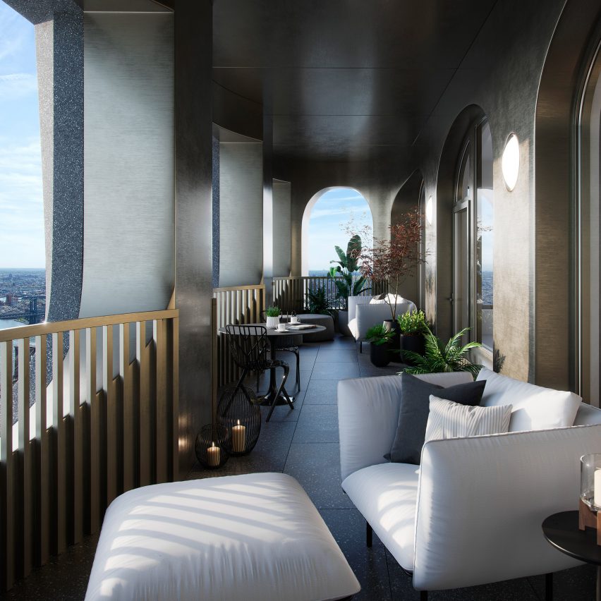
Five Aston Martin Residences will be located on the 59th and 60th floors of 130 William – Adjaye's 244-metre-tall residential tower under construction in Manhattan. Each resident will also receive a limited-edition, Adjaye-designed Aston Martin DBX.

Entrance in Aston Martin Residences by David Adjaye and Aston Martin
Above image: crosshatched bronze, an emblem of Aston Martin, will cover Adjaye-design wallpaper. Top image: residences will have outdoor loggias

"The 130 William Aston Martin homes have been touched in a very particular way that merges our design sensibilities," said Adjaye.

"Together with the limited edition SUVs that come with these units, we've created a truly unique signature that blends our two disciplines."

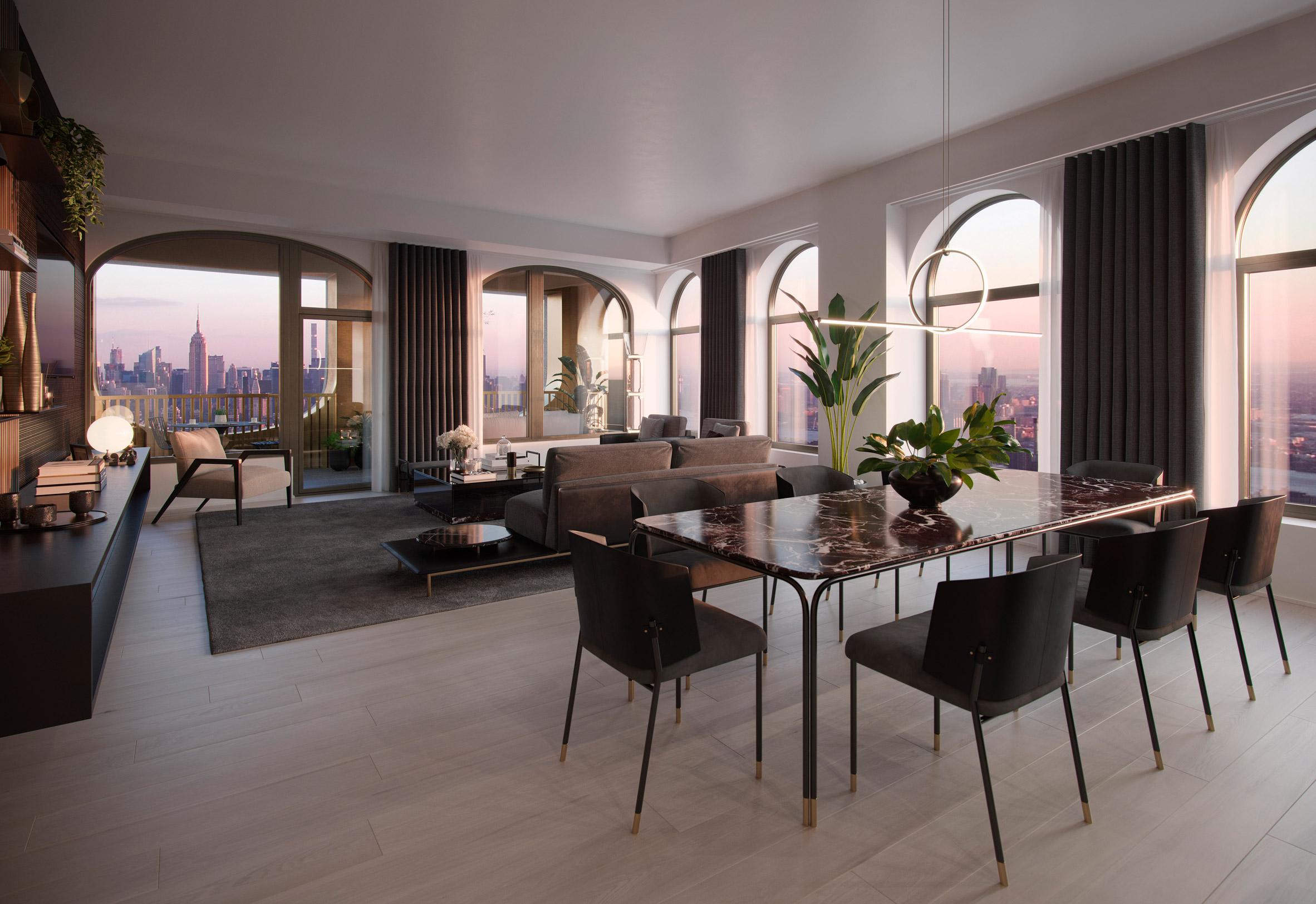
Differing from the other homes in the 242-unit tower, these five will be decorated with materials, textiles and furniture sourced from the Aston Martin Home Collection by the Italian manufacturer Formitalia, with additional touches by Adjaye.

Living room and kitchen in Aston Martin Residences by David Adjaye and Aston Martin
The living and dining room will feature items from Aston Martin's home collection

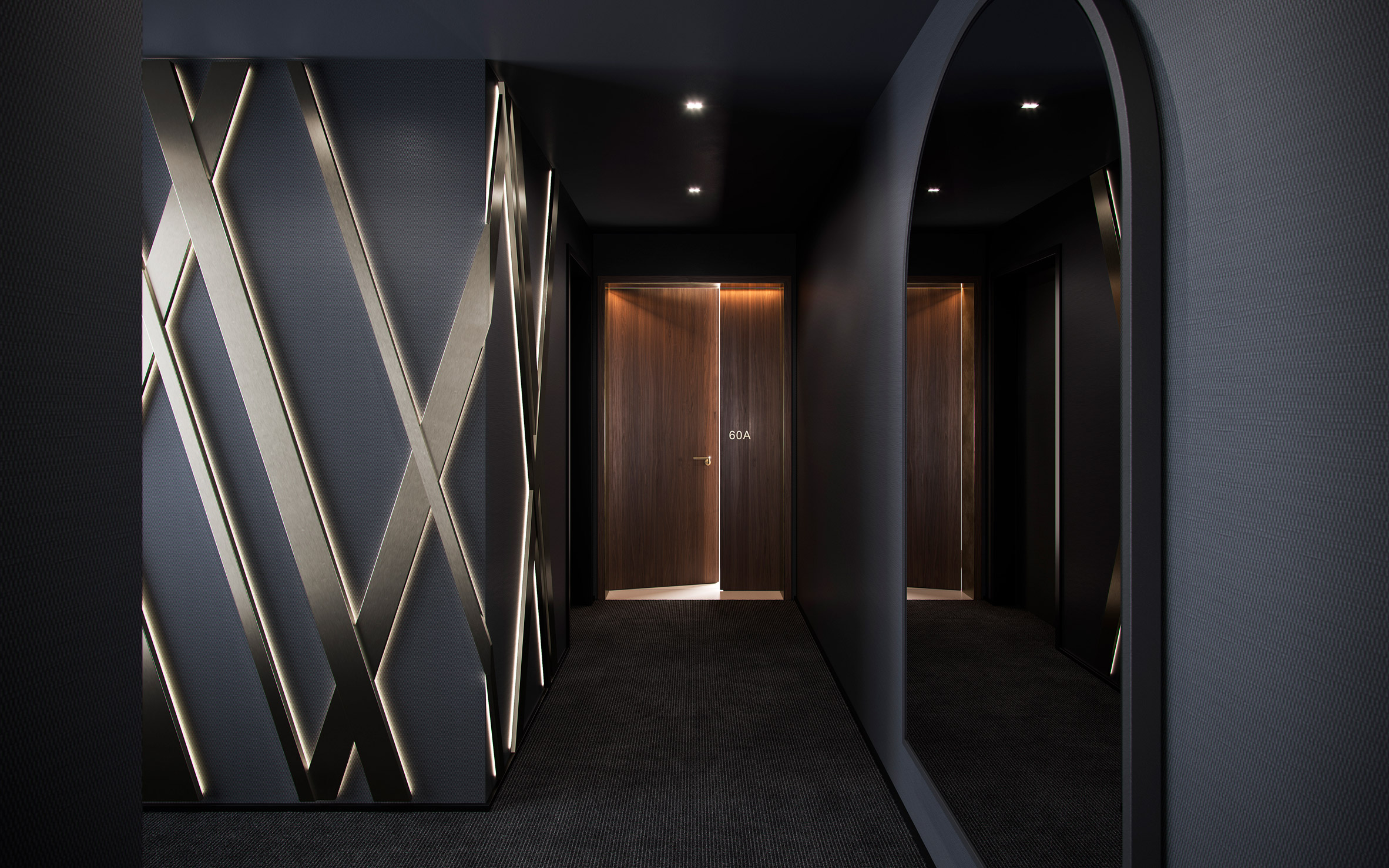
The entry hallway will be covered with a bronze cross-hatch, a signature of the Aston Martin brand, that will cover over dark Adjaye-designed wallpaper. A large arched smoked-glass mirror by Aston Martin's design team will hang on the wall, as a reference to the arched windows of the skyscraper.

Renderings show these windows will flood daylight into the lounge and dining room, whose furnishings will include leather, metal and fabric chairs that are intended to draw on the aesthetic of Aston Martin car interiors.

Study in Aston Martin Residences by David Adjaye and Aston Martin
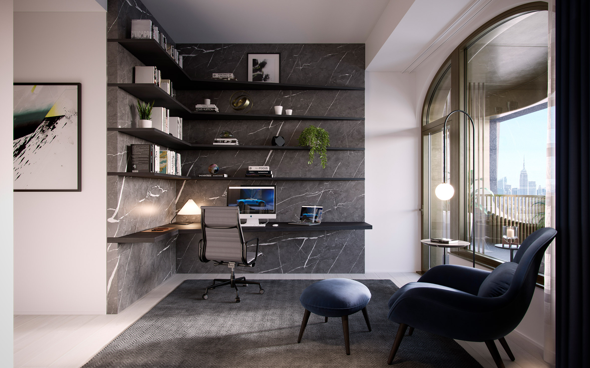
Residents can customise a bedroom into a study

An open-plan kitchen adjoining the living room will have rich materials like blackened-oak cabinetry, marble countertops from Italy's Apuan Alps and a cantilevered Nero Marquina marble top.

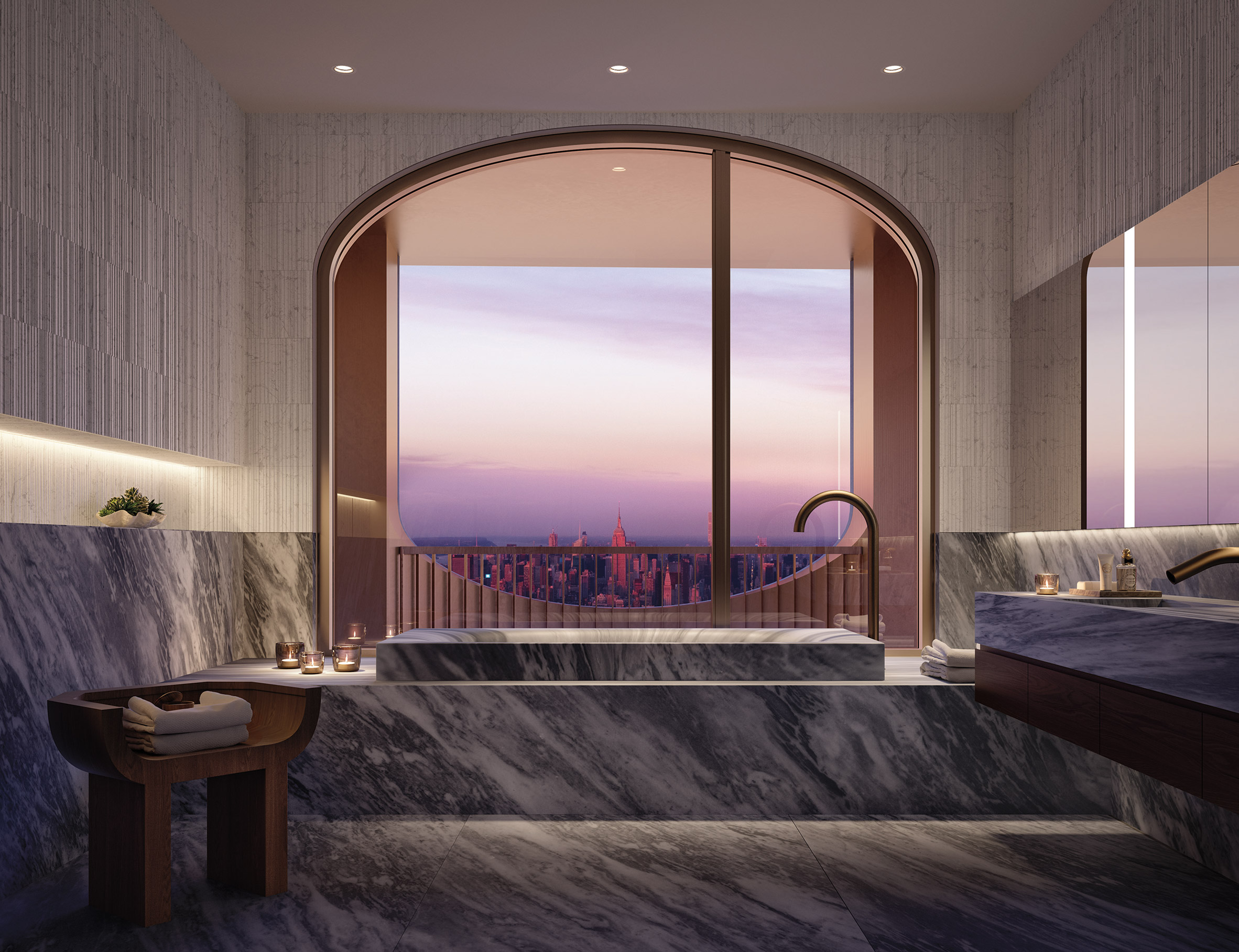
In the main bathroom, meanwhile, dark Italian Salvtori will be carved into a bathtub and double vanity sinks. Design details in the main bedroom will include Formitalia furniture and a custom cashmere headboard.

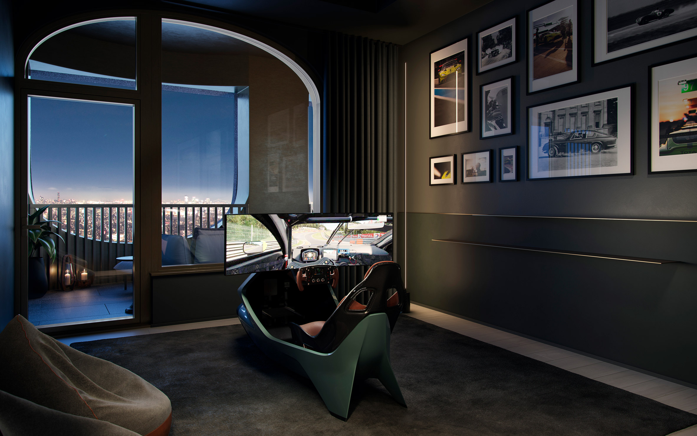
Racing simulator in Aston Martin Residences by David Adjaye and Aston Martin
The spare room can also be turned into a racing simulator

Residents will also be able to turn one of the rooms in the two- or three-bedroom homes into a racing simulator, an office and library space or a bedroom. The racing simulator will be made in partnership with British technology company Curv Racing Simulators.

Each residence will also have an expansive outdoor space with bespoke slatted screens to divide up lounging areas.

Master bathroom in Aston Martin Residences by David Adjaye and Aston Martin
The main bathrooms with have a bathtub carved from marble

The Adjaye-designed Aston Martin DBX that will accompany the purchase of each residence will feature rich materials to mirror the homes – including marble, walnut wood and hand-stitched leather with green trim.

The five Aston Martin Residences include two penthouses for sale at $11,500,000 and $10,500,000, and three loggia residences priced from $3,985,000, $5,985,000 and $10,000,000.

First unveiled in 2017, 130 William is a 66-storey skyscraper in Downtown Manhattan that Adjaye has designed with local firm Hill West Architects for developer Lightstone.

It will have a textural hand-cast concrete exterior to complement the materiality of the surrounding historic, brick commercial buildings, which Adjaye has previously said will make it ideal for close-up drone photography.

Adjaye-designed Aston Martin DBX luxury car for Aston Martin Residences by David Adjaye and Aston Martin
Each resident of the five homes will get an Adjaye-designed Aston Martin DBX luxury car

The partnership with Aston Martin is not the first time the car marker has turned its hand to architecture and design.

"This is a fascinating project for the Aston Martin design team to work on and a great opportunity to collaborate with David," Aston Martin CCO Marek Reichman said.

Interior of Adjaye-designed SUV
Rich materials inside the SUV are intended to reference the homes

"It is our first real estate project in New York City but our second collaboration in real estate design after the Aston Martin Residences in Miami," he added. "We can apply what we have learnt in Miami and also bring our unique automotive design skills to these beautiful luxury homes.'

Last year, the brand also launched an architectural design service called Automotive Galleries and Lairs to design homes around the resident's cars. It has since teamed up with US studio S3 Architecture to create Sylvan Rock, an angular black-cedar home in Hudson Valley, New York.

Renderings are courtesy of Aston Martin.

The post David Adjaye and Aston Martin design five residences in New York skyscraper 130 William appeared first on Dezeen.


Stefan Brüggemann installs TRUTH/LIE neon lights at US-Mexico border on election day

$
0
0
Truth and Lie by Stefan Brüggemann

Mexican artist Stefan Brüggemann has created red, white and blue neon lights of the words truth and lie for an artwork unveiled on the US-Mexico border on the day of the 2020 US presidential election.

Featuring the colours of the American flag, Brüggemann's artwork was unveiled to coincide with the US presidential election, which is scheduled today.

TRUTH/LIE by Stefan Brüggemann is installed at the US-Mexico border
TRUTH/LIE is installed at the US-Mexico border

The artist, who is based in Mexico and London, created the words lie and truth because he wanted to show the notion of these words have "lost meaning" in political campaigns leading up to the event.

"I came up with the idea of the installation after observing and absorbing how so many of the political narratives in the world in these last few years have brought truth and lies into question, and shifted their meaning," Brüggemann told Dezeen.

TRUTH/LIE neon lights by Stefan Brüggemann colours of the American flag
The lights are red, white and blue – the colours of the American flag

"These powerful words, LIE and TRUTH have eroded into a meaningless word – or shifted polarities – now perhaps the lie is the truth and the truth is the lie," he added. "The relevance is that these words have lost their meaning in many ways."

TRUTH/ LIE is installed in Tijuana, a city in Mexican state Baja California that borders the US – a location Brüggemann chose to further emphasise the meaning of the work.

"The location in Tijuana attracted me as I liked the idea of how the piece would be understood on a physical, geographical border – reflecting the idea of blurring boundaries, of language losing its clarity, and how the meaning of the two words have eroded one another, their meaning blending into each of the two words," he explained.

As shown in an accompanying video, the neon lights are elevated on stilts atop a building known as the tunnel house, which Brüggemann said previously served as an illegal physical connection between the US and Mexico.

TRUth/LIE by Stefan Brüggemann is elevated above a building known as tunnel house
TRUTH/LIE is raised above a building known as tunnel house

Brüggemann's choice of site on the US-Mexico border also has significance because a key commitment in US president Donald Trump's 2016 presidential campaign was that a wall would be built between the two countries.

A number of architects and designers have come up with conceptual and real proposals to challenge Trump's US-Mexico border wall.

They include the installation of pink seesaws across the border wall so that children on either side can play together, a 1,954-mile-long dinner table and a flat-pack Ikea kit.

The post Stefan Brüggemann installs TRUTH/LIE neon lights at US-Mexico border on election day appeared first on Dezeen.

RISD launches Race in Art & Design cluster-hire for anti-racism initiative

$
0
0
RISD design school in Providence

Rhode Island School of Design is hiring 10 faculty members that specialise in issues of race and decoloniality in the arts, architecture and design as part of its wider plan to tackle systemic racism in the school.

RISD's Race in Art & Design cluster-hire initiative includes four roles in the school's Liberal Arts and Experimental and Foundation Studies divisions, three in Architecture and Design and three in Fine Arts.

In order to improve the diversity of both staffing and curriculum, the school intends to hire those with scholarship, practice and pedagogies related to the African American and African diasporas, Indigenous North American and Latinx communities.

RISD aims to diversify staff and curricula

The school added that applicants can also be scholars focusing on any Indigenous or communities of colour that have been historically marginalised.

"We repeatedly heard from our community that the most definitive transformation we could make would be to increase the diversity of the scholarship of our faculty and thereby our pedagogy," said RISD president Rosanne Somerson.

"This initiative will bring 10 new faculty members to RISD in fall 2021, launching a fundamental transformation toward diversifying and expanding our curricula."

"Cluster hire initiative is a cornerstone effort"

RISD, a private art and design school in Providence, said the cluster hire is made possible by one of the largest and anonymous gifts it has ever received.

The cluster hire forms part of a wider, anti-racist plan created in response to issues highlighted by the student-led RISD Anti-Racism Coalition (risdARC) and black, indigenous and people of colour (BIPOC) faculty members amid racial unrest in the US.

Somerson revealed the proposal in an open letter sent to the Rhode Island School of Design (RISD) community in July this year, following the call for the school to do more for social equity and inclusion amid racial unrest in the US.

"I want to acknowledge and thank the student-led risdARC and the group of BIPOC faculty who passionately led the efforts to instigate much-needed change at RISD, along with the generous anonymous donors who made this possible," she said.

"This cluster hire initiative is a cornerstone effort of many major commitments underway to make substantive, meaningful and durable change at RISD."

"We'll continue to focus on issues of racism and colonialism"

In addition to expanding and diversifying curriculum and pedagogy, other key aims include cultivating a more diverse community; implementing research on issues of social equity and inclusion in art and design; and embedding anti-racist and anti-discriminatory infrastructures.

A faculty-led Social Equity and Inclusion (SEI) committee will spearhead change.

"The cluster hire is a concrete and significant step forward for RISD but I see it as the impetus behind a much larger and more durable initiative," SEI associate provost said Matthew Shenoda.

"Over the coming years, we'll continue to focus on issues of racism and colonialism and how they intersect with other key issues like sustainability."

Architecture and design profession tackles systemic racism

RISD's proposal came in the wake of the killing of African-American George Floyd in police custody in May this year. His death sparked racial unrest and anti-racism protests in cities across the US and countries across the world.

It also brought to focus the systemic racism in the architecture and design profession and resulted in members of the industry,  such as RISD, establishing a number of initiatives  to address and improve racial equality

Examples include a Google Docs spreadsheet listing black-owned studios and anti-racism design conference Where are the Black Designers?.

Photo is by Dimitri Bong, courtesy pf Unsplash.

The post RISD launches Race in Art & Design cluster-hire for anti-racism initiative appeared first on Dezeen.

Sara Ruffin Costello fashions quirky interiors for The Chloe hotel in New Orleans

$
0
0
The Chloe hotel in New Orleans features moody interiors

Inky blue walls, alligator-print carpet and grand four-poster beds appear inside The Chloe hotel in New Orleans, which has been designed by decorator Sara Ruffin Costello.

The Chloe hotel comes as the latest venture from restaurateur Robert LeBlanc and is situated amongst the picturesque streets of New Orleans's Uptown neighbourhood.

It occupies a family mansion that was originally designed by American architect Thomas Sully in the 1860s.

The Chloe hotel in New Orleans features moody interiors
Top image: The Chloe's entrance lobby. Above: an alligator-print carpet runner features on the stairs

Sara Ruffin Costello, who is a native of New Orleans, was tasked with devising the interiors of the hotel.

"Sully's architecture is grand Southern Victorian – exceptionally tall ceilings, incredible tile work and plaster mouldings and a Byzantine layout," Costello told Dezeen.

"I ran with the romance of that era and played around with the notion of New Orleans being a port city, kind of that 'what news do you bring from the outside?'," she added.

"To translate that into a vibe, The Chloe is moody with dark, antique furniture, with an emphasis on Orientalism but updated and made culturally relevant through a very special art collection."

Reception lounge of The Chloe hotel in New Orleans
Plush furniture decorates the reception lounge

Guests enter The Chloe via a lobby that features inky-blue walls and dark wood floors. The building's original ornate staircase is left in place but updated with a quirky, deep-red carpet runner that depicts an alligator creeping down the steps.

"Last time I went for a kayak in the Bayou, not five minutes into my paddle two giant alligators got into a splash fight right in front of my boat – alligators are a real part of life here!" added Costello.

The Chloe hotel in New Orleans features moody interiors
Inky blue walls appear throughout the hotel

Adjacent to this is a reception room arranged around a large fireplace. Just in front are a couple of plush, claw-footed sofas perched on a blue floral rug, while an oversized cream lamp has been suspended overhead.

A doorway in the corner of the room looks through to a cosy blush-pink seating nook with trellis-style walls.

The bar inside The Chloe hotel in New Orleans
A bird-print mural is the focal point of the hotel's salon

The hotel's restaurant serves signature New Orleans' dishes with a contemporary twist. Drinks can be enjoyed in the bar and salon, where one wall has been painted to feature Egret birds fluttering amongst spindly tree boughs.

A burnt-orange leather sofa runs along the lower half of the wall, accompanied by a handful of fringed seating poufs and tiny lamps that dimly illuminate the room.

Outdoor patio of The Chloe hotel in New Orleans
Guests can also enjoy dinner and drinks out on the patio

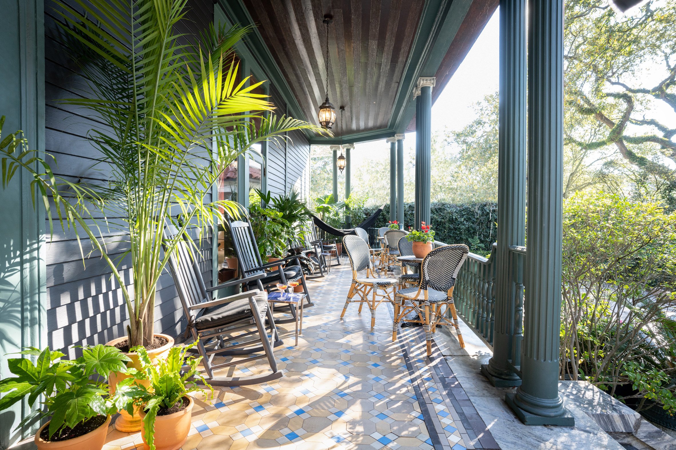
Guests can alternatively sit with cocktails on the hotel's porch – the floor here is clad with the tiles that date back to the 1860s.

Outdoors there's also a swimming pool shaded by palmetto trees, a herb garden and an alfresco bar.

Bedrooms of The Chloe hotel in New Orleans
Bedrooms come complete with four-poster beds

A more pared-back design approach is taken in the bedrooms, where walls have been painted eggshell-white.

Touches of drama are added by the four-poster beds and freestanding soaking tubs that take centre stage in the bathrooms.

"Since The Chloe is actually a house, it feels like you are getting invited over to a local's – which is all I ever want to do when I travel," concluded Costello.

Bathrooms of The Chloe hotel in New Orleans
The en-suite bathrooms also include freestanding tubs

The Chloe joins a number of charming spots to stay in New Orleans, where tourists continue to flock to experience its rich history, vibrant live music scene and revered Mardi Gras parade.

Others include The Eliza Jane, which takes over seven historic warehouses, and Maison de la Luz, which is designed as if it's the home of a well-travelled woman that's come to acquire several worldly souvenirs.

Photography is by Paul Costello.

The post Sara Ruffin Costello fashions quirky interiors for The Chloe hotel in New Orleans appeared first on Dezeen.

BIG unveils The Village student centre for Johns Hopkins University

$
0
0
The Village by BIG

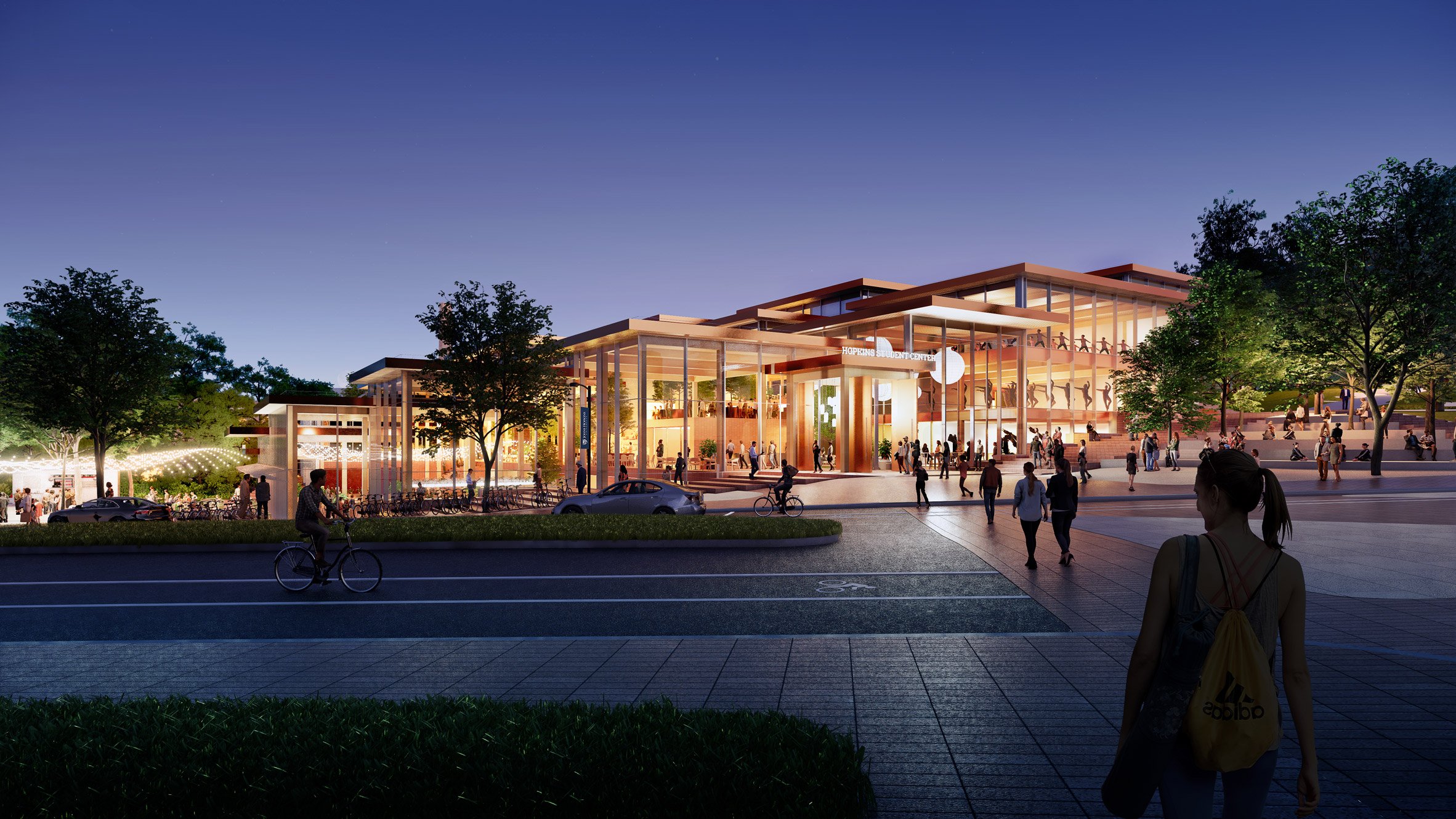
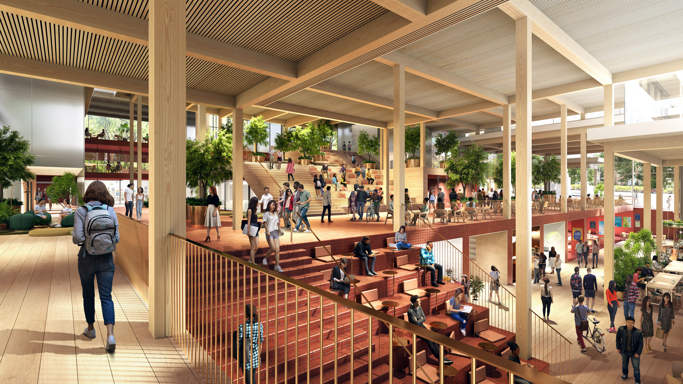
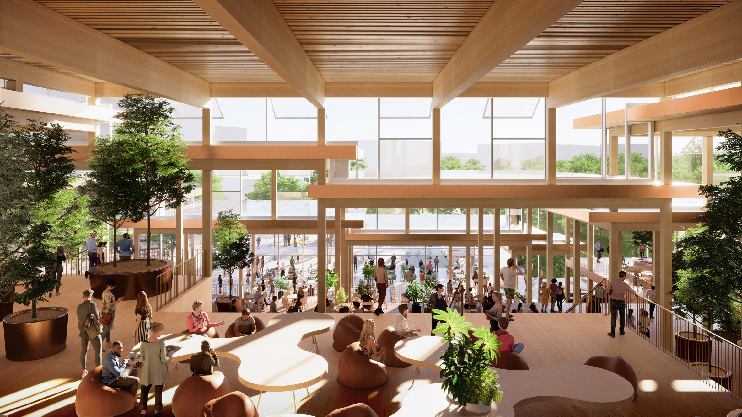
Architecture firm BIG has won a competition to design a village-like student centre for the John Hopkins research university in Baltimore, Maryland.

BIG came up with The Village design proposal for the Hopkins Student Center in response to an international design competition.

The winning scheme for the 150,000-square-foot (13,935-square-metre) building will provide a non-academic hub on the Homewood campus of the school, which was founded in 1876 as America's first research university.

Exterior view of The Village student centre by BIG for Johns Hopkins University
BIG has designed The Village student centre for Johns Hopkins University

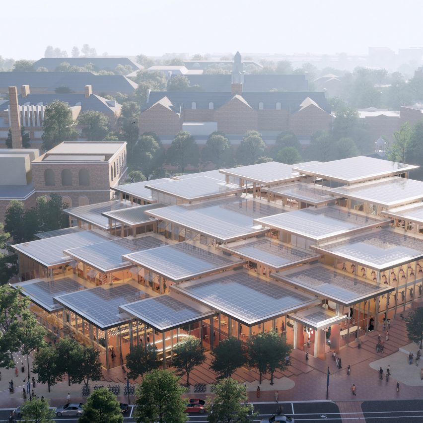
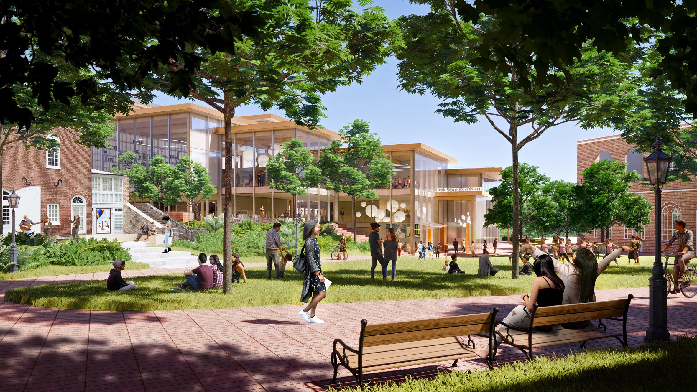
It will comprise a cluster of flat-roofed, timber volumes that will host a range of activities like relaxation, performing arts and dining, all stacked along a sloped site. These will also open to the outdoors to complete the arrangement BIG likens to a village.

"We have attempted to imagine and design the Campus Center like a village condensed from a plethora of different spaces and pavilions for the greatest possible diversity of activities, interests and sub-cultures," said BIG founder Bjarke Ingels.

Outdoor area in The Village student centre by BIG for Johns Hopkins University
Likened to a village, it will comprise a mix of indoor and outdoor facilities

The Village will be built at the intersection of 33rd Street and Charles Street, which runs through Baltimore and cuts between the school campus and Charles Village neighbourhood where 3,500 students live.

With this location, it is intended to provide a new link between the school and the surrounding city and become a main hub.

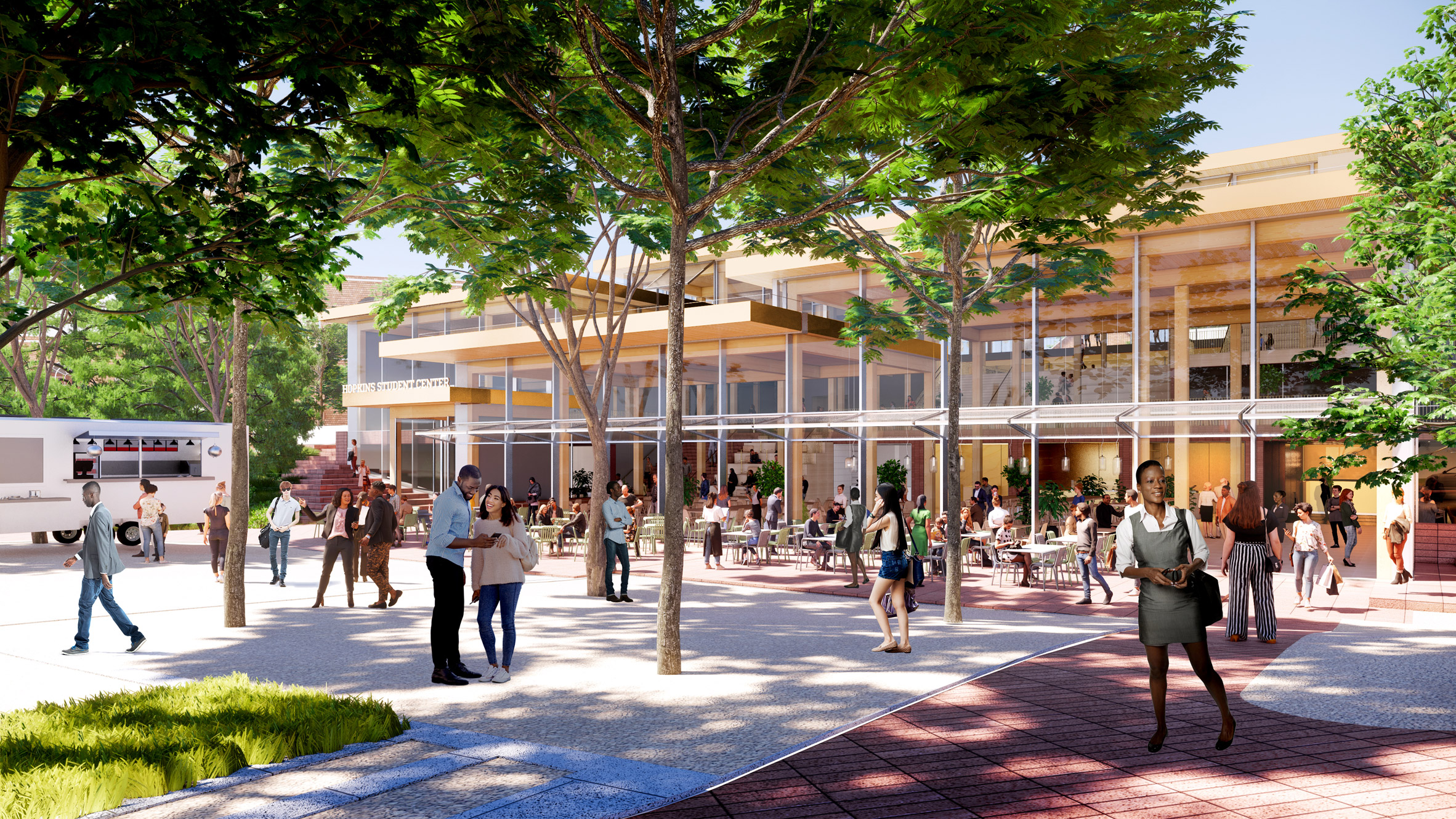
Events-focused outdoor space in The Village student centre by BIG for Johns Hopkins University
There will be an events-focused outdoor space

"Often the greatest ideas and breakthroughs occur away from the desk, when minds have a chance to wander, to play, to riff with others," said BIG partner Leon Rost.

"The new Hopkins Student Center is designed to provoke the sometimes-necessary distractions that complement rigorous academic life – a place for a future generation of Salks, Curies, and Cricks to unlock their next great discovery."

Ground level view of The Village student centre by BIG for John Hopkins University
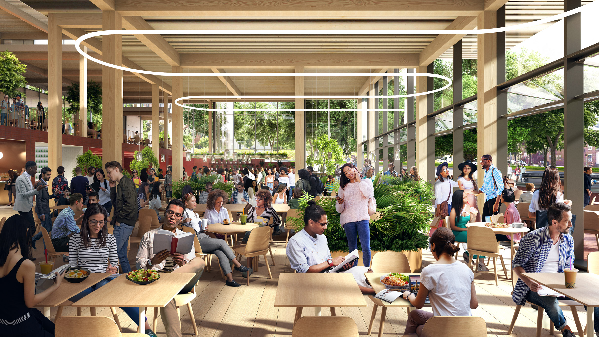
The interiors are intended to be open and flexible

The volumes will be mass timber and topped with photovoltaic panels. These design choices were made to help meet the university's goals for sustainability.

While the exterior is fragmented, the inside will form open-plan, flexible layouts for facilities such as student resources and support services, lounges, a digital media centre, a performance space with seating for 200 people and a dynamic dining hall.

These will be linked to the public outdoor spaces including the entry plaza at 33rd street, a new food market and plaza to the south and an events-focused commons.

"This will be a new kind of space for us – one that is not academically focused, but entirely social by design, open to all, reserved for none, and boasting the kind of flexible spaces that invite connection and collaboration, this will be a place where athletes and actors, step teams and SGA members can gather side by side," said Johns Hopkins University president Ronald J Daniels.

Interior view of The Village student centre by BIG for John Hopkins University
Red-brick walkways inside will echo the materiality of the school campus

In order to connect the new building to the existing campus, red-brick pathways like those on the school campus will run throughout its interior.

Organised by a special advisory committee, the Hopkins Student Center involved the school's students and student affairs staff in the selection. BIG's proposal was one of four shortlisted for the project and evaluated by over 1,200 students, faculty, staff and alumni in a survey.

Interior view of The Village student centre by BIG for John Hopkins University
Large expanses of glazing will create light-filled spaces

BIG is collaborating on the project with Rockwell Group for interior design and Michael Van Valkenburgh Associates for landscape design. US firm Shepley Bulfinch will serve as Architect of Record. The project is slated for completion in 2024.

Founded by Ingels in 2005, BIG has recently completed two other academic buildings in the United States. They include a Massachusetts university building with "domino effect" copper walls and a twisted, white-brick and glass school building in Virginia.

Renderings are courtesy of BIG.

The post BIG unveils The Village student centre for Johns Hopkins University appeared first on Dezeen.

Foster + Partners' 425 Park Avenue skyscraper nears completion in New York

$
0
0
Foster + Partners' 425 Park Avenue skyscraper,

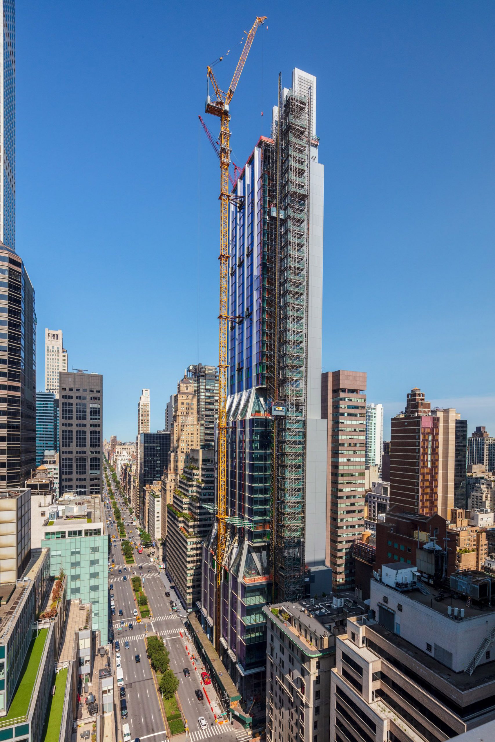
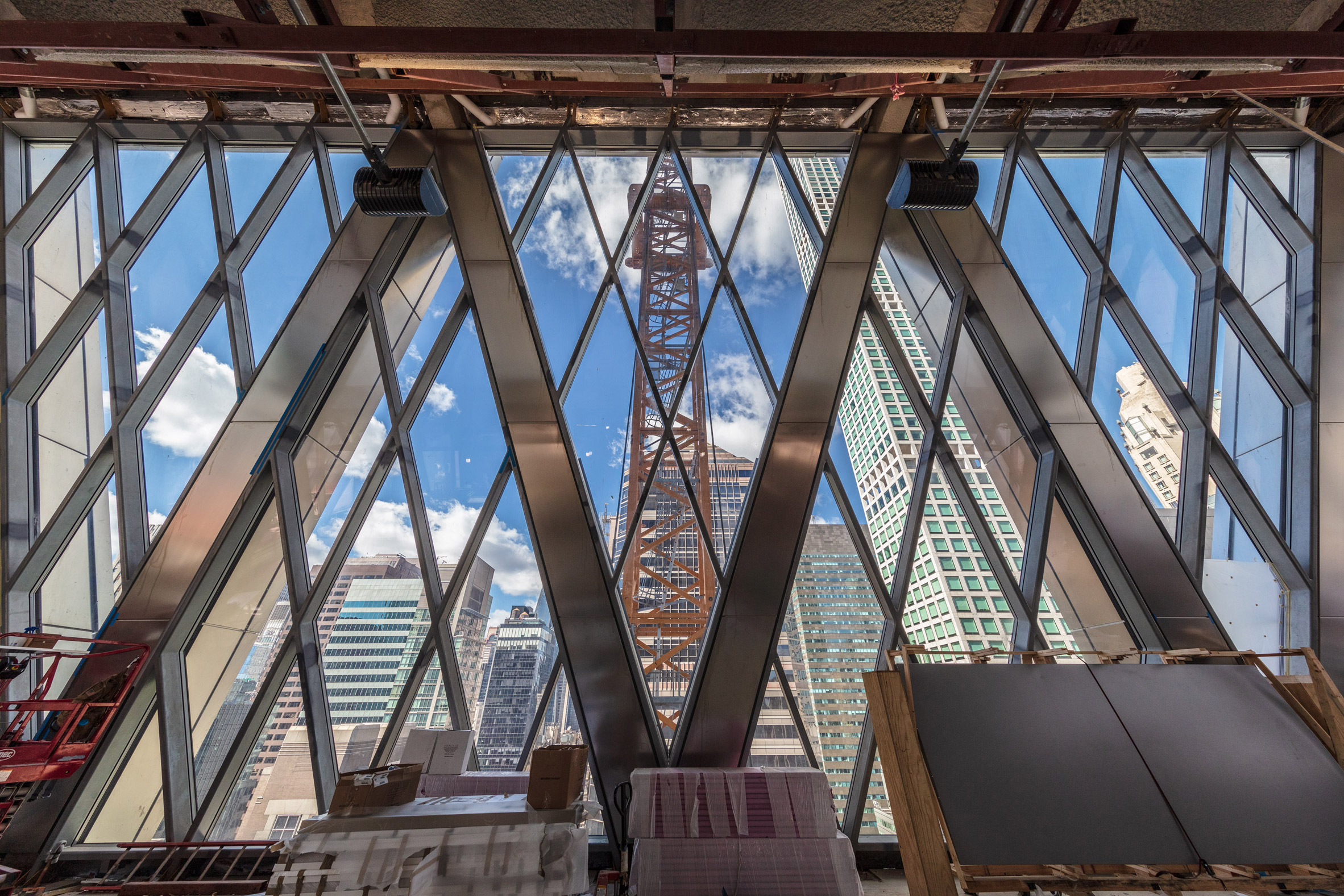
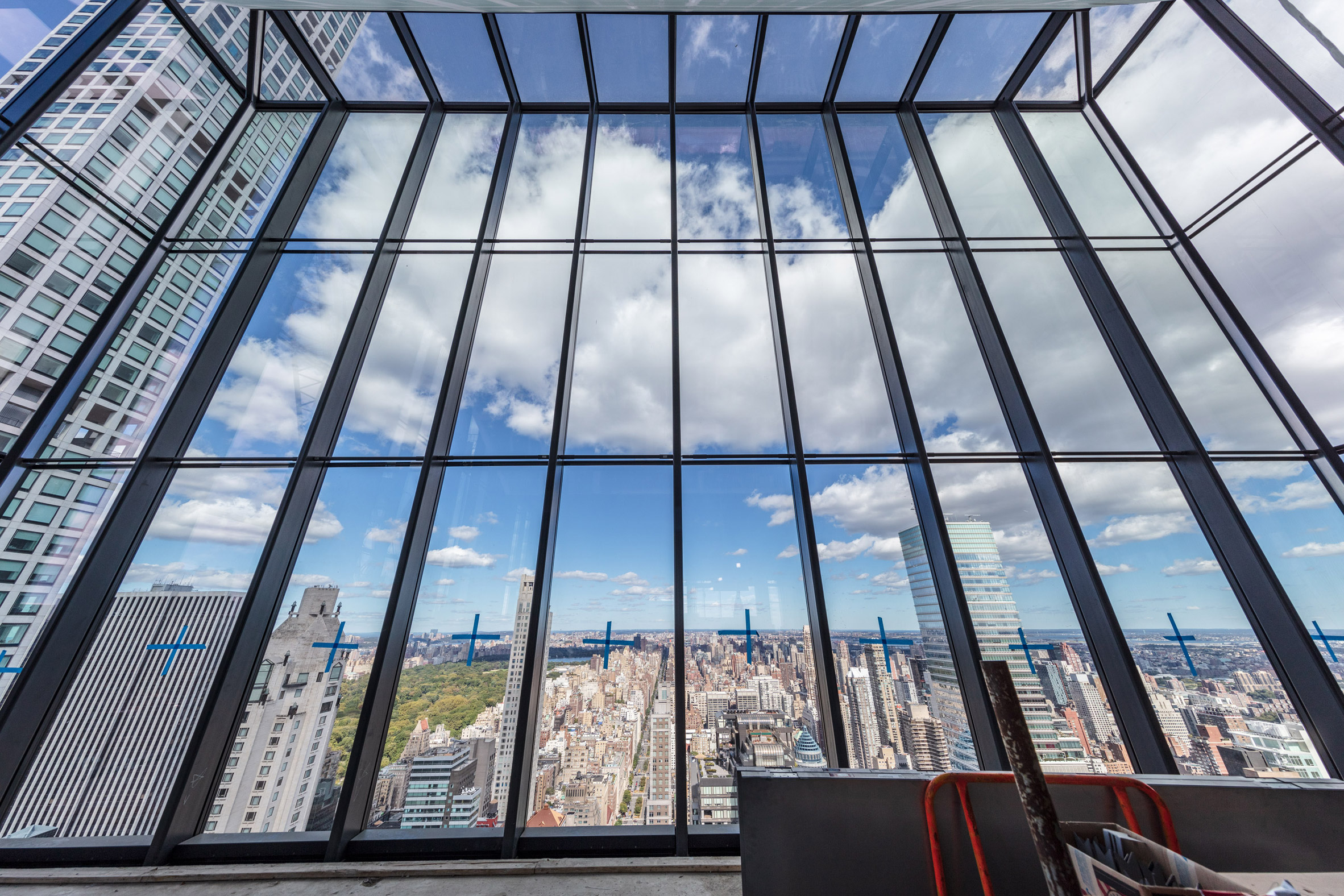
Architectural photographer Alan Schindler has revealed images of Foster + Partners' 425 Park Avenue skyscraper, which is nearing completion in New York.

The photos show that the glass facade of the 260-metre-high skyscraper on Park Avenue, which is being built for developer L&L Holding, is fully installed.

425 Park Avenue skyscraper
425 Park Avenue is nearing completion

The 41-floor office building occupies a full block on Park Avenue in midtown Manhattan near Rafael Viñoly Architects' super skinny 432 Park Avenue skyscraper and Philip Johnson and John Burgee's Postmodern AT&T Building.

Designed by UK architecture studio Foster + Partners the skyscraper is divided into three sections that step back from the street and are reduced in size as the building rises.

425 Park Avenue glass cladding
The skyscraper's cladding is complete

The skyscraper's seven-storey base contains a triple-height lobby for the offices above. It will contain a restaurant on the lowest three floors with above space above.

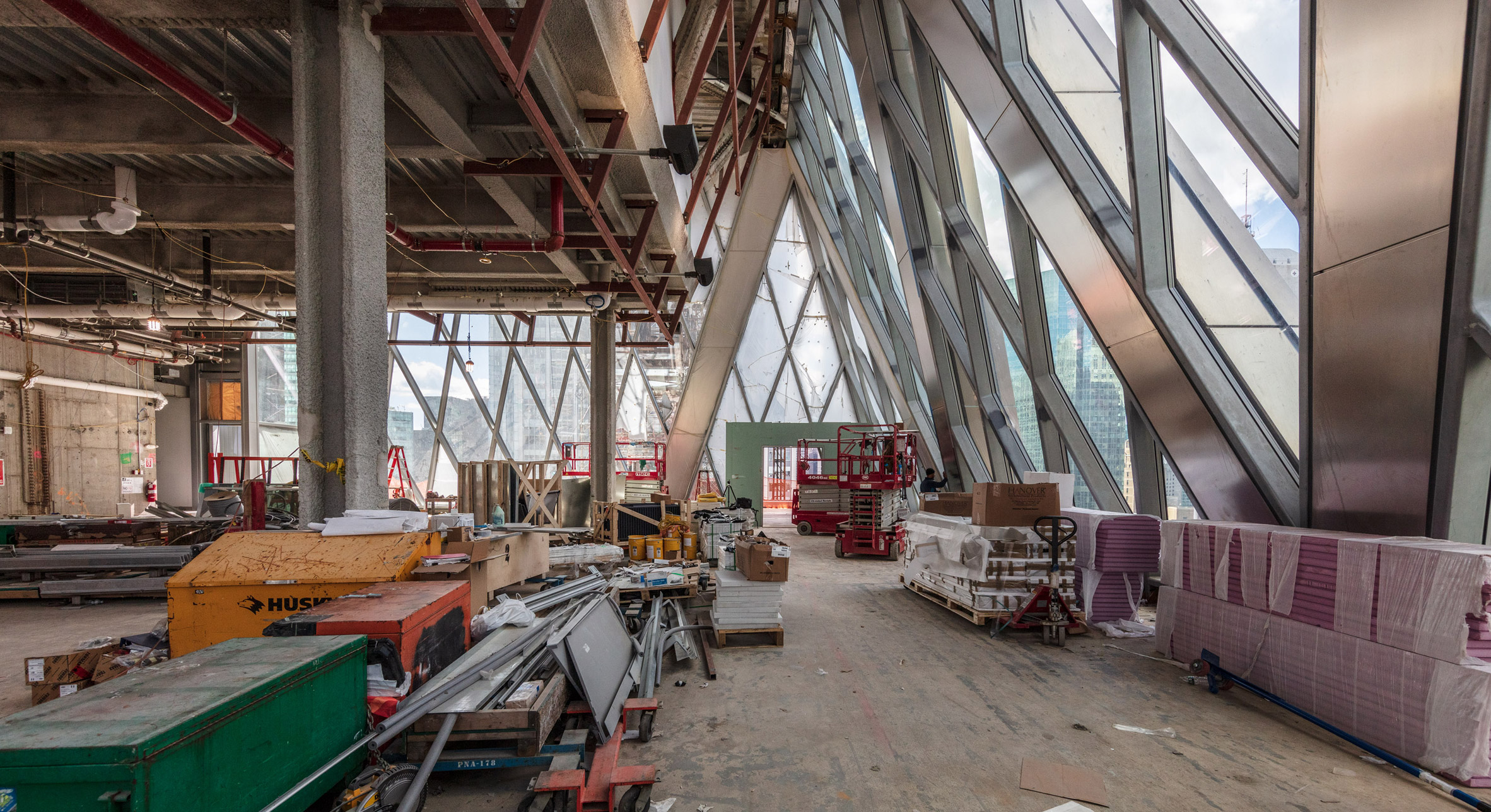
Above the base section is a triple-height space, which is enclosed by a diagrid of columns that mark the building narrowing. This space will contain cafes and facilities for meetings and conferences and will have an outdoor terrace.

Diagrid floor
Triple-height spaces will divide the office floors

The recessed central section above this contains further offices and will be topped with a second triple-height space enclosed by a diagrid of columns.

This floor will also have an outdoor terrace.

Diagrid Floor in 425 Park Avenue
These spaces will contain cafes and communal facilities

Above this will be the final 20 floors of offices that are all column-free spaces.

The building is topped with a penthouse floor that will have views across Manhattan.

Penthouse in 425 Park Avenue
The penthouse space will have views across Manhattan

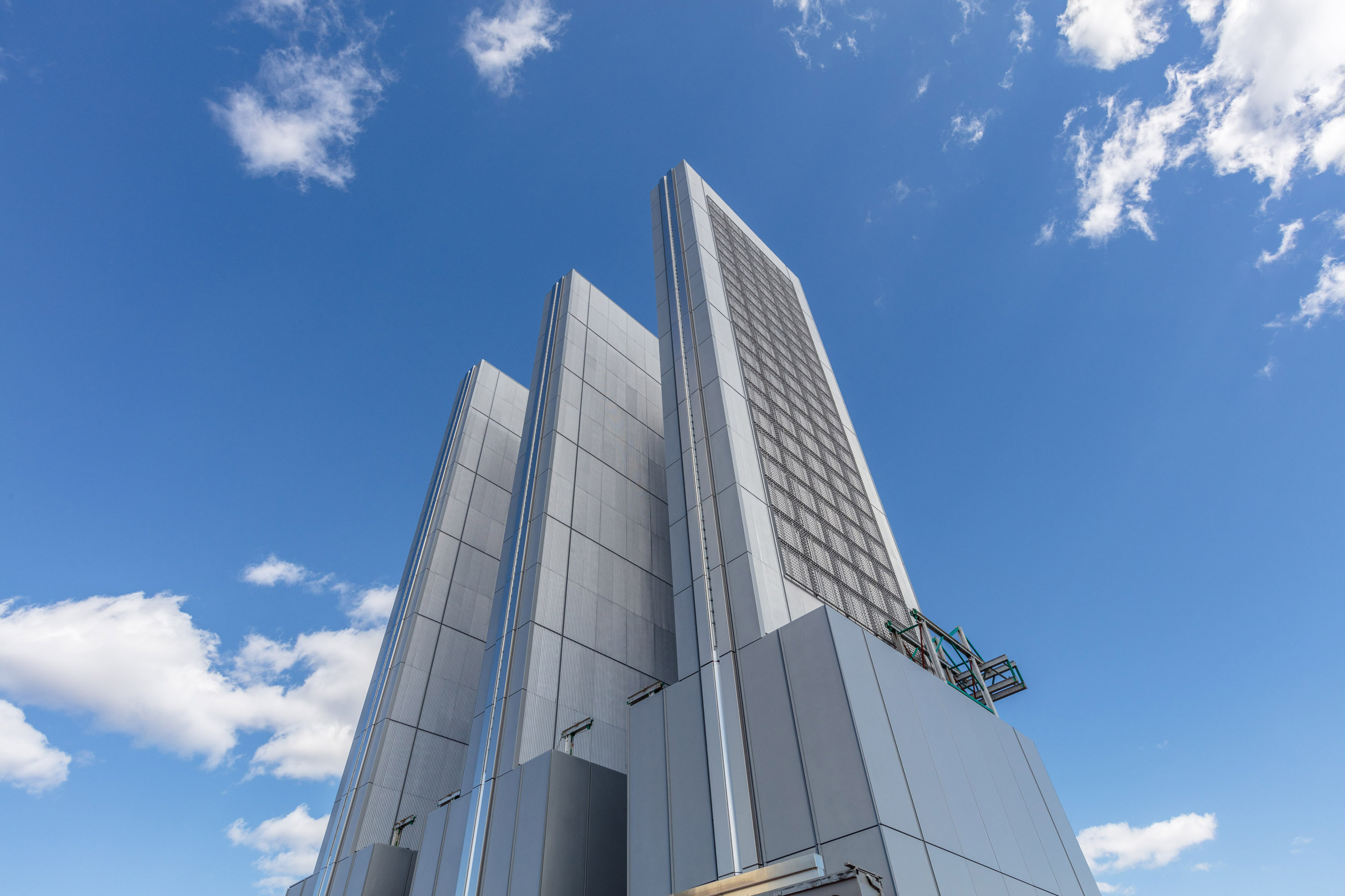
Photos also show the three ornamental steel and glass fins that are at the top of the building. These forms are now fully clad.

According to the developer, the process of removing the skyscraper's exterior tower crane has begun and the temporary certificate of occupancy is expected in December.

Three ornamental steel and glass fins
425 Park Avenue is topped with three ornamental steel and glass fins

425 Park Avenue is one of several skyscrapers currently under construction in New York. Foster + Partners super-skinny One Hundred East Fifty Third skyscraper is also nearing completion, while British architect David Adjaye is designing his first New York high-rise: a 66-storey concrete skyscraper in Downtown Manhattan.

Another tower close to completion is Central Park Tower by architecture firm Adrian Smith + Gordon Gill, which will be the tallest residential building in the world.

Photography is by Alan Schindler.


Project credits:

Architect: Foster + Partners
Architect of record: Adamson Associates Architects
Structural engineer: WSP
MEP engineer: WSP
Construction manager: Tishman Construction

The post Foster + Partners' 425 Park Avenue skyscraper nears completion in New York appeared first on Dezeen.

Residence for Two Collectors is an art-filled Chicago penthouse

$
0
0
Chainmail drapery at Residence for Two Collectors by Wheeler Kearns Architects

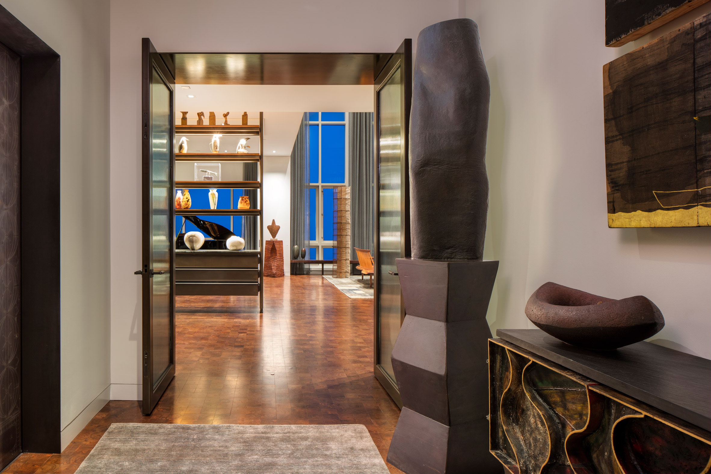
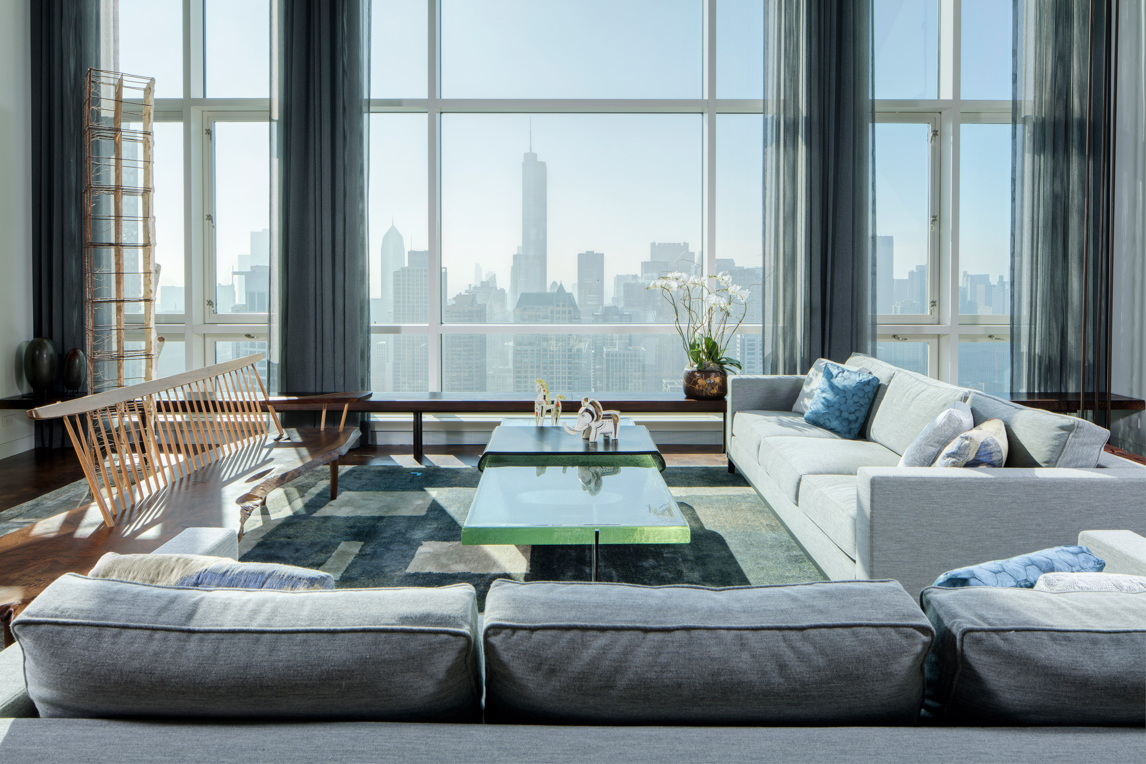
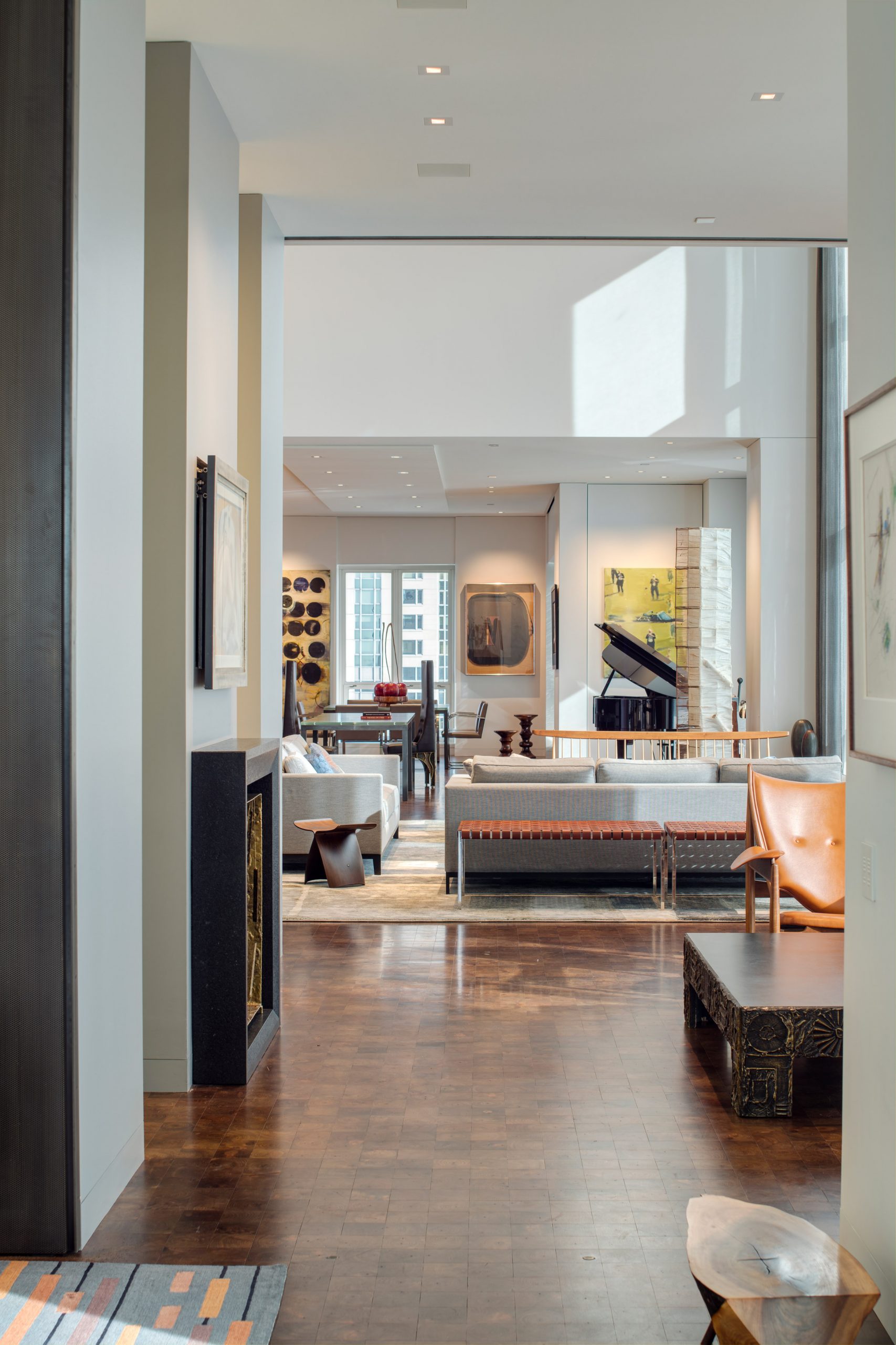
An extensive art collection is complemented by industrial detailing, a walnut floor and earthy, muted colours in this Chicago penthouse flat that local studio Wheeler Kearns Architects designed for two art collectors.

Working together with Sharlene Young of Symbiotic Living, Wheeler Kearns Architects created the interior of Residence for Two Collectors for a couple who wanted a home that would have space for their family, art and furniture.

Foyer of Residence for Two Collectors by Wheeler Kearns Architects
The foyer features wooden accessories and earthy colours

Located in a Chicago high-rise, the penthouse flat measures 6,350 square feet (590 square metres) and was gutted to a shell condition ahead of Wheeler Kearns Architects' refurbishment.

Designed for a couple and their dog, the residence is intended to be a welcoming space for family and friends. The owners, who are actively engaged in the community, also wanted room to host philanthropic events for up to 75 people.

View from Residence for Two Collectors by Wheeler Kearns Architects
In the living room, floor-to-ceiling windows overlook the Chicago skyline

"As such it is a bit of a transformer, with a series of perforated metal partitions that open and close to adjust to the needs of the day," Wheeler Kearns Architects principal Dan Wheeler told Dezeen.

"Acoustics and lighting systems were carefully integrated into the shell to attend to the technical demands."

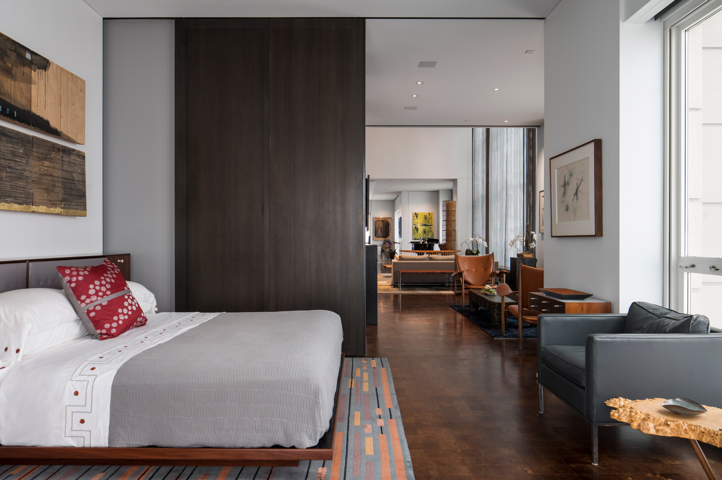
Guest room of Residence for Two Collectors by Wheeler Kearns Architects
The guest room has sliding doors for privacy

The apartment has a master bedroom and a kids' room as well as a guest room, family room, living room, dining room, a sitting room and two offices.

A kitchen and a laundry room complete the residence, which also features a terrace and has its own service entrance in addition to the main foyer.

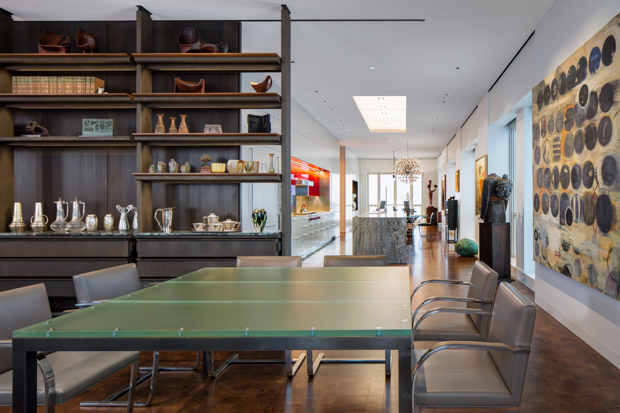
Dining room of Residence for Two Collectors by Wheeler Kearns Architects
The dining room is located between the living room and kitchen

As all rooms are on one floor and many are open-plan, the walnut flooring and muted wall colour are intended to keep the design consistent throughout.

One of the owner's father was a machinist, which informed a steel and wood material palette that runs through the apartment.

Sitting room of Residence for Two Collectors by Wheeler Kearns Architects
Pieces from the owners' art collection decorate the walls

"This led to a use of metals, patinated plate and perforated sheet steel," Wheeler explained. "[The owner's] focus was down to the selection of the profile of a screw head, something that we could all love."

Book shelf in living room of Residence for Two Collectors by Wheeler Kearns Architects
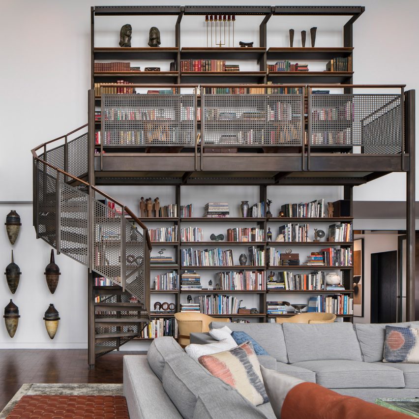
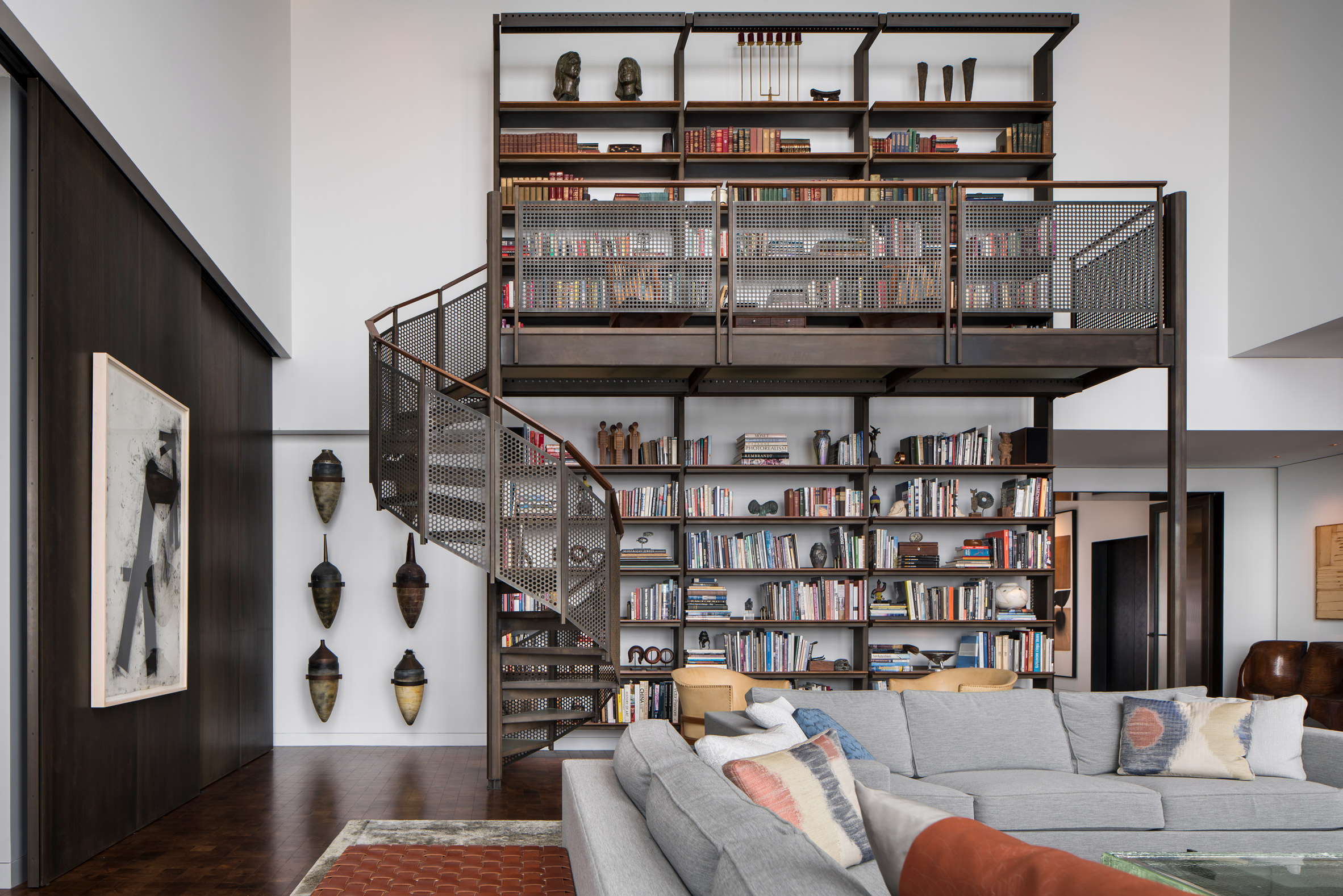
The large, custom-made bookshelf with a dedicated spiral staircase

"She was drawn to the end-grain walnut block flooring inspired by factory flooring, but here softer, warmer, each milled squared, laid in a grid to purposely bely directionality in the residence," he added.

"Those two elements, steel and walnut, drove the project home."

Chainmail drapery at Residence for Two Collectors by Wheeler Kearns ArchitectsChainmail curtains let light into the living room
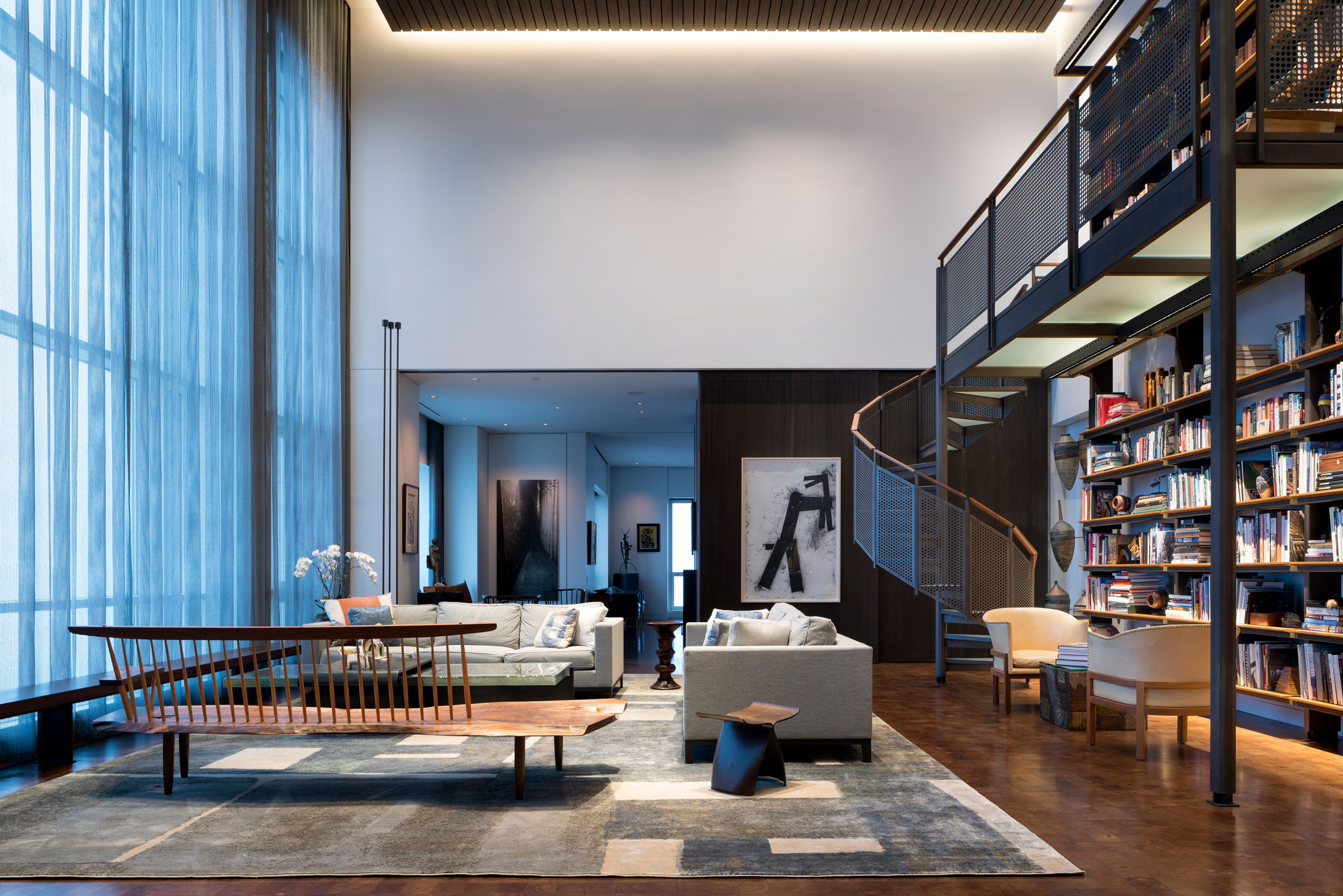
Chainmail curtains let light into the living room

To design the interior the studio worked together with Young, who is the founder of Symbiotic Living, an interior architecture and design firm.

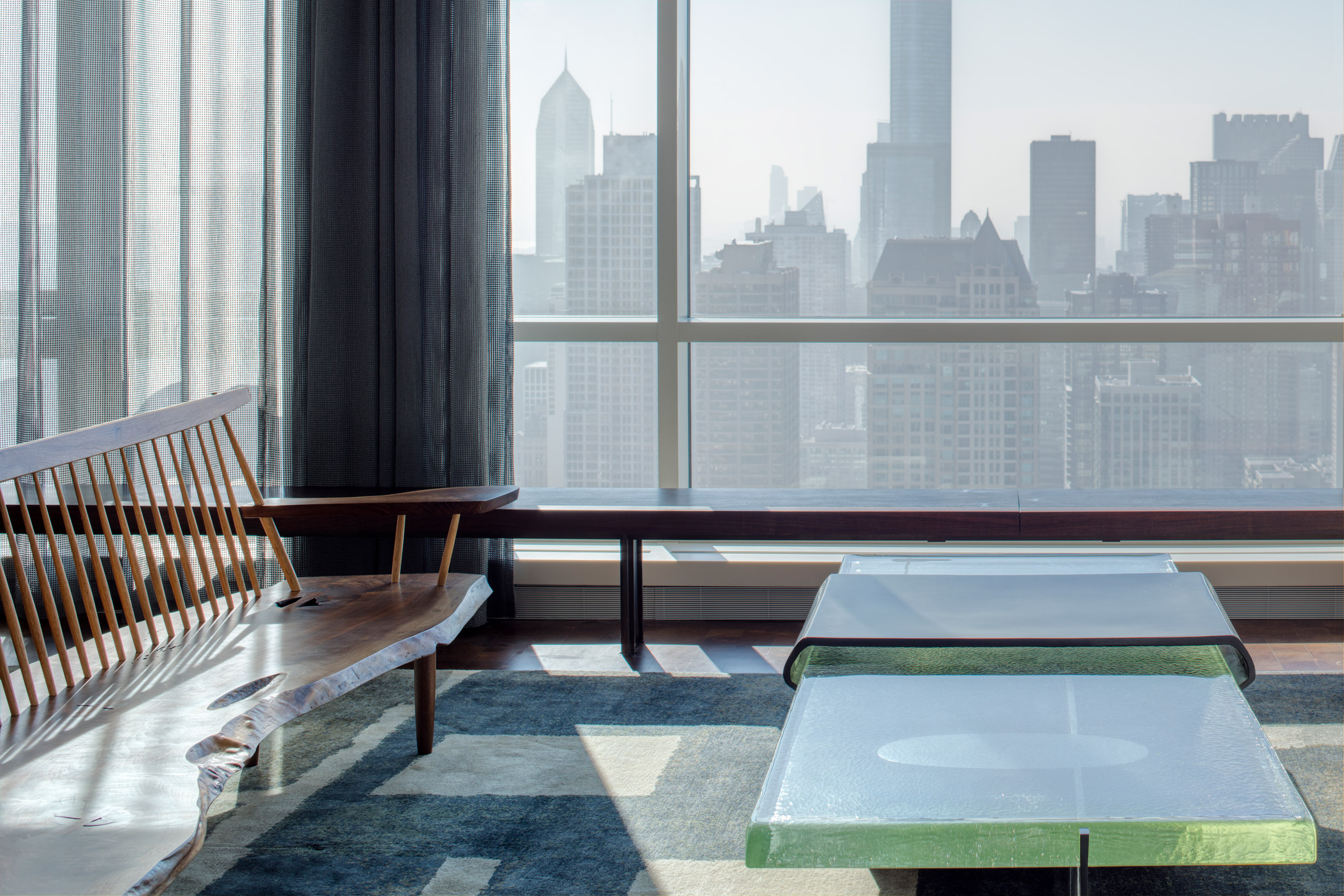
The owners' extensive art collection played a big part in her choices for the interior design with key pieces including a George Nakashima bench, Harry Bertoia sculptures and furniture by Paul Evans.

Glass table at Residence for Two Collectors by Wheeler Kearns Architects
A green custom-cast glass table adds warmth

Even the bathrooms, of which there are two as well as an additional powder room, are filled with art. The master bathroom features a lighter colour scheme with pale blue-grey walls and a marble floor.

Other details include a custom-made loft and bookshelf with a spiral staircase that takes up one side of the living room, which opens up into the dining room; and drapery that resembles chainmail.

Bathroom of Residence for Two Collectors by Wheeler Kearns Architects
Sculptures decorate the master bathroom

"Chainmail, a material used historically in both Eastern and Western cultures, conveys strength and endurance, yet it also bears the surprising qualities of visual softness and ability to diffuse sunlight," Young explained.

Also in Chicago, Vladimir Radutny overhauled an industrial loft on the city's Michigan Avenue inside a century-old structure that was built for automotive assembly and display.

Photography is by Tom Rossiter Photography.


Project credits:

WKA Team:​​ Dan Wheeler, FAIA, Principal, ​​​Janette Scott, AIA, Project Architect
Consultants ​General Contractor: JDL Development Corporation
Owners Construction Advisor/Manager: Peter Seigel
Structural Engineer: Halvorson and Partners
Millwork: Glazebrook Woodworking
Acoustical Consultant: Threshold Acoustics
Lighting Design: Mitchell Cohn Lighting
MEP: BES Engineering Systems
Interiors: Sharlene Young with Wheeler Kearns Architects (founder of Symbiotic Living)

The post Residence for Two Collectors is an art-filled Chicago penthouse appeared first on Dezeen.

MW Works uses dark wood and sandy walls for interiors of Ocean Drive apartment in Miami Beach

$
0
0
Interiors of Ocean Drive apartment by MW Works in Miami, Florida

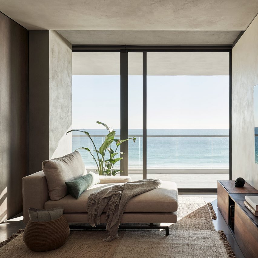
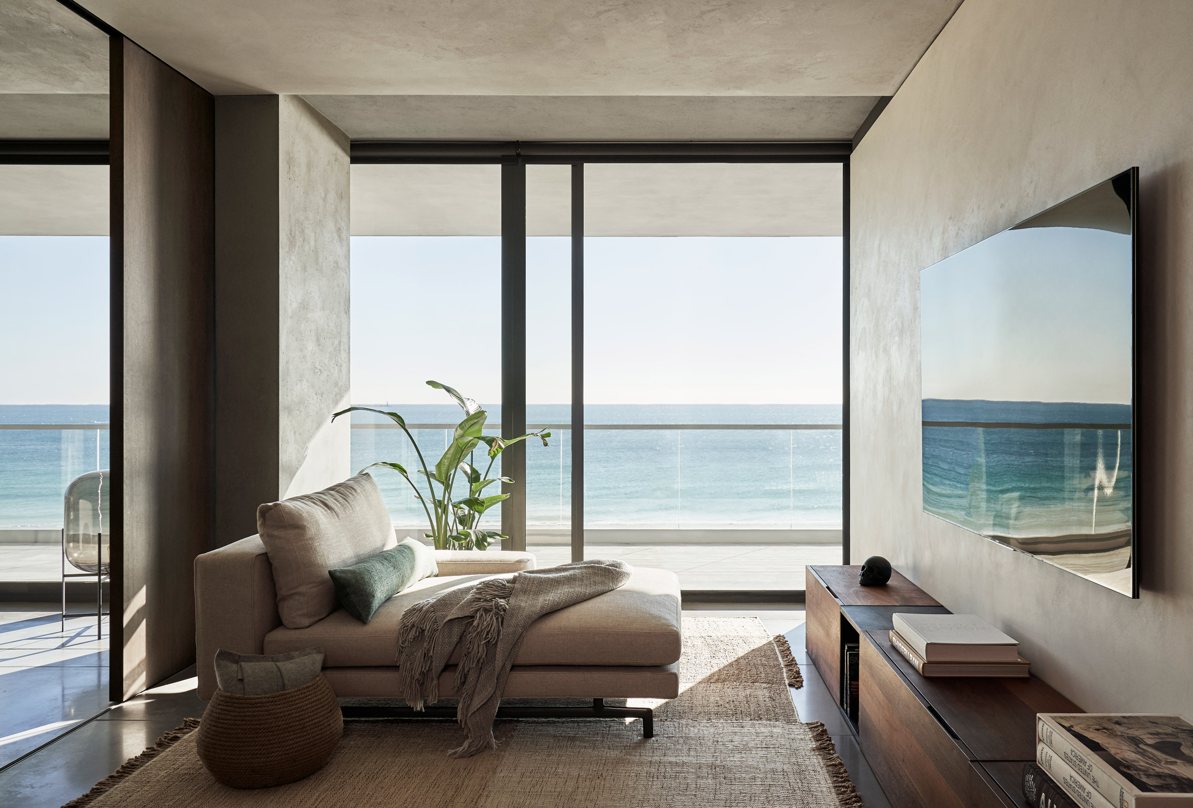
American studio MW Works has converted and refurbished a large beachside apartment on Ocean Drive in Miami Beach, Florida, using tropical hardwood and sand-coloured plaster.

The studio knocked together two units in a new high-rise building to create a home for a family of six relocating from Seattle.

Media room of Ocean Drive apartment by MW Works in Miami, Florida
Living areas feature plaster walls and concrete floors

Materials were chosen to make the most of the quality of light and views of the seashore.

"The irregular surface of the plaster highlights the changing quality of light throughout the day and lends a softness to private spaces," said MW Works.

Dining area of Ocean Drive apartment by MW Works in Miami, Florida
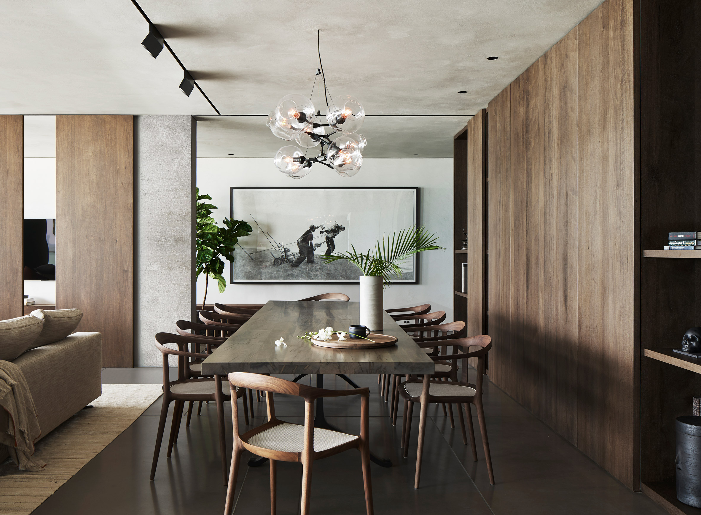
Dark tropical hardwood in the dining area

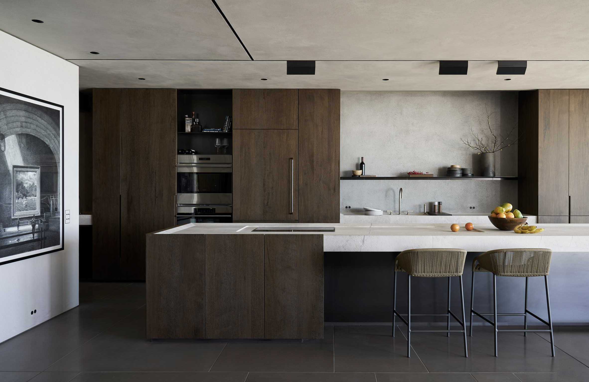
The Ocean Drive apartment's five bedrooms are placed around the perimeter and decorated in a paler palette, while the kitchen and dining areas in the middle are darker and moodier.

"Bedroom volumes are treated in pale, sandy tones of hand-troweled plaster reflecting natural light deep into the floor plate," said the studio

"The heart of the unit is clad in dark tropical hardwood with careful detailing emphasising mass and craft."

Kitchen of Ocean Drive apartment by MW Works in Miami, Florida
Plaster and dark wood in the kitchen

Wide wooden planks form the floors. Handles and light switches are set into the doors and walls to create an uncluttered atmosphere.

In the living room and media room, pale concrete floor slabs and a plastered ceiling bounce light around from the floor to ceiling glazing. Balconies overlook a stretch of beach with Miami Beach's signature lifeguarding huts.

Children's bedroom of Ocean Drive apartment by MW Works in Miami, Florida
The home is for a family of six

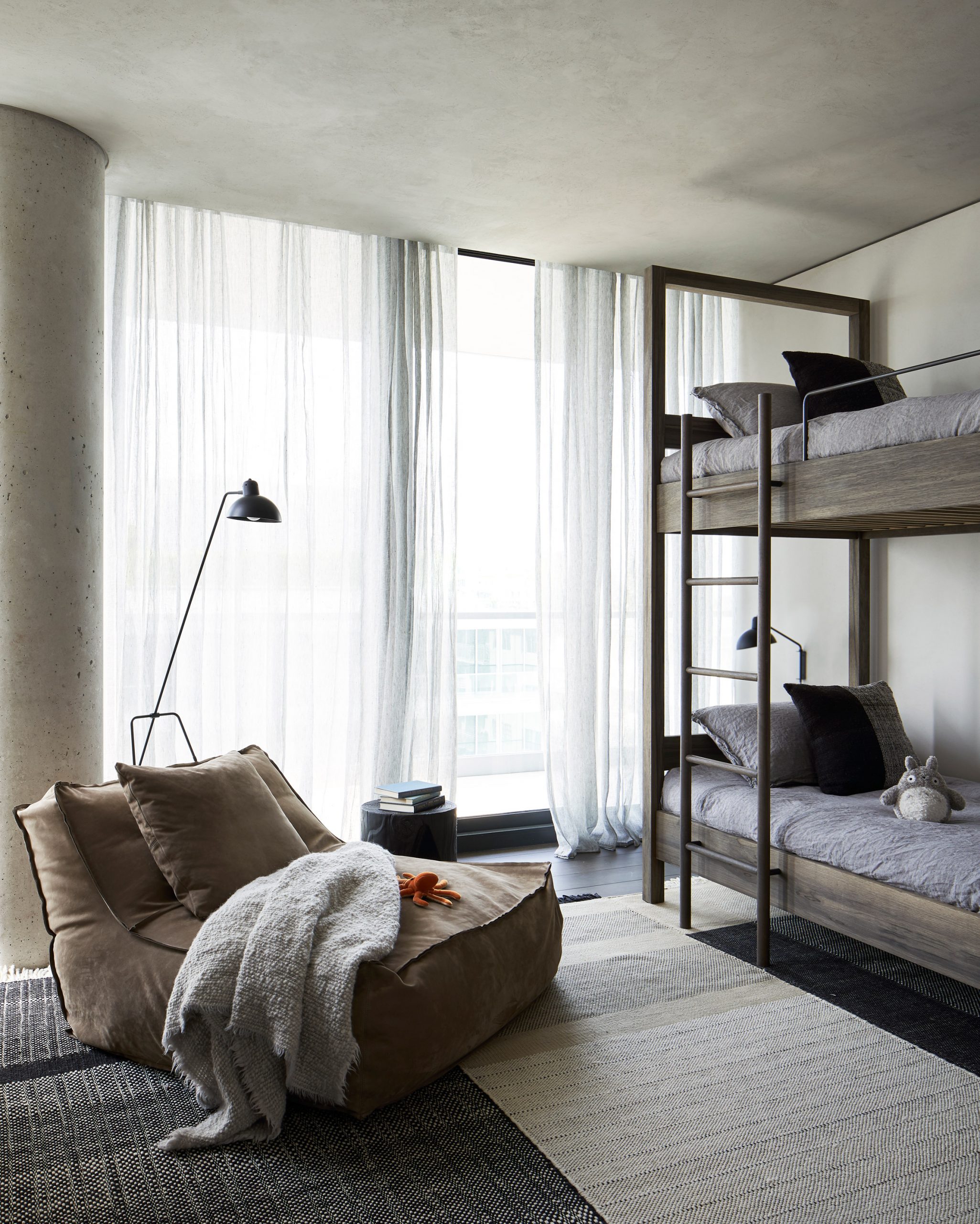
Gauzy curtains and earthy-coloured rugs continue the highly textured, refined yet beachy aesthetic of the apartment on Ocean Drive.

"Woven baskets and patterned floor coverings add a layer of softness," said MW Works. "Amongst the neutral canvas varied shades of blue, orange and red respond to the native flora and fauna of southern Florida."

Master bedroom of Ocean Drive apartment by MW Works in Miami, Florida
Bas relief texture in the master bedroom

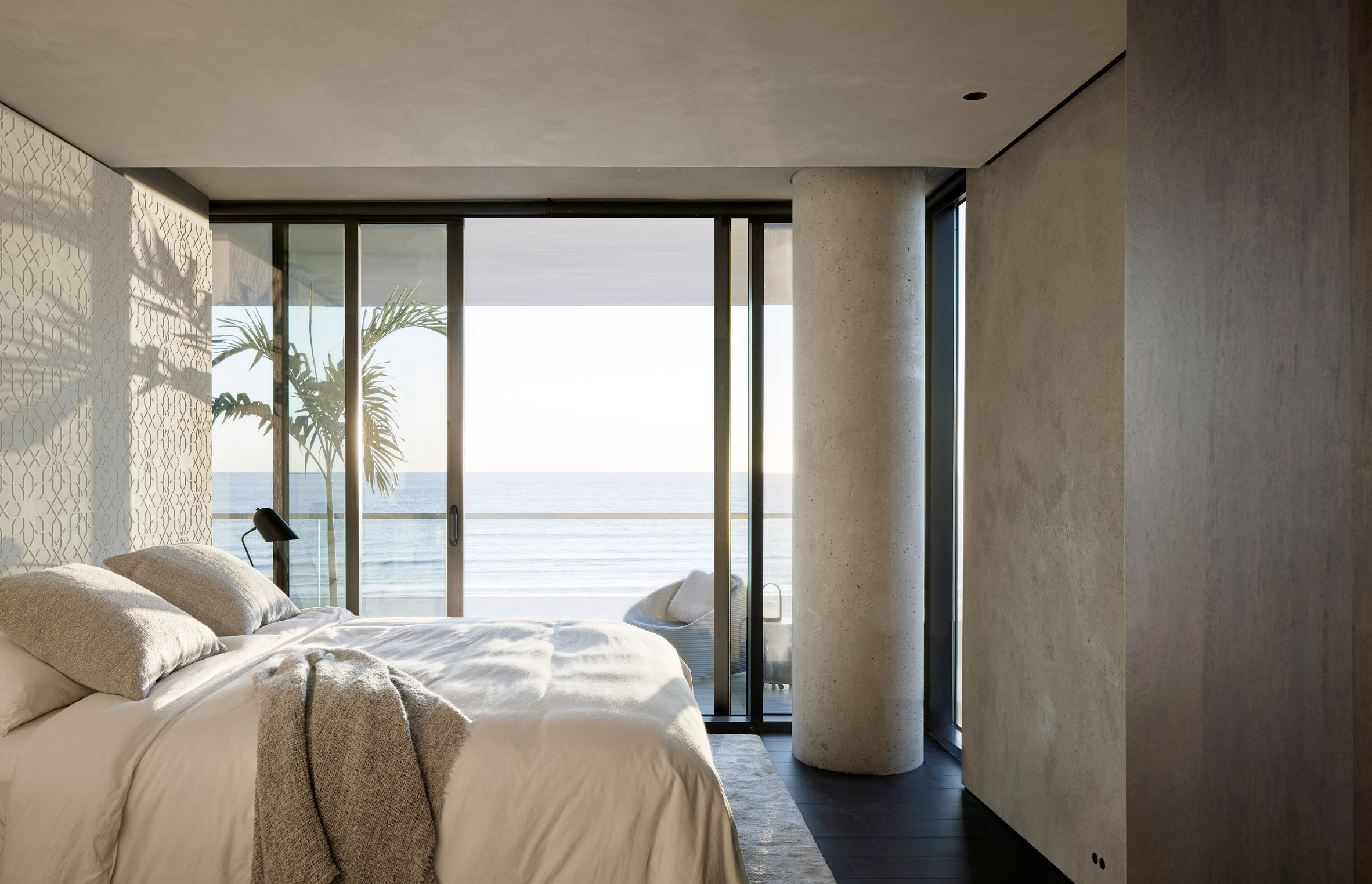
In the master bedroom, the headboard wall dividing the bed area from the bathroom has a detailed geometric pattern in bas relief.

"This design opportunity grew out of the client's extensive travel in the middle east and their interest in mathematical patterns," said MW Works.

"Working with the craftspeople who would install it, we developed a pattern and a fabrication procedure to create an abstracted surface to catch the morning light."

Bathroom of Ocean Drive apartment by MW Works in Miami, Florida
The Miami apartment has ocean views

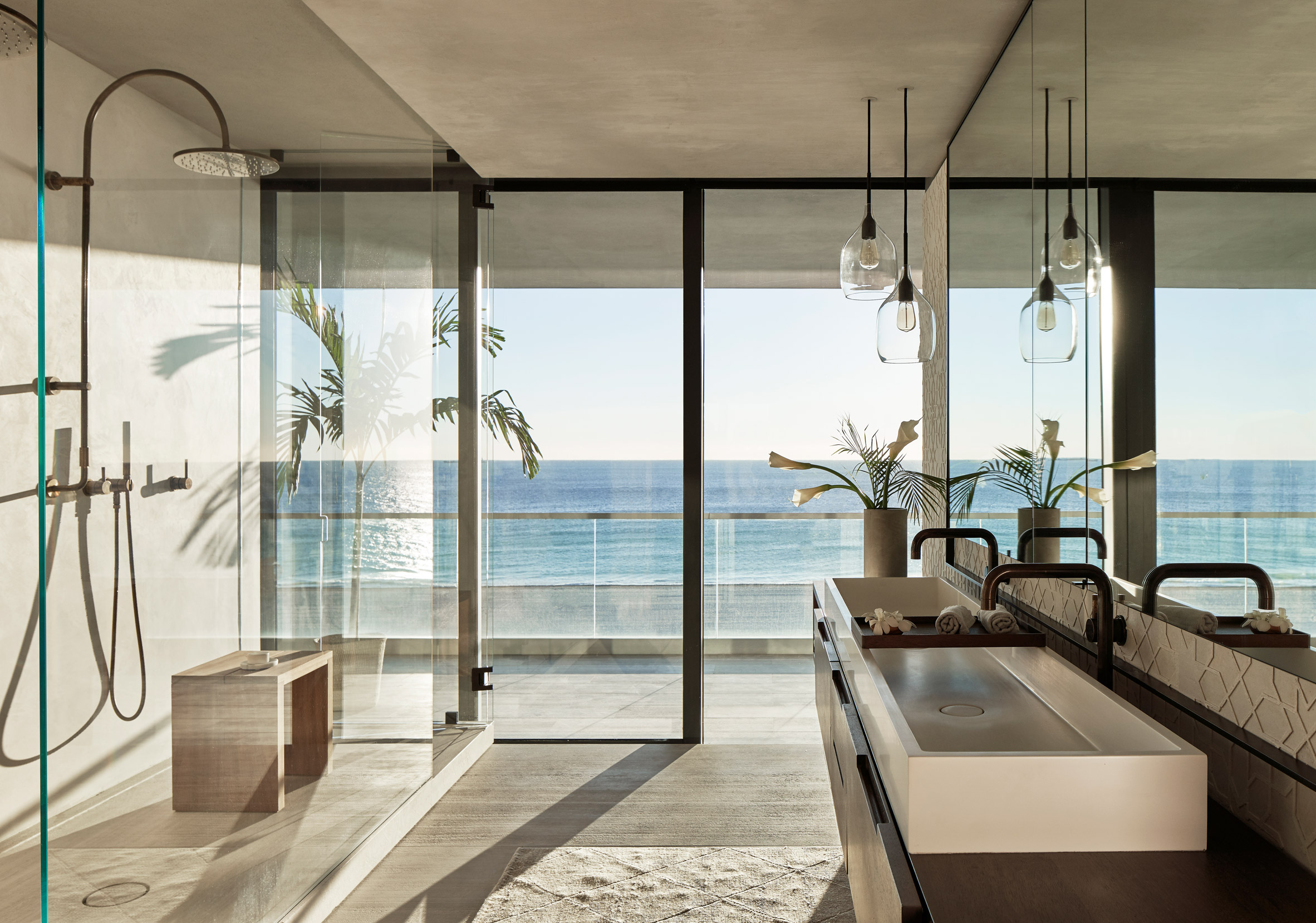
In an alcove off the entry hall an LED lighting system casts shadows through a small garden that track with the movement of the sun throughout the day. At night, one of the bathrooms lights up with an approximation of moonlight.

Based in Seattle, MW Works was founded in 2007 by Steve Mongillo and Eric Walter. The studio often works with natural textures, cladding a cabin in Washington with blackened cedar and using reclaimed timber for a home in Seattle.

Photography is by Kevin Scott.


Project credits:

Architecture and interiors: MW Works
General contractor: Dowbuilt
Local contractor: Woolems
Engineer (MEP): Shamrock Engineering
Engineer (low volt): Visual Acoustics
Engineer (structural): PCS Structural Solutions
Lighting: Niteo
Furnishings: Studio DIAA; Matt Anthony Designs
Carved Countertops: The Vero Stone
Plaster (walls, master headboard): Cathy Connor Studio C
Wood (casework, floor, ceiling): Dowbuilt
Metal (casework, hardware, patinas): Dowbuilt
Interior landscape garden: Formaneta
Custom concrete: John Dietrich
Metals: Argent

The post MW Works uses dark wood and sandy walls for interiors of Ocean Drive apartment in Miami Beach appeared first on Dezeen.


Edel Rodriguez creates "You're fired" graphic after Donald Trump loses 2020 US presidential election

$
0
0
Donald Trump graphic by Edel Rodriguez

Cuban-American artist Edel Rodriguez has created cartoons lampooning president Donald Trump as a toppling statue and a fired employee after he lost the 2020 US election to Joe Biden.

On Saturday, Rodriguez posted an illustration of Trump standing on a crumbling clifftop with bold black text reading "You're Fired" in reference to Trump's catchphrase when he hosted television reality show The Apprentice.

It is among a series of post-election visuals Rodriguez has created. Another shows Trump as a toppling statue while a third depicts president-elect Joe Biden putting the head back on the Statue of Liberty.


View this post on Instagram


A post shared by Edel Rodriguez (@edelrodriguez) on


The latter is a follow-up of an older Rodriguez visual depicting Trump holding the severed head of the statue in one hand and a bloody sword in the other.

Rodriguez, who has 28,000 Instagram followers, has become a regular critic of Trump since the former reality-TV star was elected president in 2016. The artist has depicted him in a number of Time magazine covers and in satirical designs for German magazine Der Spiegel.

In the lead up to the 3 November election, and the days following during the vote count, Rodriguez ramped up production of his cartoon Trump, who he typically characterises with bright orange skin, yellow hair and an open mouth, but no other facial features.


View this post on Instagram


A post shared by Edel Rodriguez (@edelrodriguez) on


Recent designs include two orange penises of varying sizes, both of which are punctured with a Trump-style mouth at the top. Beneath Rodriguez has captioned the larger image PERCEPTION and the smaller image REALITY.

He also made a bin-bag version of Trump bearing the slogan "NOV 3 DON'T FORGET TO TAKE OUT THE TRASH".

Rodriguez gained popularity for cartoons that graced a number of magazines during Trump's presidency. These included illustrations of Trump on fire for TIME magazine.

In 2018, he released a reimagined a more provocative cover for Trump exposé Fire and Fury, which depicted Trump's face as a large flame with a small White House illustrated at the bottom.


View this post on Instagram


A post shared by Edel Rodriguez (@edelrodriguez) on

When Trump won the election four years ago in November Four years ago, illustrators took to social media to post images that expressed their feelings about Trump becoming the next US with many similarly portraying him unfavourably.

Democratic candidate Biden was called as the 46th president on 7 November 2020 following a tense race with Republican candidate and current President Trump.

Leading up to this year's election, artists and designers created graphics with the aim to motivate people to vote, including Instagram gifs, brass pins, billboards and magazine covers.

The post Edel Rodriguez creates "You're fired" graphic after Donald Trump loses 2020 US presidential election appeared first on Dezeen.

Photographs capture OMA's Jewish temple extension taking shape in LA

$
0
0
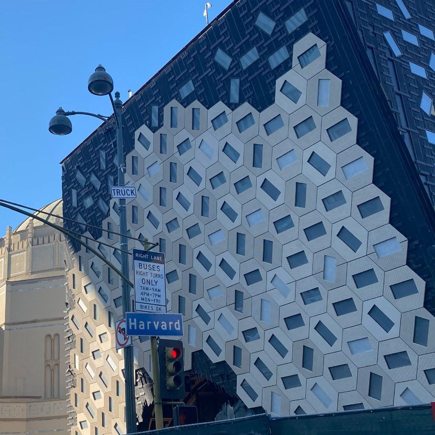
Audrey Irmas Pavilion by OMA under construction

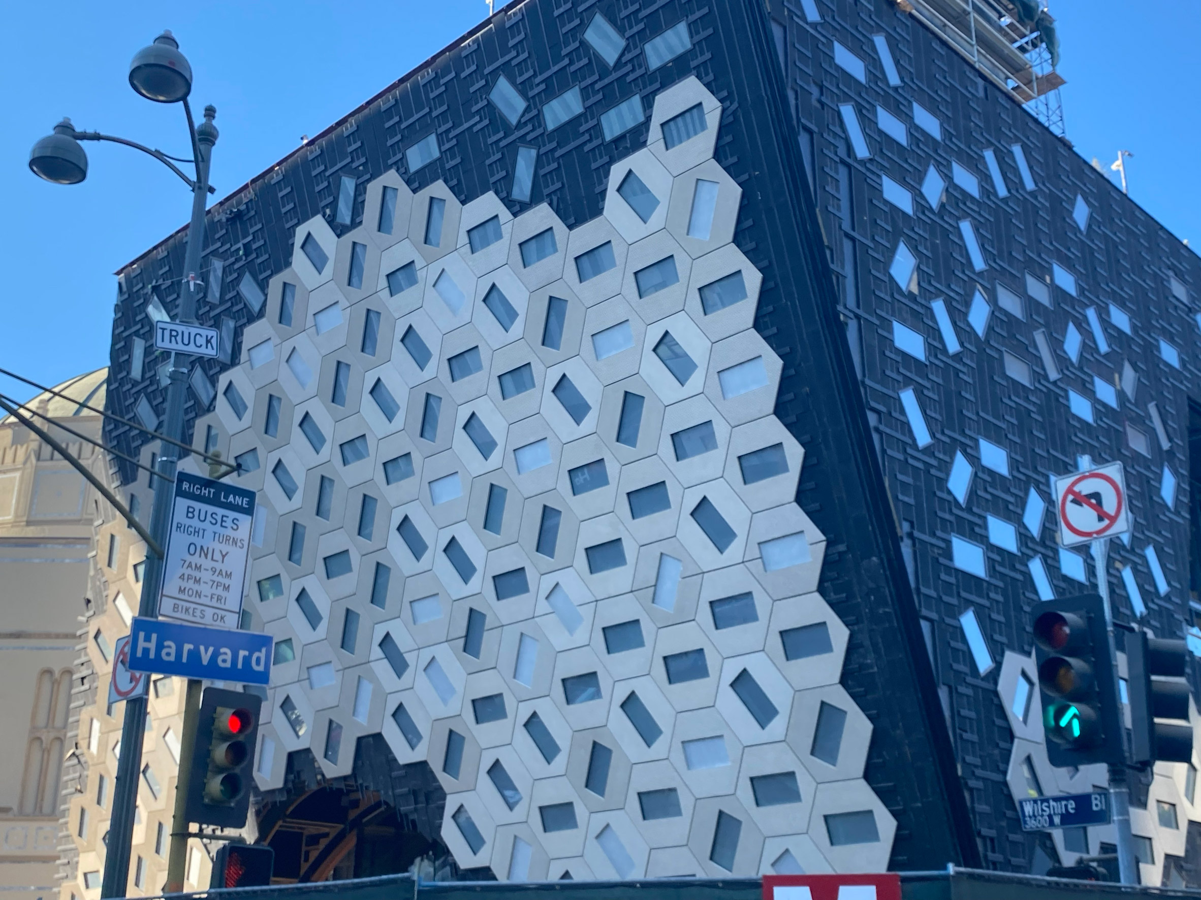
These photographs by architect Alessandra Cianchetta capture the construction of the tilted and patterned walls of the extension OMA has designed for a Jewish temple in Los Angeles, California.

The project, called Audrey Irmas Pavilion, will mark OMA's first cultural building in California when it completes early next year.

Exterior photos of Audrey Irmas Pavilion by OMA under construction
Audrey Irmas Pavilion will have slanted walls covered in hexagonal tiles

First unveiled in 2018, it will provide a series of multi-functional gathering spaces alongside the Wilshire Boulevard Temple, which is home to one of the largest Jewish congregations in the city.

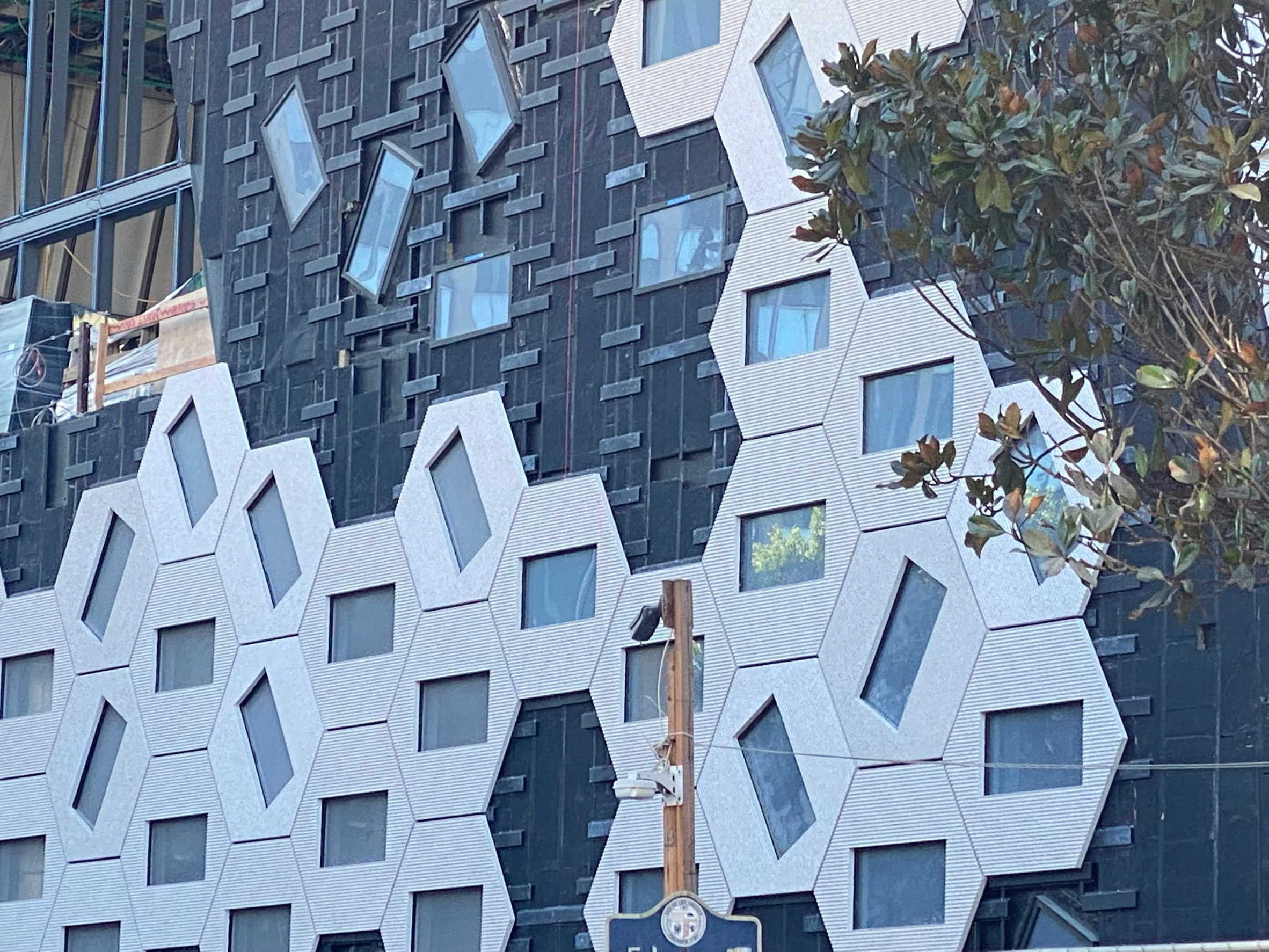
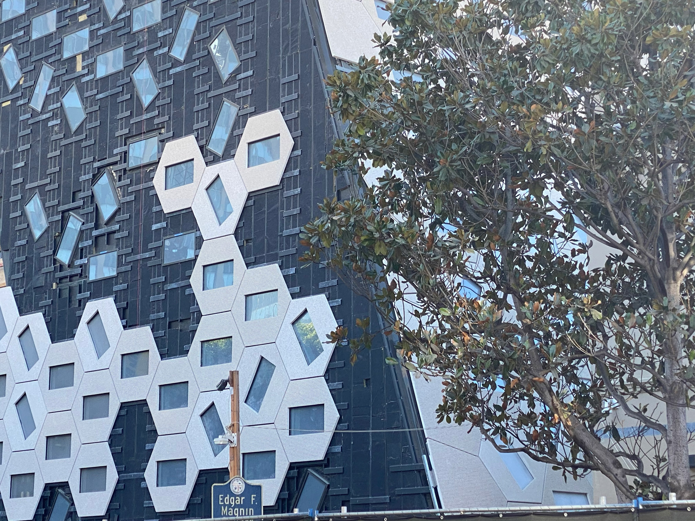
As shown in Cianchetta's photos, the design is composed of tilted walls that will be eventually completely covered in hexagonal shapes. These tiles are punctured by rectangular openings that are rotated in different directions.

Exterior photos of Audrey Irmas Pavilion by OMA under construction
The windows are rotated in different directions

OMA developed the decorative exterior to reference the interior murals of the existing building, which was completed in 1929 and provides an example of Byzantine Revival architecture style, with key features including its dome-shaped roof.

The slanted facades of Audrey Irmas Pavilion will be punctured by an arched doorway facing the street and an opening to terrace on the western wall.

There will also be a third smaller glazed opening below this that forms an entrance from a courtyard slotted between the old and new buildings.

Inside, Audrey Irmas Pavilion will have the main event space, a smaller multi-purpose room and a sunken garden. According to the firm, these will be "stacked one atop another to establish vantage points and framed views in and out".

Exterior photos of Audrey Irmas Pavilion by OMA under construction
The decorative exterior is intended to reference the interior murals of the existing building

OMA partner Shohei Shigematsu and his New York-based team won a competition in 2015 to design the extension – named after lead donor Audrey Irmas – for the Erika J Glazer Family Campus.

Occupying an entire block, the campus is composed of the temple, an early-learning centre, elementary school and a religious school.

Audrey Irmas Pavilion is among a number of projects that OMA New York has underway across the US. Others include the design of galleries in Gio Ponti's Denver Art Museum and an extension of the historic Tiffany & Co store on Fifth Avenue in New York City.

Photography is by Alessandra Cianchetta.

The post Photographs capture OMA's Jewish temple extension taking shape in LA appeared first on Dezeen.
SOM's National Museum of the United States Army opens in Virginia

$
0
0
National Museum of the United States Army by SOM

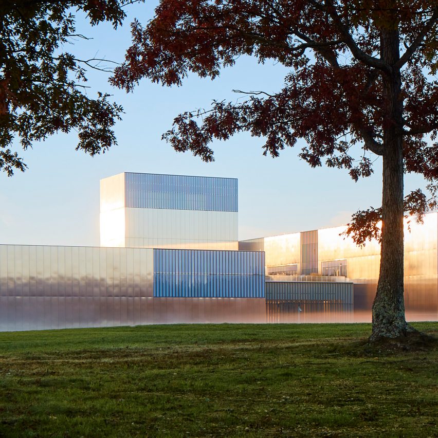
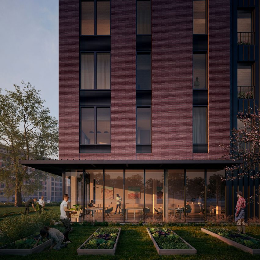
Monolithic volumes clad in stainless steel reflect the trees surrounding the National Museum of the United States Army, which architecture firm Skidmore, Owings & Merrill has completed in Virginia.

The National Museum of the United States Army (NMUSA), opened yesterday, on Veterans Day, as the first in America dedicated to to the country's oldest military service.

Exterior of the National Museum of the United States Army by SOM
Laser-cut stainless steel clads the National Museum of the United States Army

SOM fragmented the 185,000-square-foot (17,187-square-metre) museum into five pavilions of varying sizes and heights – the tallest is 100 feet (30 metres) – and connected them with glazed walkways.

The volumes are designed to follow a three-foot (0.9-metre) grid system.

Exterior of National Museum of the United States Army by SOM
The museum is located in Fort Belvoir Military Installation in Virginia

Stainless steel panels, laser-cut to precisely fit the grid, cover the blocks and reflect the natural surrounds in the bucolic Fort Belvoir Military Installation in Virginia, which is just 20 miles from Washington DC.

To add "dynamism" to the exterior, corners of the blocks feature glass sections and aluminium fins spaced 18 inches apart.

Exterior of National Museum of the United States Army by SOM
Sections of glass and aluminium fins are intended to add "dynamism" to the exterior

Stainless steel pylons matching the cladding are used as stands to showcase individual soldier stories. They are arranged to lead from the exterior promenade, through a glass entrance and into the exhibition hall.

To continue this storytelling the grand lobby has a wall made of black granite listing every campaign from the Army's history, while the terrazzo floor is inscribed with the Department of the Army's emblem.

Lobby in the National Museum of the United States Army by SOM
A black granite wall lists every campaign from the Army's history

The white coffered ceiling above the lobby, which is also intended to be used as an events space, is decorated with 22 rows of translucent, laminated glass panels coloured to match Army campaign streamers.

"Symbolism and community were at the core of our design," explained SOM design partner Colin Koop.

"We wanted to create a place where veterans and their families could feel at home, and establish a new centre of national significance that would, in its architecture, express that very significance and evoke three ideals: discipline, modesty and rigorousness."

Lobby ceiling in the National Museum of the United States Army by SOM
Laminated glass panels in the ceiling were coloured to match Army campaign streamers

The ground floor of the three-storey museum comprises shops, a cafe, exhibition spaces, a 300-degree theatre and a terrace. A wide wooden staircase leads from the lobby to the first floor where additional exhibition spaces are located.

The Veterans' Hall on the second floor is lined in wood, forming part of a natural material palette that includes stone, American white oak and ash.

Interior detail in National Museum of the United States Army by SOM
Natural materials like wood are used throughout

Other areas on the top level include the outdoor Medal of Honor Garden, which features a tall granite wall engraved with the names of every medal recipient. Covering the floor is stripey, granite paving decorated with the Army Medal of Honor's emblem and stainless steel stars.

SOM intends to further extend across NMUSA across its 84-acre (34-hectare) site with a memorial garden, parade field and grandstand and an Army Trail.

Exhibition space in National Museum of the United States Army by SOM
The museum includes a range of exhibition spaces

The museum is completed with a number of environmentally-friendly design details to reduce energy consumption – including extra insulation, high-efficiency glazing and LED lighting, automatic daylighting control and a green roof. It has been awarded LEED Silver certification in recognition of these elements.

Other cultural and government buildings SOM has designed in the US include an FBI technology building in West Virginia, a Chicago municipal library and a courthouse in Los Angeles with pleated glass.

Earlier this year Rafael Viñoly Architects unveiled renderings of a museum that will be dedicated to US Armed Forces Medal of Honor recipients in Arlington, Texas.

Photography is by Dave Burk.

The post SOM's National Museum of the United States Army opens in Virginia appeared first on Dezeen.
Home Studios fills 20 Bond apartment in New York with one-off decor details

$
0
0

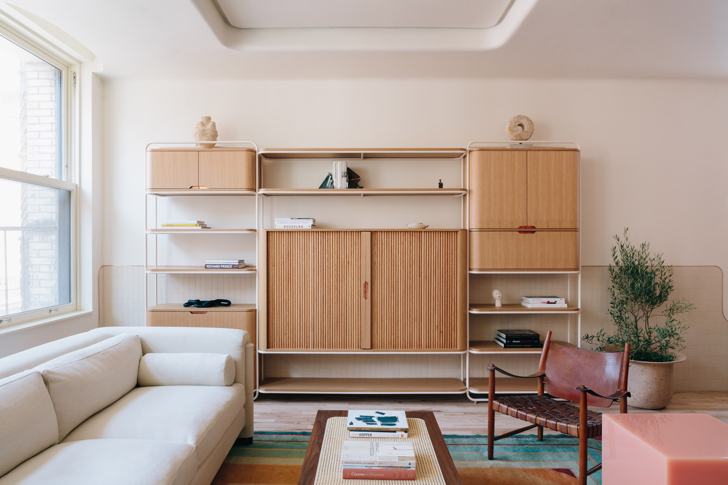
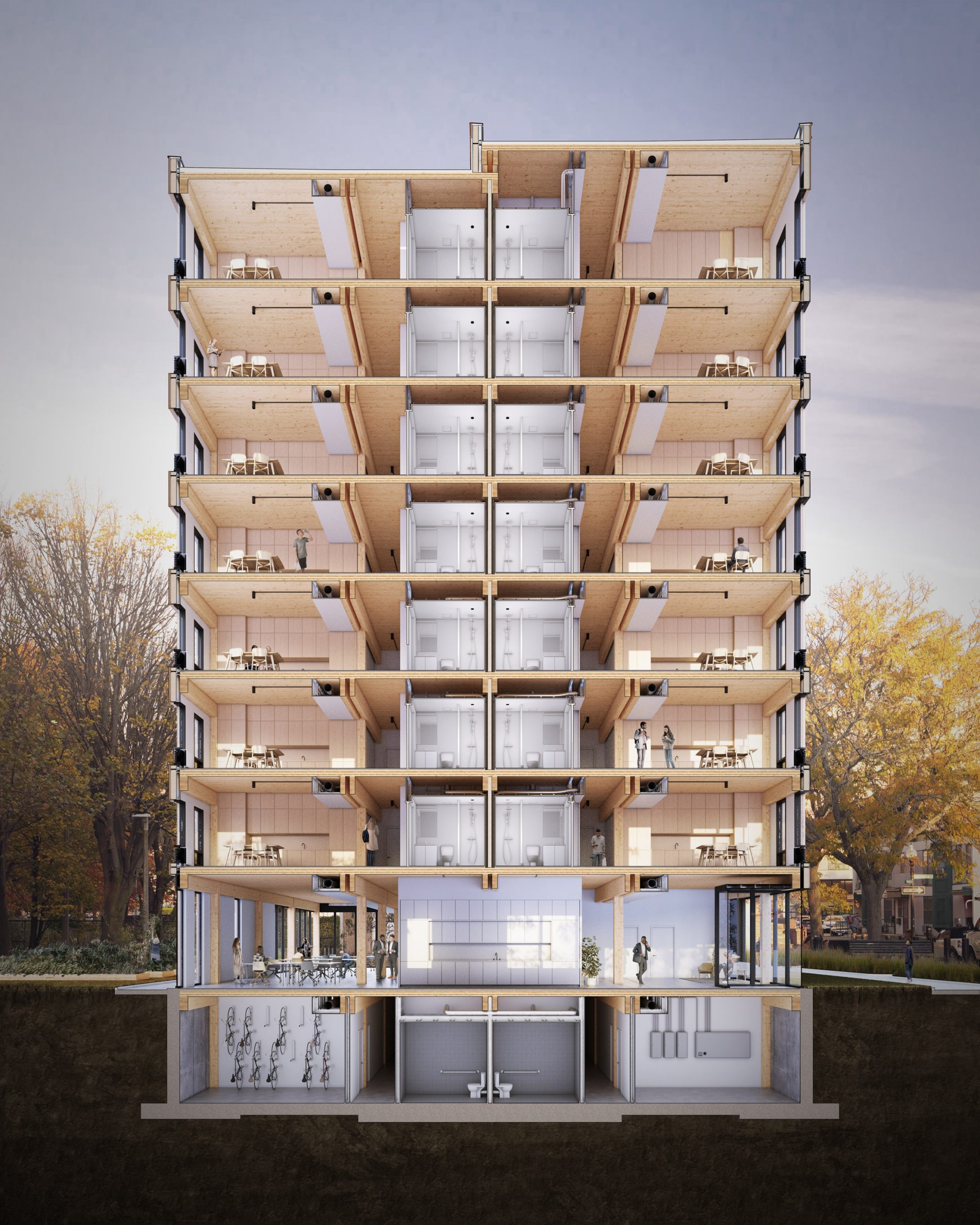
Design firm Home Studios used a medley of bespoke furniture and vintage finds to revamp this family apartment in New York's NoHo neighbourhood.

The 20 Bond apartment measures 2000 square feet (186 square metres) and is set within a building that dates back to 1925. Since the 1980s, it hasn't undergone any significant renovations.

Dining area of 20 Bond apartment by Home Studios
Above: custom lights hang above the dining area. Top image: the apartment's living room

Brooklyn-based Home Studios was asked to carry out the much-needed overhaul of the dated apartment.

Its owners – a couple with young kids – had grown to be a fan of the studio's aesthetic after frequenting two New York restaurants it had designed, Elsa and Goat Town.

This is, to date, only the second residential project that the studio has worked on, but founder Oliver Haslegrave says the creative process was much like developing a restaurant.

Kitchen of 20 Bond apartment by Home Studios
A copper hood contrasts the kitchen's blue-grey cabinetry

"Like our hospitality projects, we envisioned an updated and modern space that defies the conformity of a typical residence," Haslegrave told Dezeen.

"20 Bond is a direct reflection of our practice in that the end product is both expressive and finely detailed, and marries contemporary and vintage influences."

20 Bond apartment by Home Studios has copper detailing
Copper frames the apartment's curved internal windows

In the open-plan kitchen, a trio of ring-shaped pendant lamps made bespoke by Home Studios dangle above a walnut dining table. The nickel and brass spotlights that illuminate the central breakfast island were also crafted by the studio.

Opposite the island is a series of cupboards painted a blue-grey hue called Pigeon by Farrow & Ball, accompanied by a custom extractor hood that's clad in gleaming copper.

Copper goes on to border the apartment's rounded door frames and skirting boards. The metal also frames the guest bathroom's internal window, which bows outwards to form a curved wall.

Bathroom of 20 Bond apartment by Home Studios
Curved forms continue into the guest bathroom

Curves continue throughout the rest of the bathroom, where a mosaic of tan-coloured tiles sinuously winds around the shower, tub and a seating nook which is inbuilt with a storage box for towels.

Haslegrave says that these features are meant to act as a small homage to the shapely form of buildings created by Finnish architect Alvar Aalto.

Bathroom of 20 Bond apartment by Home Studios
Tan-coloured tiles serve as a backdrop to the shower and bathtub

"The freeform curves found in [Aalto's] work represent both a fluid motif and an engaging playfulness that we aim to incorporate in all Home Studios projects," he explained.

"We included images of Aalto's Screen 100 and the Maison Louis Carré – the residential building in Bazoches-Sur-Guyonne, France designed by him and his wife, Elissa – in our initial project mood board."

20 Bond apartment by Home Studios has copper detailing
The doorways and skirting in the apartment are also edged with copper

More bespoke and vintage pieces can be found in the master bedroom, for which Home Studios has made a walnut and travertine headboard.

A French floor lamp from the 1940s stands in the corner of the room, beside a boucle-upholstered armchair by LA brand Atelier de Troupe.

Bedroom of 20 Bond apartment by Home Studios
A bespoke headboard and vintage French lamp feature in the master bedroom

In the living room, two antique Danish chairs with woven leather seats have been contrastingly paired with a blocky side table by Sabine Marcelis, which is cast from candy-pink resin.

An oak and brass shelving unit made by Home Studios dominates a peripheral wall.

"The final product is a near-ideal extension of our process and values – a tailored place that offers its residents something special," Haslegrave concluded.

Living room of 20 Bond apartment by Home Studios
The nearby living area is dominated by a shelving unit made by the studio

Home Studios was established by Haslegrave in 2009. Previous projects by the studio include the revamp of Bibo Ergo Sum, an eclectic bar in West Hollywood which takes visual cues from the early 20th-century Viennese architecture, French film posters and the 1967 film The Graduate.

Photography is by Brian Ferry.


Project credits:

Architecture, interior design, furniture and lighting, styling: Home Studios
Fabrication: Works Manufacturing, Shelton Studios, Zalla Studios, Anthony Hart, Anders Rydstedt
Construction: Vertical Space

The post Home Studios fills 20 Bond apartment in New York with one-off decor details appeared first on Dezeen.
Studio Gang transforms Wisconsin power plant into Beloit College student union

$
0
0
Beloit Powerhouse by Studio Gang

US firm Studio Gang has completed its transformation of a coal-burning power plant into the wellness-focused student union for Beloit College in Wisconsin with a suspended running track looping through the building.

The 100-year-old plant building, which is located between the campus of the arts college and Rock River in Beloit, was updated to include a fitness centre and a gymnasium with a three-lane track and an eight-lane swimming pool.

Exterior of Beloit Powerhouse by Studio Gang
Studio Gang added a pedestrian bridge and a polycarbonate field house to the building

Originally called Blackhawk Generating Station, the plant was first built in 1913 by Wisconsin Power and Light. It was expanded in 1927 and again in the mid-1940s before being decommissioned in 2010.

Studio Gang's project for Beloit College, called Powerhouse, retained and updated the original red brick, yellow brick and concrete structures, and added a new 17,000-square-foot (1,579-square-metre) volume made from translucent polycarbonate walls and steel framing.

Translucent panels of Beloit Powerhouse by Studio Gang
Large windows are slotted between the translucent panels

As such, Powerhouse is segmented into three volumes that form the arrangement of three key facilities: the swimming pool, the track and the field house.

The translucent structure on the northern side contains a field house. The panels are arranged at angles to one another to create slender long gaps for windows in between. At night, when artificial lights are turned on, the entire structure glows up.

Interior of Beloit Powerhouse by Studio Gang
The suspended running track loops through the building

In the middle, a larger brickwork volume hosts a suspended, three-lane running track that loops around the first floor of the building partially extending into the field house and the swimming pool on either side.

In addition to the sports facilities, Powerhouse includes a number of recreational spaces for students, like a coffee shop, lounges, a conference centre, a lecture hall and a theatre.

Interiors of Beloit Powerhouse by Studio Gang
Existing brickwork runs throughout

Studio Gang also added a new pedestrian bridge that punctures the brickwork structure to connect Powerhouse to the existing campus, and created a link from the college and the town to the Rock River.

Inside, the firm chose a stripped-back industrial palette that pays homage to the history of the building – including existing weathered brickwork and steel structures.

Field house of Beloit Powerhouse by Studio Gang
The running track also extends into the field house

Another key element of the project is that, rather than using air for heating and cooling, it uses water-supplied radiant panels.

"Buildings usually use air for heating and cooling; however, water, which is much denser, is actually more efficient," said Studio Gang.

"Radiant panels integrated into the building's surfaces are able to use energy from the river water for most of the Powerhouse's heating and cooling needs, improving comfort within the building and maintaining the highest quality of air, while also significantly minimising total energy use."

Swimming pool in Beloit Powerhouse by Studio Gang
The swimming pool is on the southern side

Other power plants that have been adaptively reused include the former Philips power plant in Eindhoven, which has been transformed into an innovation hub by young architect Janne van Berlo.

London's decommissioned Battersea Power Station is also undergoing redevelopment and will become the centrepiece of a 17-hectare Thames-side masterplan by Rafael Viñoly.

The project is set to include a public square designed by BIG, and housing designed by Ian Simpson Architects, dRMM, Gehry Partners and Foster + Partners.


Project credits:

Associate architect: Angus Young Associates
Civil engineer: RHBatterman & Co
Lighting and mechanical/environmental engineer: dbHMS
Landscape architect dbHMS
Landscape architect: Applied Ecological Services
Acoustics and A/V consultant: Threshold
Signage, wayfinding consultant: 3st/Span
Pool consultant: Ramaker & Associates
Athletic consultant Hastings+Chivetta Architects
IT consultant True North Consulting Group
Cost consultant: Dharam

The post Studio Gang transforms Wisconsin power plant into Beloit College student union appeared first on Dezeen.
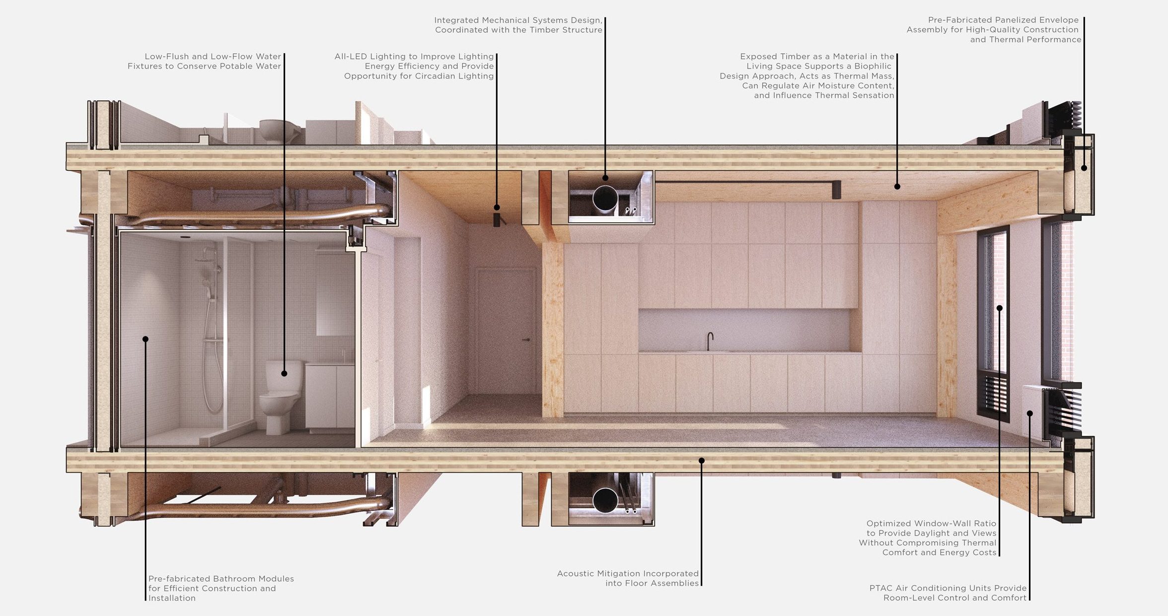
Viewing all 2531 articles
Browse latest View live


<script src="https://jsc.adskeeper.com/r/s/rssing.com.1596347.js" async> </script>