An outdoor auditorium will top the student centre that Adjaye Associates is developing for Rice University's forested campus in Houston, Texas.
Slated for completion in 2023, the three-storey facility will encompass 7,400 square metres and replace the university's existing 1950s student hub called the Rice Memorial Center.
Adjaye Associates' proposal is hoped to become the new heart of the 121-hectare campus and will incorporate a distinctive rooftop auditorium, alongside a multicultural centre that supports the diversity and inclusion of students.
Adjaye Associates wins competition for Rice University project
"This is an important and inspiring project for Adjaye Associates and we look forward to collaborating with Rice to imagine a new campus anchor point that engages its community in the most inclusive way possible," said the studio's founder, David Adjaye.
"Responding to the architectural history of the university, the city of Houston and the region, the student center will come to embody its position at the heart of the campus, fostering catalytic connections between undergraduates, graduates, faculty and staff activated in both the threshold and formalized spaces of the new building," Adjaye explained.
Above: a visual of the multicultural centre. Top image: an aerial view of the proposed student hub
Adjaye Associates' proposal for the student facility was the winning entry of competition held by Rice University for which there were three finalists.
Though the university has requested that the majority of the existing student hub will be demolished, Adjaye Associates' design will incorporate its original chapel and a memorial to 10 Navy Reserve Officers Training Corps students who died in a plane crash in 1953.
Adjaye Associates has disclosed few details about the student centre's design, though the visuals reveal its massing will be broken into a series of smaller volumes, unified by an earthy-hued gridded facade.
Alongside the oval-shaped auditorium, the rooftop will also incorporate green space and solar panels.
A visual of the multicultural centre reveals that it will have a neutral material palette, lined with curving timber walls.
Once Rice Memorial Center complete, it will be the second building at Rice University to have been designed by a winner of RIBA's Royal Gold Medal, following the completion of Anderson Hall by James Stirling in 1981.
Last year, Adjaye's firm completed a contemporary art centre Ruby City in San Antonio, Texas. The building has an angular, red concrete skin based on a dream of its patron, philanthropist Linda Pace.
Translucent glass tubes meet with curvy roofs "imagined from cloud circles" in this art museum US firm Steven Holl designed for Museum of Fine Arts Houston.
Steven Holl Architects' Nancy and Rich Kinder Building – which forms part of a major campus redesign – is split into segments topped with curved roofs. This creates gaps for natural light to enter into the galleries inside the 164,000-square-foot (15,200-square-metre) building.
Curved translucent glass tubes wrap around the building. Photo by Richard Barnes
"The Texas sky opens 180-degrees overhead above a luminous canopy covering the new building," said Steven Holl Architects.
"Concave curves, imagined from cloud circles, push down on the roof geometry, allowing natural light to slip in with precise measure and quality, perfect for top-lit galleries."
Transparent glass tubes are used on the western side around an arcade
Tube-like laminated glass covers the exterior to contrast existing buildings on Museum of Fine Arts Houston campus – including an adjacent transparent glass and steel building by Mies van der Rohe, and an opaque stone building by Rafael Moneo.
On the west side of Nancy and Rich Kinder Building transparent glass tubes wrap around an arcade area.
The building is open to views of gardens outside
The transparent cladding, formed of laminated glass tubes with semicircular sections, is suspended from steel supports cantilevered off the concrete walls. Tubes are bolstered together by aluminium clips and rest on a steel shelf at their base.
A small cavity between the glass and the concrete acts as a "cold jacket" for the building so that it doesn't overheat.
Galleries are arranged over two levels. Photo by Richard Barnes
The tubes follow the building's unusual curvy roofline at the top and have different relationships between with ground. For example, some stop above concrete benches while others are open at the bottom so visitors can look all the way up.
According to the firm, the facade features a total of 1,103 pieces of glass in over 450 different sizes.
Curved roof reflects lights inside
Steven Holl said it developed the facade by experimenting in its workshop with 1:1 scale acrylic rods that were cut in half and laminated to acrylic sheets, which it found to create an interesting light play.
Seven gardens are cut into the building's footprint to denote different entry points with the largest located at the Texas city's Bissonnet and Main Street intersection. This also forms principal access to the Museum of Fine Arts' Susan and Fayez S Sarofim Campus.
Inside, the curved underside of the roof acts as a reflector of the natural light into galleries organised over two levels. They have views into various gardens around the building with trellises providing shade from strong sunlight.
"When standing in the new entrance lobby of the Kinder Building, one can see gardens and lush Houston vegetation in four directions and feel the inviting energy of a new sense of openness to the community," said Steven Holl Architects.
The interiors are arranged around a central atrium
The Nancy and Rich Kinder Building is one of two structures that Steven Holl Architects has developed as part of a new masterplan of the Museum of Fine Arts in Houston (MFAH)'s 14-acre (5.7-hectare) site. The project also involved the replacement of the 35-year-old Glassell School of Art, which was completed in 2018.
The firm beat finalists Morphosis and Snøhetta in an international competition in 2012 for the campus redesign. The firm's scheme, first unveiled in 2015, aimed to add new buildings to offer a "complementary contrast" to structures by Mies van der Rohe and Rafael Moneo.
Windows offer diffuse lighting in bright white galleries
Architect Steven Holl founded his eponymous firm in 1976. Today it has offices in New York and Beijing and is headed up by Holl with partners Chris McVoy, Roberto Bannura and Noah Yaffe.
Cabin-design company Den has launched a flat-packed, kit-of-parts for a steeply pitched cabin, known as an A-frame, that can be assembled in just a few days.
The 115-square-foot (10.68-square-metre) Den Cabin Kit has slanted wooden walls with a large triangular window. It is designed to be an ideal guest house, yoga studio or study.
Den Cabin Kit is intended to be assembled in remote places
Prefabricated in New York, the kit has pre-drilled holes and includes everything from the wooden structural parts that lock together, to bolts and even door hardware – details Den said make the project stand out from other flat-packed structures.
"Under the hood – or roof, ha – we have components that are cut with CNC precision, a design that slots together intuitively, and a kit so complete even the door hardware is included so you won't need to make any trips to the hardware store," the New York-based team told Dezeen.
"The cabin bolts and screws together and all the holes are pre-drilled making for fast assembly."
It has a large triangular window
Den Cabin Kit is designed to be built with minimal equipment including a ratchet set, a power drill, a ladder, step ladder and a staple gun. Flat-packed materials arrive stacked according to the order in which they are needed during the build, as part of an ambition to make construction as easy as possible.
"If you don't have any construction experience you can certainly make up for it with tenacity, and a few friends to help you with the job," Den explained.
The cabin can be used as a guesthouse
"Building something even as easy as this still requires some hutzpah mind you," the company added. "You need to be comfortable on a ladder a story off the ground to set the ridge cap and screw in the roofing panels, and you and your friends (or team) need to be careful with the large windows while setting them in place."
Den suggests novice builders employ a contractor to bolster the structure if it is being built on a sloped site, or in an area with harsher weather, and also to help set foundations – which it likens to the same basic requirements as a shed. The cabin is intended to touch the ground lightly so it can be disassembled and rebuilt elsewhere, and constructed without nails for the same reason.
There are three external cladding options, including corrugated metal
Despite its light touch, the team said the cabin is still robust and well-insulated in harsh weather conditions. "Even though it's 'semi-permanent' in this regard it's no less a building and can withstand the harshest elements, with four-season compatibility," it explained.
Owners can choose from three types of exterior cladding: either black Forest and silver Alpine metal or cedar shingles. They can also add a propane heater provided by Den.
Other similar self-build projects include The Backcountry Hut Company's conceptual proposal for tiny houses that users could assemble like IKEA furniture.
People in Mississippi have voted to replace the state's official flag, which incorporated the Confederate battle emblem, with a design that has a magnolia blossom in its centre.
Designed by Rocky Vaughan, with support from Sue Anna Joe, Kara Giles and Dominique Pugh, the new flag is called In God We Trust.
Flag chosen from 3,000 submissions
It replaces the state's previous flag, which was retired in June 2020 following increased pressure to remove Confederate symbols from official places after the death of African-American George Floyd in police custody.
Mississippi was the only US state that was still using the Confederate emblem in its flag, which had been in use since 1894, after Georgia removed the symbol from its flag in 2003.
Top: the new In God We Trust flag. Above: the previous state flag
The design was chosen from nearly 3,000 submissions made to The Commission to Redesign the Mississippi State Flag.
It contains a white magnolia blossom – Mississipi's state flower – at its centre, which recalls the state's original flag that was used between 1861–1865 and incorporated a magnolia tree.
The blossom is on a blue background and surrounded by 20 white stars that represent the fact Mississippi was the 20th state in the union along with one gold star to signify the state's indigenous peoples. Below the blossom are the words In God We Trust – the official motto of the United States of America.
This arrangement is on a blue background, which is flanked by a pair of gold bars and wider red bars.
Vaughan, who works as creative director of a screenprinting shop in Mississipi, was responsible for the broad layout; Joe, a web designer in San Francisco, the central arrangement; Pugh, a graphic designer, helped with the layout; while Giles, a member of the redesign committee, added the gold bars.
Design ratified in referendum
The design was selected by the nine members of the flag commission before being ratified by voters in a state referendum on 3 November held as part of the general election.
In the referendum, 71 per cent of people voted that the design should become the official Mississippi state flag.
The decision to redesign the flag after 126 years marks a changing attitude towards the Confederate battle emblem, as several previous attempts to change the state's flag had failed.
At a previous referendum held in 2002, 64 per cent of people voted to retain the existing flag. Another unsuccessful attempt was made to remove the Confederate symbol from the Mississippi state flag in 2015 after the racially motivated Charleston church shooting.
Image courtesy of the Mississippi Department of Archives and History.
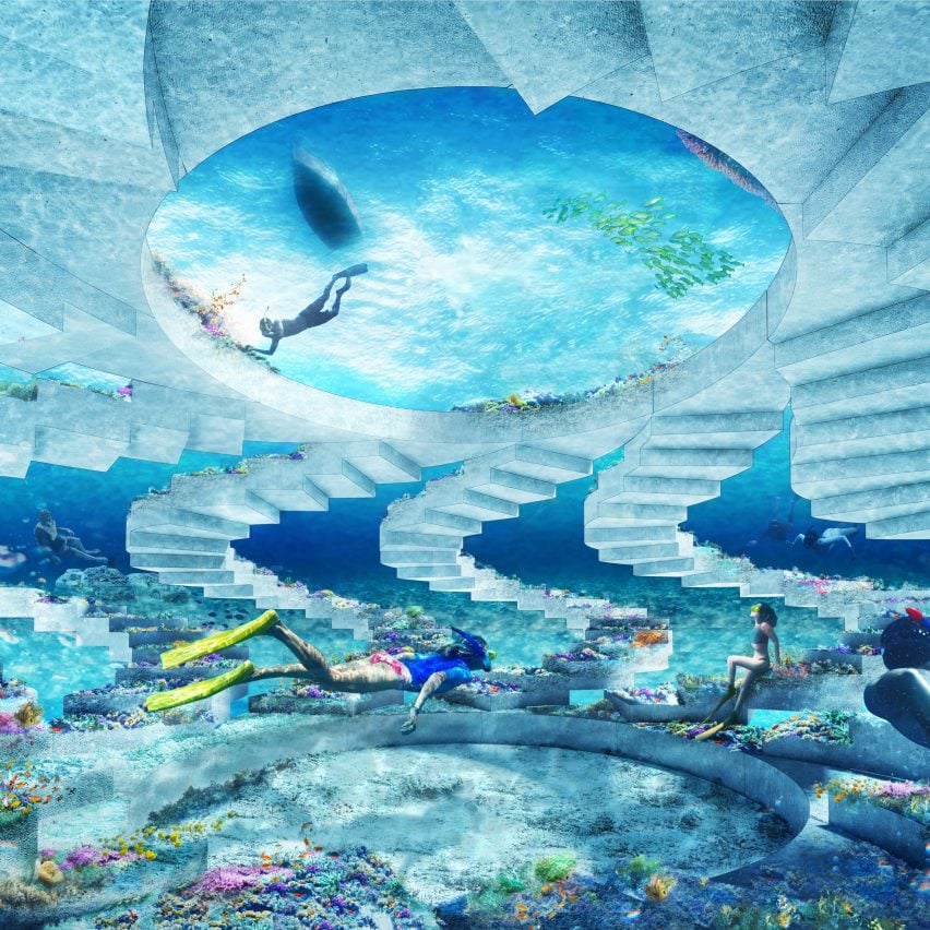
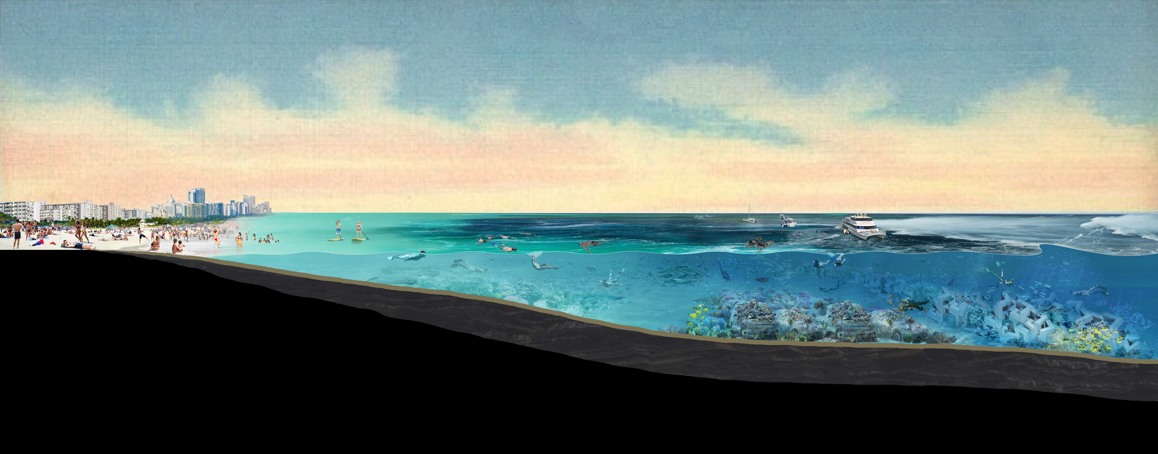
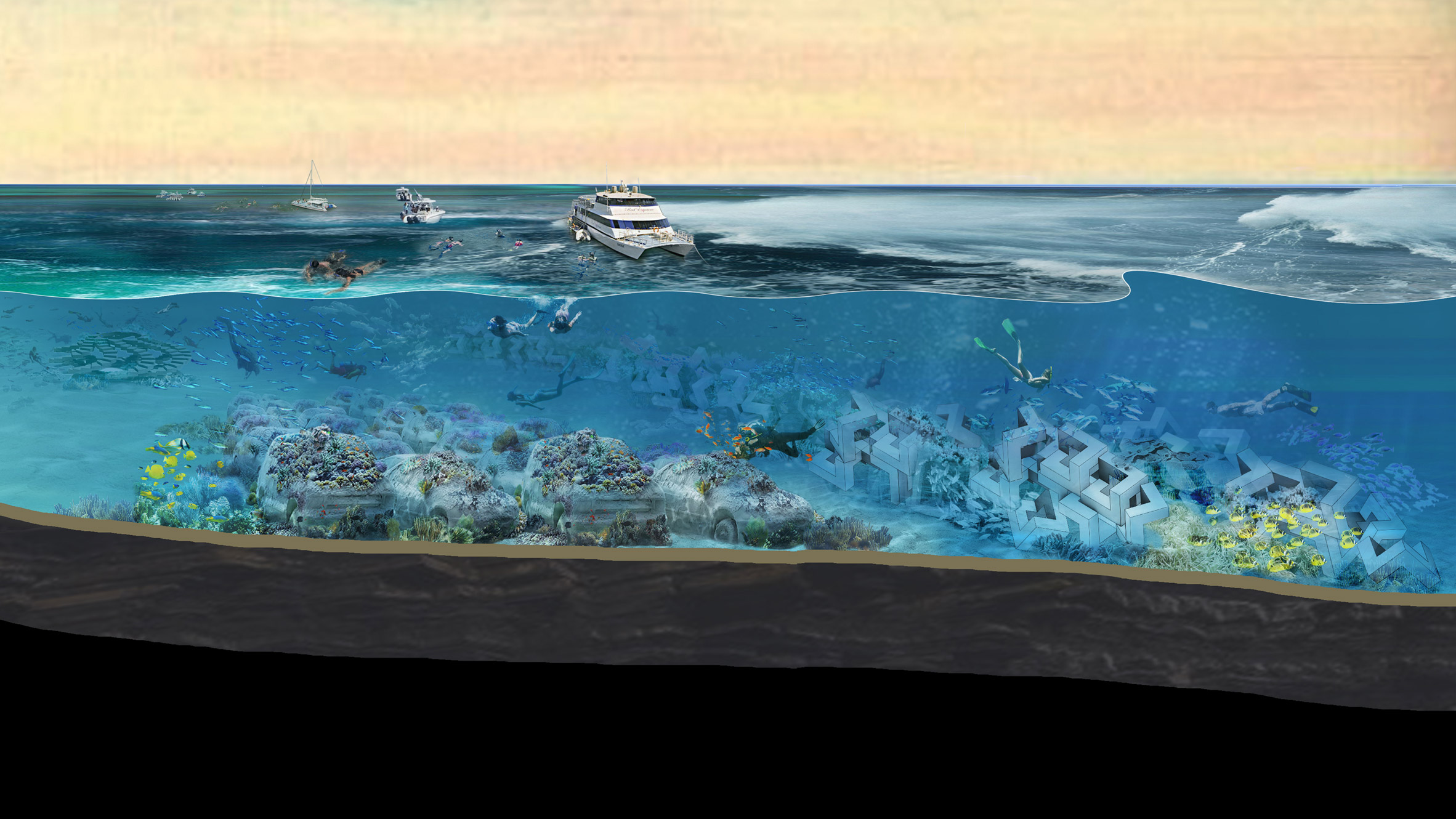
Architecture firm OMA is building a seven-mile-long, underwater sculpture park, which it says will bolster the shoreline of Miami Beach against the effects of climate change and include installations that can only be viewed while snorkeling.
Initiated by Argentinian curator Ximena Caminos, The ReefLine is intended to respond to, and raise awareness of, the way climate change is causing rising sea levels and coral reef damage in the coastal city.
OMA partner Shohei Shigematsu, who heads the firm's New York office, is leading the masterplan project, working with a team that includes marine biologists, researchers, architects and coastal engineers.
Above: The ReefLine will stretch from South Beach to the north. Top image: OMA's staircase-like installation
"The ReefLine is a unique project that brings attention to and mitigates the dangers of climate change in Miami Beach, while simultaneously enriching the city's vivid art scene," Shigematsu explained.
"We look forward to collaborating with a diverse group of experts and professionals on our first underwater cultural masterplan and sculpture."
The ReefLine masterplan will be composed of geometric concrete modules, stacked approximately 20 feet (six metres) under water and approximately 900 feet (247 metres) off shore. They will run seven miles from South Beach at the southern end of the city all the way to the north to enhance the coastal resilience of the Miami Beach shoreline.
OMA's masterplan is composed of geometric concrete structures that will form an artificial reef
As climate change warms the ocean and causes damage to coral, this structure is also intended to act as an artificial reef where endangered marine life can live.
To achieve this, structures will be constructed with State of Florida-approved materials for artificial reef deployment. According to the team this includes concrete and limestone as they are chemically similar to natural reef substrate.
"The ReefLine will provide structure for corals and sponges to naturally colonize, adding biodiversity to an area that is currently an underwater desert of sand," Caminos told Dezeen. "In the future, we are looking into the feasibility of transplanting nursery grown corals to the structure from University of Miami's Rescue-a-Reef programme."
Artworks installed in between the concrete framework will also be made of similar materials and intended as an extension of the reef. Contributing artists will have access to a 3D printer that is able to replicate artificial reef modules from cement to include in their designs.
Featured projects are being curated by Caminos, who is also the founder of BlueLab Preservation Society and Coral Morphologic. The project is being completed with the City of Miami Beach and researchers from the University of Miami.
OMA's installation will feature spiral staircases arranged in a circle
"This series of artist-designed and scientist-informed artificial reefs will demonstrate to the world how tourism, artistic expression, and the creation of critical habitat can be aligned," Camino explained.
"The ReefLine is a singular investment in civic infrastructure, public art and environmental protection that will pay dividends over the coming decades and attract ecologically-minded tourists and art lovers to Miami Beach."
OMA is also among the contributing artists and will be one of the first to complete its structure in the sea. Its design will be composed of spiral stairs rotated around a circular opening overhead.
Leandro Erlich will create an underwater traffic jam. Rendering by Erlich
With glimpses of the seaside to views of the Rocky Mountains, we've rounded up 10 dining rooms in American houses that would be spectacular settings for a Thanksgiving dinner.
An expansive roof provides shade to a wooden deck furnished with a dining area in this residence Seattle firm Olson Kundig has completed on an old lava field in Hawaii.
Suited to a large gathering, the wood table and benches mirror the form of the surrounding wood architecture.
A more intimate gathering would suit this foldable Finn Juhl dining table – one of a number of Danish mid-century designs furnishing the holiday home in a Catskill Mountains development.
The table is placed to make the most of a square window framing a view of the outdoors.
Weathered metal chairs and a weathered wood table form a simple, stripped-back setting for diners in Little Peek House.
The area is an enclosed patio that is sandwiched between two cedar volumes to form the holiday home that the founders of Berman Horn Studio built themselves on an island in Maine.
The Rocky Mountains in Idaho are visible through sliding glass doors from the dining table in this Shaw Mesa residence by Michael Doty Architects.
Metal slices through the wood table top referencing the materiality of the house, which includes charred-black timber walls and a corrugated metal roof.
The dining room in Sheffield House is furnished with warm, red-hued wooden chairs with woven seats and a glossy black table.
With these bold hues, which provides a contrast to the house's bleached cedar exterior, the dining area provides an anchor in the open-plan living space.
False Bay Writer's Cabin by architecture firm Olson Kundig in the USA has three glass sides surrounded by decks that double as shutters when pulled up like a drawbridge.
This unique feature allows the owners to secure their guest house cabin in San Juan Island, Washington, when not using it as a cosy writer's office.
The cabin doubles as a writing office and a guest room
A system of hydraulic winches and wire rope pulls the decks up to protect the glass walls. Three steel sleepers provide supports for the timber panels to rest upon.
When the decks are down, sliding glass doors open the interior space to the outdoors.
Three shutters can lie flat as outdoor decks
The fireplace in the living area can rotate 180 degrees, facing in towards the sofas for a cosy winter evening or turned out towards the deck to warm those seated outside.
"It is intended to be a shelter of extremes, open or closed," said architect Tom Kundig.
"In order to feel cold, you have to feel hot, in order to feel safe, you have to feel at risk. Contrast is the true measure of a complete experience."
The fireplace can rotate 180 degrees
Inside, the cabin has 500 square feet (46 square metres) of floor space. A single room contains an open plan living area.
The wooden floor is bisected by a panel of blackened steel that runs from the back of the cabin, where there is a small window, to the glazed front. The steel matches the fireplace and the cylindrical chimney that tops it.
The decks can be raised up to form shutters
A Murphy bed folds down from the back wall to transform the space into a guest cottage, with the shutters doubling as curtains.
There is also a small kitchen and a separate bathroom at the back of the cabin. A rack on the exterior's non-glazed wall can hold the cabin owners' kayaks.
A bed folds down to create a guest room
Olson Kundig Architects was founded by Jim Olson in 1967, and the practice is based in Seattle.
The founders of design house The Brooklyn Home Company have created a hotel in New York's Finger Lakes region that draws on their summers growing up on Canandaigua Lake.
The Lake House on Canandaigua is named after its location on one of the 11 long and narrow lakes that form the region aptly named the Finger Lakes.
Above: a monolithic wood reception desk anchors the hotel lobby. Top image: The Lake House on Canandaigua is designed with an ambiguous style
The brother and sister founders of The Brooklyn Home Company, whose family previously owned a motor-lodge on the same plot, enlisted New York-based Studio Tack to work on a new project to reinvigorate the site.
"We wanted to create something special for the community and also something that would put the Finger Lakes on the map as a destination," said The Brooklyn Home Company founder William Caleo, who runs the firm with his sister, designer Lyndsay Caleo Karol and her artist husband Fitzhugh Karol.
The lounge-style lobby has an eclectic mix of furniture and baskets filled with rugs
"We grew up in this place, one of the greatest natural environments in this country, with the best crystal clear lakes and rolling, green hills," Caleo explained.
"But, the Finger Lakes, with all its natural beauty, was relatively geographically unknown as a place," he said. "We wanted to change that. Guests from around the world deserved to see this place."
The decor includes muted textiles, leather and wood
Built from the ground up, The Lake House on Canandaigua contains a number of buildings, including the main hotel with 125 guest rooms and suites, a timber frame events space for weddings and daily yoga classes, the casual Sand Bar, The Rose Tavern Restaurant and The Lake House Spa by Soveral.
There is also a swimming pool and an outdoor hot tub where guests can relax with views of the lake all year round, and a gym.
A moody library with a log fire adjoins the lobby
Running along the rear of the property is a private boardwalk for water sports on the lake, or to enjoy fishing and a series of firepits for making s'mores.
"Our concept for the design was inspired by our summers growing up on the same lake," Caleo added. "We wanted the hotel to feel like a home so when guests check in it feels familiar immediately."
It features dark blue walls and stacks of books for guests to read
"It was also important for us to connect guests to the lake and show how beautiful and pristine this region is, whether by sitting on the deck in an Adirondack chair or reading a book in the library overlooking the water," he continued.
White-painted and gabled structures that form the 109,745-square-foot (10,196-square-metre) complex are intended to be undefinable. Studio Tack partner Ruben Caldwell explained the aim was to create buildings that could have been built one hundred years ago.
Dark hues continue in The Rose Tavern restaurant
"The design concept revolves around trying to capture some of that narrative and history, then project and imagine it forward into the distant future," he told Dezeen. "The physical manifestations of this concept evolved from an idea of bridging the past and future."
"The goal was to suggest a place that had long existed, perhaps a beloved family home, that had been carefully updated over the years," he told Dezeen.
"When you inhabit these spaces, you are a part of something that came before and are invited to become a part of something new."
The Sand Bar provides a more casual eatery by the water
"The site is intended to allow for exploration, and it was important that the spaces not be monolithic in their perspectives," Caldwell added. "We imagined a family coming back year after year and finding something new each time."
This concept continued inside where the design team have created a series of cosy spaces with eclectic furnishings.
Off-white walls and rustic, pale wood furniture create cosy guest suites
The entrance leads into a bright white lobby featuring a monolithic reception desk, and a lounge-style layout composed of leather and wood furnishings, and baskets stacked with rugs. Accessed from here, is the library and bar painted in contrastingly dark tones and warmed by a log fire.
"At a more detailed scale we were interested in exploring materials such as wood and canvas that suggest a utilitarianism that is simultaneously comfortable and familiar," Caldwell said. "Our interest more broadly was in using familiar materials in ways that invite a closer look and moment of reflection."
A swimming pool and a hot tub overlook the lake
Off-white-painted walls feature in the bedrooms, with matching built-in storage and hooks for hanging clothes. Muted hues are complemented by rustic, pale wooden four-poster bedframes and bedside tables.
The team created a variety of bedrooms, including the Double Queen and the signature Lakeside King Suite. The latter features a cosy lounge with a fire and glass doors that open onto a terrace with views to the lake.
A private boardwalk is used for water sports and fishing
Designers: Studio Tack and The Brooklyn Home Company Architect: SWBR Architects Construction team: LeChase Construction Owner ans operator: The Sands Family Hospitality partner: Preferred Hotels Executive chef: Scott Riesenberger Spa partner: Alexandra Soveral
US studio GRT Architects has completed this black house with huge triangular windows in New York's Dutchess County, which has the layout of an open-plan studio.
The project in Dutchess County, which is just under two hours drive from New York City, was created for a couple thinking about permanently moving out of Manhattan.
Black brickwork walls prop up the triangular windows
While the move was not confirmed they tasked Brooklyn-based GRT Architects to create a bolthole on a 24-acre (9.7-hectare) plot to accommodate their children and grandchildren.
Dutchess County Studio is composed of three rectangular volumes arranged in a pinwheel to overlap one another. Textured black brickwork walls are slanted at the top to meet with triangular clerestory windows.
Cedar with copper trim covers the roof
"Each mass has an identical roof atop a beak-like clerestory window but asymmetry was introduced in response to the site," GRT Architects said.
The roof of the house is clad in natural cedar with copper trim, chosen to complement the brickwork.
Ceiling beams show the intersection of three volumes
"Outside, the studio is clad in textured black brick, a material that plays optical tricks depending on lighting, sometimes flattening the complex mass into a single plane," the studio explained. "The roof is clad in natural cedar shakes with copper trim intended to add a warmer aspect to the design."
Inside, three exposed black ceiling beams mark the meeting of the three volumes above the kitchen area – this forms the central space in the project, which is designed to have an open-plan layout like a studio apartment.
Pale wood topped with terrazzo forms kitchen cabinets
"The masses meet at a centre point, marked by the pinwheel intersection of three steel beams but the interior is conceived as three subtly implied rooms, each oriented each to a different view," it added.
Steps lead down to the third volume, which is intended to be occupied by a bedroom, and is located on a lower level due to the slope of the sight. This block has a huge window with views outside. The other two wings are occupied by the lounge – with a murphy bed for guests – and a small bathroom.
The house is warmed by a "clean-burning" stove
Because the residence has an open floor plan, the studio has used pale wood cabinets to divide the kitchen area from the sunken bedroom, and offer privacy. A simple material palette of white-painted walls, built-in pale wood furniture topped with custom terazzo made by Kaza Concrete, and concrete flooring runs throughout.
A large window offers views of the surroundings
According to the studio, the concrete slab is radiant and forms part of an environmentally friendly approach to heating and cooling the house without fossil fuels. Other facilities include the "clean burning" Flores 8 stove by Buntfires, which has reduced toxic emissions.
The lounge cabinets include a murphy bed for guests
The bathroom is the only space separated by walls. Pink-tinted Moroccan Tadelakt plaster covers the walls inside and is complemented by a reddish sink, golden details and warm woods.
Stone steps lead down from the house at the top of the slope to a swimming pool, which GRT Architects created as part of a masterplan for the site. The studio is also planning to complete a dock and workshop.
Red slats create a wave-like movement when people play on swings in this temporary installation, which Chilean studio GT2P designed and developed for Miami Design District.
Conscious Actions was curated by Anava Projects for Miami Design District as part of this year's Design Miami. The intention is that the structure's dual movement is representative of the impact of human actions on the world, according to the studio.
Conscious Actions is installed in Miami Design District
"Our design responds to the Anava Projects – founded by Anna Carnick and Wava Carpenters – curatorial brief that asked our studio to reflect both on the energy that we consume and the energy that we contribute back to the world," GT2P co-founder Guillermo A Parada told Dezeen.
"In response to that our project... invites users to enjoy the carefree fun of childhood again, while also being reminded of the direct impact every action has on our environment and our communities."
The movement of the swings causes the cover to ripple
The swings and the remaining structure is made of powder-coated steel. All the elements were laser-cut and included "little notches" to make assembly easier.
Key elements, such as the columns, beams and suspension system, were all welded together, but GT2P said it will still be possible to disassemble the structure and build it elsewhere.
The green swings are contrasted by the red, wave-like cover
A main challenge of the project was completing the construction amid Covid-19 lockdown restrictions. This meant that Santiago-based GT2P had to work remotely with its construction partners, including Atlanta-based creative design and fabrication company Altbld.
"The project was entirely designed, developed, fabricated and installed by Zoom and Whatsapp," said Parada.
"It was a great challenge that prove that we can work from Chile to the whole world," he added. "All through digital platforms in the middle of these challenging days."
Elastic connects the slats triggering the ripples
GT2P, which is short for Great Things to People, has still been unable to see the project since it was built.
"You can't imagine how we feel just seeing all things happen just through videos," said Parada. "We are rewarded with the great comments from the visitors from Instagram, Facebook and other social media like Tiktok – the swing is being used by children and adults."
Yellow springs run along the top of the structure. Photo by Luis Gomez
Conscious Actions opened to the public to coincide with this year's Design Miami, which runs from 27 November to 6 December with both online and in-person events in the Miami Design District. Conscious Actions will remain open until January.
Agate Pass Cabin overlooks the Agate Passage, a tidal waterway on the Olympic Peninsula. Maskin added a first-floor extension and proper foundations to the old cabin.
Low ceilings have been open up into the old attic
Original wide planks of Douglas fir – a species that was bountiful in the region 100 years ago – still line the walls and ceilings.
Where some panels were taken down to make room for alterations, the wood was refashioned into cabinets or storage or used to line new ceilings.
Panels of original Douglas fir still line the walls
Contrasting wood such as Gulam plywood was chosen for additions to the cabin, to clearly mark what is original 1930s and what is new.
Maskin bought the cabin as a dream renovation project, although it took him years to find the time to work on it after he was made an owner of Olson Kundig Architects.
"My work life and love life were separated by Elliott Bay and a three-hour commute," said Maskin.
"I was looking for a small, extremely inexpensive fixer-upper. In my dreams, I wanted it to be a small cabin with a view of the water – hopefully with some character – and located somewhere in the middle of my two primary destinations."
A screened-in porch has become a dining room at one end
When he heard the cabin had come up for sale he went to view it and realised that he could see Agate Pass if he climbed up on the roof.
"I hired a residential building inspector to check it out and make sure that buying such a rundown house wasn't insane," added Maskin.
"While he was underneath looking at the foundations of the house, I noticed 12 bald eagles flying directly over the house. Let's just say that after that, the inspector's report didn't seem as necessary."
The other side of the former porch is now a study
After years sleeping on a mattress in the cabin's unheated attic while he was busy with Olson Kundig Architects, Maskin finally found the time to redesign the cabin.
New foundations were added, with seismic upgrades as the Pacific Northwest sits on a fault line called the Cascadia subduction zone.
A first floor has been added to the cabin
The low ceiling between the living room and the attic was removed, opening the space up to create a five-metre-high vaulted roof beneath the gables. A wood-burning sits on a raised metal hearth.
A screened-in porch was turned into a dining room and office space with views over the gardens.
The bedroom has views over the Agate Pass
Upstairs, the new first storey houses a wood-lined bedroom with views over the trees and the water.
The gable end is made of and flanked by windows. A cardboard 3D portrait of the American sculptor Ed Kienholz by the local artist Scott Fife hangs over the bed, which Maskin designed himself.
Gulam plywood was used for new additions to the cabin
Maskin also designed the bed and armoire. Above the office space is a first-floor outdoor terrace.
Architect: Olson Kundig Architects Design principal and interior design: Alan Maskin Project architects: John Kennedy and Hill Pierce Landscape (hardscapes): Alan Maskin Landscape (plants): Duane West and Brian McLaughlin General contractor: Krekow Jennings Structural engineer: Nic Rossouw, Giraf Design Lighting design: Niteo
Local design studio Basic Projects combined antiques with modern furniture pieces so that boutique hotel Post House in South Carolina "feels like it has always been there".
Host to seven guest rooms and a restaurant, Post House is situated just outside of Charleston in the suburban town of Mount Pleasant.
The Post House inn occupies a 19th-century building
The building was originally constructed back in 1896, but since then has been reincarnated as various eateries and guest accommodations.
When ownership of the building ended up falling into the hands of Kate and Ben Towill – the couple behind Basic Projects – they set out to design Post House as an inviting inn that blended new and old-world charm.
Bedrooms are lined with chintzy William Morris wallpaper
Sourcing eclectic pieces for the project came naturally to Kate Towhill, who used to work as a set designer for films.
"This project brought me back to my days as a set designer; I really wanted the space to feel like it had always been there, but never wanted it to feel like a tired bed and breakfast," she explained.
"I did this by mixing found antiques and modern pieces to keep things feeling fresh, making sure to not forget those creature comforts, like crisp white soft sheets and branded plush house robes."
Decor is provided by patterned rugs and bedside lamps
Walls upstairs in Post House's bedrooms have been covered with wallpaper by William Morris, as the Towhills felt his chintzy, floral designs matched the age of the building.
Some of the suites feature plain white or powder-blue surfaces, but have been dressed with patterned Turkish and French rugs that Kate Towhill found at an antique fair in Massachusetts.
Post House's restaurant is downstairs on the ground floor
The studio did however make sure that not every decorative element was vintage so that the rooms "still felt fresh and durable".
The rattan beds, for example, come from US furniture brand Serena & Lily, while the ornately-printed bedside lampshades were ordered custom via e-commerce site Etsy.
Blue chairs run in front of the drinks bar
Wooden chairs and marble-topped dining tables have been scattered throughout the restaurant downstairs.
Intimate seating booths have set at the peripheries of the room, illuminated overhead by porcelain wall sconces that the Towhills purchased from Felix lighting specialists in England.
Work from local artists has been put up on the restaurant's walls
"Lighting is my favourite part about my job," said Kate Towhill. "It is so important to create a glow when people are inside or walking by – that glow and warm twinkling lights say 'come on in and sit down!'," she continued.
"Bad lighting can affect everything in my eyes, even how the food tastes!"
Cosy dining booths lay at the restaurant's peripheries
Paintings and illustrations made by local artists have been mounted on the restaurant's walls and behind the bar, in front of which is a row of plush, teal-blue high chairs.
During the warmer months, guests can spill onto the outdoor dining area, which is shaded by red-and-white stripey awning. On site there's also the Rose Room, an events space complete with grand Murano-glass chandeliers.
US architecture and design school Harvard GSD has removed Philip Johnson's name from a house he built while studying at the institution in response to a campaign calling for a rethink of the Nazi-supporting late architect's legacy.
Harvard Graduate School of Design announced this week it has renamed the house Johnson designed and built in the 1940s as his GSD thesis project.
Formerly known as Philip Johnson Thesis House, the single-storey dwelling is now named after its address, 9 Ash Street.
Philip Johnson is "an inappropriate namesake"
The move is a response to a campaign by activist organisation The Johnson Study Group that has also called on New York's Museum of Modern Art to remove Johnson's name from a curatorial post in light of the architect's "commitment to white supremacy".
MoMA employs a Philip Johnson Chief Curator of Architecture and Design to honour Johnson's involvement at the museum, where he funded the creation of its architecture department.
However, according to The Johnson Study Group, the architect's "significant and consequential" commitment to white supremacy meant he should no longer be celebrated by public institutions.
Portrait of Philip Johnson by B Pietro Filardo
"We call on the Museum of Modern Art, Harvard Graduate School of Design, and any other public-facing nonprofit in the United States to remove the name of Philip Johnson from every leadership title, public space and honorific of any form," the group wrote in an open letter to MoMA and Harvard GSD.
"Philip Johnson's widely documented white supremacist views and activities make him an inappropriate namesake within any educational or cultural institution that purports to serve a wide public".
Martino Stierli, the current holder of Philip Johnson Chief Curator of Architecture and Design post at MoMA, told Architectural Record that the museum was taking the "issue very seriously and extensively researching all available information".
Dezeen has contacted MoMA but is yet to receive a response.
"Strenuous support of white supremacy has absolutely no place in design"
Harvard GSD dean Sarah Whiting announced the renaming of the Cambridge house in a response to The Johnson Study Group, which is dedicated to "studying the legacy of a 20th-century white supremacist who founded the most significant modern architectural institutions in the United States".
In the letter, Whiting agreed that the architect's actions meant it was "inappropriate" for the house to bear his name.
"The power he wielded and continues to wield make it critical that not only his own work as an architect and curator continues to be reappraised, but also that the consequences and persistent legacy of his influence in shaping the field and canon of architecture continue to be scrutinised," Whiting wrote.
"His racism, his fascism, and his strenuous support of white supremacy have absolutely no place in design."
Johnson used "curatorial work as a pretense to collaborate with the German Nazi party"
Johnson was born in 1906 in Cleveland, Ohio and became one of the best-known architects of the 20th century. He was awarded the first-ever Pritzker Architecture Prize in 1979 and died in 2005.
Called 1941: Fighting the Shadow War, the book suggests Johnson's allegiance with the regime began when he attended a youth rally led by Adolf Hitler shortly after organising a 1932 show on the International Style at MoMA. The architect's pro-Nazi efforts soon garnered attention in the US, with Harper's Magazine listed him as a leading American Nazi in an article, and the FBI tracking his activities.
The house Johnson completed for his thesis was his first built project
"He used his office at MoMA and his curatorial work as a pretense to collaborate with the German Nazi party, including personally translating propaganda, disseminating Nazi publications, and forming an affiliated fascist part in Louisiana," The Johnson Study Group's letter said.
"He effectively segregated the architectural collection at MoMA, where under his leadership (1933-1988) not a single work by any Black architect or designer was included in the collection," it added.
"He not only acquiesced in but added to the persistent practice of racism in the field of architecture, a legacy that continues to do harm today."
Thesis house was his first built project
The house he completed in Cambridge, Massachusetts in 1941 for his Masters of Architecture thesis was his first built project. He designed the house as a rectangular volume with a tall fence that wraps around a large outdoor courtyard. A door in the fence provides access from the street into the yard.
Johnson is said to have hosted a number of parties in the house before selling it after the Second World War. GSD purchased it in 2010 and completed a restoration project in 2016.
The call to remove the prominence of Johnson's name comes in the wake of wider calls to address systemic racism in the architecture and design industries. This followed racial unrest in the US triggered by the killing of African American George Floyd.
Protests come in wake of call to address racism in architecture
Whiting said that the removal of Johnson's name is just the start in bringing change to the "the entrenched, paradigmatic racism and white supremacy of architecture".
"We do not pretend to think our work, as a school, ends here," Whiting said. "At the GSD, we are committed to doing our part to bring much-needed, long-overdue change to the field, to a fundamental reorientation toward inclusion."
"Johnson's influence runs deep and wide, and across generations, and yet he is also just one figure among the entrenched, paradigmatic racism and white supremacy of architecture," she added.
"Undoing that legacy – of the field, not only of Johnson – is arduous and necessary, and as a school and community we are committed to seeing it through."
Read of for Whiting's full letter:
Dear Mitch and other members of the Johnson Study Group:
Thank you for this note, which I take very seriously – both as dean of the GSD and as a designer. Philip Johnson's global influence in architecture in the 20th century and his grip on the field even now, 15 years after his death, cannot be overstated.
And the power he wielded and continues to wield make it critical that not only his own work as an architect and curator continues to be reappraised, but also that the consequences and persistent legacy of his influence in shaping the field and canon of architecture continue to be scrutinized. His racism, his fascism, and his strenuous support of white supremacy have absolutely no place in design.
At Harvard, the GSD owns a private residence in Cambridge that Johnson designed and built for his thesis project at the GSD, when he attended the school in the 1940s. At the university, the house doesn't have an official name on record, although it is usually referred to as the Thesis House, or the Philip Johnson Thesis House, or some variation.
But I fully agree with your strong point about the power of institutional naming, and the integrity and legitimacy it confers. And so we are taking steps to officially recognize the house within the university as simply "9 Ash Street" – the house's physical address.
As you put it, this is a minor but clarifying step in making room for other legacies to come. I agree about this, too. We do not pretend to think our work, as a school, ends here. At the GSD, we are committed to doing our part to bring much-needed, long-overdue change to the field, to a fundamental reorientation toward inclusion. Johnson's influence runs deep and wide, and across generations, and yet he is also just one figure among the entrenched, paradigmatic racism and white supremacy of architecture.
Undoing that legacy – of the field, not only of Johnson – is arduous and necessary, and as a school and community we are committed to seeing it through.
American architect Edward Mazria has scooped the 2021 AIA Gold Medal prize in recognition of "his unwavering voice and leadership" in the architecture industry's fight against climate change.
The esteemed Gold Medal award, which is the AIA's highest annual honour, is given to architects in recognition of their contribution to the field.
The institute said Brooklyn-born Mazria was selected by the jury for his longstanding dedication to "motivating the profession to enact positive change and take immediate action".
Mazria is the architect behind the Museum of Indian Arts and Culture. Photo is by Robert Reck
"An amalgam of architect, researcher, advocate, and influencer, Mazria's impact on the AEC industry is profound, helping to plot a new course for practice in the 21st century," explained the AIA.
"As one of the world's foremost experts on the built environment's role in both causing and curing climate change, Mazria addresses the global threat as a design problem," it said.
"Facing countless challenges and a client base of 7.5 billion humans, his leadership and positioning of architects as a critical resource is creating a healthy, just, and carbon-positive future."
The Stockebrand Residence in Albuquerque is one of his best-known projects. Photo is by Richard Rush
Pratt Institute-educated Mazria, who is also an established author and educator, is best known for helping to establish the AIA's Committee on the Environment and founding the pro-bono organisation Architecture 2030 in 2002.
Architecture 2030's mission is to transform the built environment from a major polluter into a solution to the climate crisis. According to the AIA, it has "shaped some of the world's actions on climate change".
This is through initiatives like the 2030 Challenge, which invites architects to make all new buildings and renovations carbon-neutral by the year 2030, and speaking to world leaders at events including the 2015 United Nations Climate Change Conference to shed light on the industry's environmental impact.
Prior to founding Architecture 2030, Mazria authored The Passive Solar Energy Book following a period of working in a teaching position at the University of Oregon with a focus on passive solar-energy systems.
The book, which remains widely referenced to this day, informed the design of some of his best-known buildings that include the Stockebrand Residence, the Museum of Indian Arts & Culture, and Georgia O'Keefe's estate, Sol y Sombra, in New Mexico.
Sol y Sombra was built by Mazria for artist Georgia O'Keeffe. Photo is by Kirk Gettings
In a letter supporting Mazria's nomination, architect Marsha Maytum said his work had ignited "a global network focused on sustainable growth and urgent climate action".
"Ed has been a tireless advocate, a consummate communicator, a skilled designer of innovative tools, and most importantly, a master builder of powerful alliances across professions, industries, and governments," she said.
"Mazria's voice in the wilderness about architecture's potential to change the projected path of impending global climate change seemed a formidable if not unattainable goal in 2003," added Thompson Penney, the 2003 AIA president.
"In the ensuing decades, his unwavering voice and leadership have shown that it can be done and in fact is being done," he concluded.
We're continuing our review of the year with the top 10 US architecture projects of 2020. They include David Adjaye's pink-concrete store, SOM's museum for the United States Army and MAD's first project in America.
The National Museum of the United States Army is a monolithic building with a mirrored steel exterior reflecting its surrounds in the bucolic Fort Belvoir Military Installation in Virginia.
Designed by SOM, it is the first in America dedicated to the country's oldest military service.
For this store for fashion retailer The Webster, David Adjaye's first project in California, the architect chose curved pink-tinted concrete walls to contrast the brutalist-style Beverly Center above.
Pink also continues throughout the interior in the form of curving walls that enclose the changing rooms, concrete display plinths and concrete columns that punctuate the space.
A private aquatic centre and a helipad are included in the One Thousand Museum, which is one of the last buildings designed by late architect Zaha Hadid.
The 62-storey residential tower has glass facades encased by a curvaceous "exoskeleton" that comprises 5,000 pieces of lightweight glass-fibre-reinforced concrete.
Nearly 17,000 extruded aluminium fins cover the Oklahoma Contemporary Arts Center, designed by Rand Eliot Architecture, and form a zigzagging roofline.
Intended as a new landmark for the city, the building is located just north of the historic Automobile Alley and replaces the contemporary museum's original home at Oklahoma City's State Fair Park.
US firm Diller Scofidio + Renfro created the twisted US Olympic and Paralympic Museum in Colorado this year, with the aim to make it one of the most accessible buildings in the world.
The museum, which is composed of four aluminium-clad volumes, is arranged so visitors ascend to the top level of the museum by elevator and gradually move through the galleries on a wide, spiralling ramp.
Chinese firm MAD completed its first US project this year: the Gardenhouse residential building in Beverly Hills.
It is designed to look like a village with 18 gabled houses that are set atop a three-storey podium covered in plants – making it the "largest living wall" in US, according to the studio.
Having first unveiled its plans to convert a decommissioned power plant in Wisconsin into new facilities for Beloit College six years ago, Studio Gang completed the project this year.
The 100-year-old plant building, which is located between the campus of the liberal arts college and Rock River in Beloit, was updated to include a fitness centre and a gymnasium with an elevated three-lane track.
Curvy roofs "imagined from cloud circles" top the Nancy and Rich Kinder Building, which US firm Steven Holl completed as part of a major campus redesign for the Museum of Fine Arts Houston.
The walls of the museums are wrapped with translucent glass tubes to contrast existing buildings on site, like the adjacent transparent glass and steel building by Mies van der Rohe and an opaque stone building by Rafael Moneo.
American studio LMN Architects renovated and expanded the 1930s, art deco-style Seattle Asian Art Museum.
Making sure to preserve "the architectural legacy of the historic building", the firm chose glass, steel and concrete for the extension. Facades were restored and new glass was installed in windows of the existing building.
Fuschia, violet and indigo lighting envelops users of these meditation chambers that multidisciplinary studio Office Of Things has designed specifically for workspaces.
The chambers come as part of the Immersive Spaces Series, an ongoing research project by Office of Things which explores how employees can benefit from having calming rooms of refuge within their places of work.
The chambers designed by Office of Things allow workers to sit in peace and quiet
So far, a total of five chambers have been created, all of which are installed in YouTube or Google offices across San Francisco's Bay Area.
The first chamber was fitted in an office in 2017 and since then the studio has taken on user feedback and tinkered with lighting and sound components to foster ultra-comforting, "womb-like" spaces.
Coloured lighting features on the chambers' ceilings
In their latest incarnation, the chambers are split into three parts, which the studio refers to as The Entry, The Ground and The Sky.
Workers gain access to the chambers via The Entry, a narrow walkway that works to "shed the literal and figurative noise of the office and outside world".
Inside the chambers is The Ground, a landscape of curving, fabric-upholstered partitions, cushioned benches and plump floor cushions which can be leant against or laid down on.
Workers can gaze up at The Sky, a series of illuminated panels on the ceilings of the chambers which typically glow deep shades of blue, purple, red or pink.
Partition walls inside the chambers are upholstered in soft fabric
The panels in each chamber are different in form – some are domed, while others are punctuated with amorphous openings or swoop upwards in an arch shape.
"In contrast to the office, these chambers feel both surreal and sublime," concluded the studio.
Office of Things believes that meditative spaces in the office are becoming more relevant than ever – particularly after 2020, when many of us have had to work from home due to the coronavirus pandemic.
There are also cushioned bench seats inside the chambers
"The pandemic has brought to the fore the toll of work-generated stress on our mental health," said the studio, which is based in Brooklyn, New York.
"For those with the fortune to work from home, the encroachment of work into our personal lives has further blurred the boundaries between the two," it continued. "If anything, working from home has shown us that a sustainable working life includes the space for physical and mental health throughout the day."
"As companies implement return to office strategies, the stresses of social distancing and general uncertainty risks leaving workers without mental health support," the studio concluded.
Several businesses – both pre and post-pandemic – have made moves to include calming spaces for staff inside offices.
The Santa Monica headquarters of wellness brand Goop, for example, contains yoga rooms, while the Kyiv offices of software company Grammarly has its own nap pods.
Toronto architect Carlo Parente has renovated an old and dilapidated mason's shop in Chicago to create a live and work space called Facility for artists Nick Cave and Bob Faust.
Located at the intersection of two prominent streets in Irving Park, Facility restores and reuses several elements of the 1920's industrial building, which is composed of a two-storey masonry structure with three storefronts, a single-storey annexe and a garage.
Facility is housed in an old masons' shop in Chicago
Cave and Faust's primary goal for the renovation was to transform the building into a place to display their extensive art collections. However, they also desired a private residence, event space and studios for other creatives in Chicago.
To achieve this, Parente reconfigured the building to function as an open, flexible "framework" to display art and use as studio space, with some enclosed, private rooms positioned in between.
Many of building's original details have been preserved
"When Nick and Bob engaged me to collaborate, they had already carefully thought through their needs and they had considered the spaces of the various programme elements," Parente told Dezeen.
"They had a clear agenda of wanting these spaces to be able to act in a flexible and open manner with the display of their art and art collections as being primary," he explained. I began to think of the project as a framework for their work – the entire building as a transformative framework and platform for the production and presentation of their work."
"The fluidity of the space and the architecture-as-framework design works beautifully, creating a feeling of ease – lived in, natural, and humming pleasantly with activity."
Some old concrete columns feature graffiti from the building's past life
Parente's design for the overhaul involved retaining as many existing elements of the building as possible to celebrate the history of the space.
He transformed the single-storey building at the north corner of the site into the building's entrance, while also introducing a library, a lounge and a private studio space for Faust.
Artwork and an eclectic mix of furniture decorate each space
The annexe now links up with the ground floor of the two-storey structure, which contains Cave's studio, a series of communal workspaces, a washroom and a kitchenette.
The adjoining garage serves as a multi-functional space for events or making art, while the second floor of this building contains the artists' private residence, alongside an apartment for an artist-in-residence.
Original, worn masonry walls feature throughout Facility
Throughout, a number of worn, existing masonry walls have been exposed, alongside graffitied concrete columns, old plastered walls and even the remains of an old wasp nest.
"Nick and Bob embrace the vestiges of what was previously there, even an abandoned wasp nest that stayed in place at their request, now revealed by an opening in the ceiling," Parente explained.
An old wasp nest is exposed inside the greenhouse and sunroom
The original masonry walls are the only full-height walls left in the building, as Parente removed all the non-loading bearing walls to achieve the open space the artists desired.
Some of these walls are punctured by new openings, while circulation spaces have also been widened throughout to transform corridors into galleries and areas to gather.
Some masonry walls have been punctured by new openings
A few partial white-painted walls now divide each floor, creating different studio spaces at ground level and private living and sleeping areas on the first floor.
To allow users to adapt each space or achieve more privacy, Parente has also installed a series of pivoting and sliding partitions throughout.
The old gallery is now a studio and event space
All of the new architectural additions to the building have been chosen to deliberately contrast with the original elements.
This includes plywood furnishings that stand out against the masonry and directional changes in the patterns of the wood flooring to emphasise where gaps have been filled.
A roof terrace crowns the building and provides views of the city
The furniture featured throughout Facility also follows this patchwork approach, combining "an eclectic mix of pieces" collected by Cave and Faust ranging from floral, upholstered sofas to Eames' classics.
Every available surface is used to display art, including work by both artists and their collections that include pieces by Kehinde Wiley, Kerry James Marshall, Beverly Mclver and Titus Kaphar.
As part of the project, Parente also updated the exterior of the building. This included reopening the building's original storefronts to maximise the light inside and create exhibition spaces that displaying the work of the artists to passersby.
White walls line the bedrooms and private areas upstairs
To the southwest of the building, an old parking space has been enclosed with fencing made from recycled shipping containers. This now functions as a private, landscaped courtyard that is accessible from Cave's studio.
Facility is complete with a private rooftop with a sunroom and greenhouse, contained within a former shed. They are both orientated to the southwest to maximise evening sunlight and vistas of the city, described by Parente as "a quintessential Chicago view".
The building's old storefronts are now used as exhibition spaces
The American Institute of Architects has banned members from designing spaces for the US justice system used for execution, torture or confinement of imprisoned people, as part of a commitment to "dismantle racial injustice".
The new code of ethics forbids AIA members from designing any places for torture or execution. The ban also includes spaces intended for detaining people for longer than 22 hours a day with no meaningful human contact for more than 15 consecutive days.
Torture and confinement against public welfare
"This decision emphasises AIA's commitment to making a difference on this issue and upholding human rights for our society,” said AIA president Jane Frederick.
"Specifically, AIA members are required to uphold the health, safety and welfare of the public," she added. "Spaces for execution, torture and prolonged solitary confinement contradict those values."
According to the AIA, the code was drawn up to "meaningfully address structural racism in the built environment" in the US. Black people are currently imprisoned at five times the rate of their white counterparts, and Hispanic people are incarcerated at twice the rate of white people, as reported by the Pew Research Center.
"We are committed to promoting the design of a more equitable and just built world that dismantles racial injustice and upholds human rights," Frederick added.
AIA responds to systematic racism
The update comes in the wake of a wider call to address systemic racism in the architecture industry, after the killing of African American George Floyd by a white police officer in Minneapolis this year triggered anti-racist protests across the US.
AIA to set up a task force to define restorative justice design
The AIA has also promised to set up a task force with the goal of defining what designing for restorative justice – where the harm caused by crimes is addressed at a community level – would mean for America's architects. This task force will also identify best practices and develop educational resources on the subject.
In the meantime, AIA members were encouraged to "promote criminal justice reform and rehabilitation" to their clients.
The US has the world's highest number of incarcerated people, with over two million people detained in prisons and jails. Despite making up only 12 per cent of the adult population of the USA, 33 per cent of the country's prison population is black according to the Pew Research Center.
80,000 people held in solitary confinement every day in America
According to the Prison Policy Initiative, in some US states Indigenous Americans are seven times more likely to be imprisoned than white people.
Experts now conclude solitary confinement can be as distressing as physical torture. In America, this treatment is facilitated architecturally by supermax units specifically designed to keep prisoners in single-occupancy cells, some without windows, for up to 24 hours a day.
Named 0 Wagon Wheel Road after its location one mile from the entrance to Joshua Tree National Park, the unbuilt property is listed on a number of real estate sites.
Whitaker, whose project became a viral sensation when unveiled in 2017, said construction is slated to begin in the middle of next year.
The unbuilt 0 Wagon Wheel Road residence is listed for $3.5 million
"We're currently working with Giant Containers who are based out of Toronto," he told Dezeen. "They are going to do the metalwork component of the build and all being well construction will start in the middle of next year."
The listings, which include floor plans and renderings, show that once built the house will be formed from an "exoskeleton" made of shipping containers painted white.
It is composed of splayed, white-painted shipping containers
Lifted off the rocky ground by concrete columns, the containers will be arranged in all directions like a starburst, with arms pushing out in all directions.
The interiors will have bright white walls and concrete floors, with square windows in the containers offering views of the desert surroundings.
Stark interiors include white-painted walls and concrete floors
"The home's exoskeleton of cuboid forms emanate in all directions oriented to capture the sheer beauty of the vistas, sky and desert-scape," describes the listing in Engel & Völkers.
"Incredible rock formations, private mountain, panoramic basin views and hundreds of Joshua Trees."
The house was designed for film producer Chris Hanley, who behind movies like America Psycho, and owns a 90-acre (36-hectare) property near the Joshua Tree wilderness preserve.
He tasked Whitaker to design a house based on his conceptual proposal for offices made from shipping containers called Hechingen Studio, which has also never been built.
Windows offer views of the desert surroundings.
The designer told Dezeen the multi-million-dollar listing follows huge interest in the house since it was first unveiled.
"The enquiries from bands wanting to launch world tours at the house and fashion brands wanting to do catwalk shows there has been staggering so hopefully 2021 will be the year it all comes together!" he added.
His client Hanley meanwhile has completed a mirrored-glass residence on his plot in Joshua Tree called Invisible House.
Hanley worked with architect Tomas Osinski to develop the slender steel-frame house clad in mirrored, tempered glass typically used for skyscrapers. The property is available to rent for filming, photography and events.
Curved seating, shelving and mirrors feature throughout Goodbody hair salon in Oakland, California, which design studio Homework has finished with salmon-pink accents.
GoodBody, which specialises in cutting, colouring and styling textured hair, is located in downtown Oakland. It takes over a building that was previously host to several dated offices.
To transform the site into a modern salon, San Francisco-based studio Homework had to completely strip away any evidence of the previous fit-out.
Top image: GoodBody is set inside a spacious hall. Above: curved elements are used to break-up the space
As well as removing decorative elements, the studio tore down partition walls and knocked through a dropped ceiling to create a vast, double-height hall.
It was initially unclear as to how the space would be organised to accommodate the salon's various service areas.
A semi-circular bench anchors the salon's waiting area
"After rounds of iterations, we developed sinuous millwork curves to promote the service functions while defining the space," explained Ben Work, who runs Homework alongside Susan Work.
Curved elements can be seen as soon as customers walk into GoodBody – a semi-circular bench has been placed in the salon's entryway to delineate a waiting area.
Arched mirrors accompany the salon's styling stations
The grooved, salmon-pink bench bends round to adjoin a matching desk where staff can stand and check appointments. Overhead hangs a quartet of brass pendant lamps.
Nearby sits a salmon-pink platform that dips inwards to form an arc shape. The platform is topped with chunky tiered shelves that display various hair and beauty products that are available for purchase.
Each mirror is illuminated by an LED strip light
On the opposite side of the room is a sequence of styling stations. Each one has a tall arched mirror framed by an LED strip light and a comfy swivel chair upholstered in caramel-brown leather.
These complement the salon's buttermilk-coloured walls and the gold-velvet curtains that have been hung in front of all the doorways.
Curved shelving displays an array of hair and beauty products
At the rear of the salon is a huge vaulted opening which leads through to the hair-wash room.
This has been completed in a darker, richer palette – surfaces have been painted what the studio describes as a shade of "peacock green", while the sinks are made from black porcelain.
A rounded, salmon-pink cabinet visually ties-in this room with the rest of the salon.
A vaulted opening looks through to the hair-washing area
Other striking hair salons to open this year include Hawthorne Studio in New York, which design practice BoND had to adapt to suit health and safety regulations put in place as a result of the coronavirus pandemic.
All of the styling stations, for example, are mobile so that customers can be moved to sit six feet apart. Spaces are also divided by wooden frames instead of walls, so that staff can monitor how many people are entering the salon.