Chinese firm MAD has completed the Gardenhouse residential building in Beverly Hills, which is designed to look like a village on top of a hill.
Composed of 18 gabled residences set on top of a three-storey podium largely covered in planting, the complex at 8600 Wilshire Boulevard, is MAD's first completed project in the US.
Photo by Nic Lehoux
The exterior of the base is covered in native planting, drought-tolerant succulents and vines, which make it the "largest living wall" in the US, according to the studio.
Photo by Darren Bradley
As its first project in America, Gardenhouse provided the opportunity for the firm to experiment with its Shanshui City concept, which aims to translate Chineses landscape paintings, known as shan-shui, into architecture.
"Gardenhouse represents a unique opportunity to impact not only the architecture of Los Angeles but to introduce a new paradigm of living on the West Coast where humans are more emotionally connected to nature, particularly in high-density cities like Los Angeles," said MAD founder Ma Yansong.
"We are elated to see Gardenhouse reach completion and hope that future residents will appreciate the conveniences of living in harmony with nature."
The green wall covers the lower portion of the complex, which is composed of residences and shops and provides a podium for 18 gabled volumes that are completely residential. These are built with wood frames and clad in white glass.
MAD decided to break up the complex into the mini house-like volumes to mimic the scale of houses in Beverly Hills. The residences are arranged in a circle around a greenery-filled central atrium.
Photo by Darren Bradley
The residences are divided up into three different types – Garden Flat Collection, Row House Collection and Sky Villa Collection. Some residences have balconies overlooking the central green space, while others have more private outdoor areas.
Garden Flat Collection are one-storey, three-bedroom houses that have private balconies and terraces with access to the interior courtyard. Comprising 2,500 square feet (232 square metres) of living area, they have large windows and blank walls for hanging artwork.
Photo by Darren Bradley
Row House Collection meanwhile are three, three-storey properties with entries on Charleville Boulevard on the south side. Each has a private three-car garage on the ground and a lift that leads up the 3,100 square feet (288 square metre) home.
Two bedrooms with a guest den are located on the ground floor, while a master bedroom suite with a Japanese onsen-style wet room, and a library is on the first floor. An open-plan lounge, kitchen and dining room is on the top level with large glass doors that open onto a terrace.
Lastly, the Sky Villas occupy the top floors of the clustered, white gable volumes. Spanning two storeys connected by a curved staircase, they have an open-plan living area on the lower level with access to a balcony and one bedroom. Two more bedrooms, including the master suite, are on the floor above.
The interiors throughout are designed by Houston-based firm Rottet Studio, which chose white walls and wooden floors to give a Californian feel to the decor.
Photo by Darren Bradley
"It was important to create interiors that complement the outdoor spaces, allowing light to be captured in a way that feels expansive, bright, and connected to its surroundings," said Richard Riveire, Principal of Rottet Studio.
"The interior finishes pay tribute to the California heritage of woodworking and high-end design in a way that is intimate in feel and lavish in tone."
Photo by Nic Lehoux
Founded by Ma in 2004, MAD is based in Beijing, China and has offices in Los Angeles, New York City and Rome.
First lady of the United States Melania Trump abandoned her architecture studies in favour of a modelling career before marrying Donald Trump, but she still has an interest in design. Here are four times she hit the headlines, including her recent redesign of the White House's Rose Garden.
The first lady has designed another project at her home – a tennis pavilion for the White House, which she unveiled on Twitter.
Created in collaboration with the National Park Service, the White House Tennis Pavilion is intended to take cues from the neoclassical style of the main presidential residence. Details include columns and large arched windows, limestone cladding and a copper roof.
Melania Trump worked with landscape architecture firms Perry Guillot and Oehme, van Sweden & Associates to redesign the White House Rose Garden with a look that combines largely green shrubbery with white and pastel flowers.
Established in 1913 by Ellen Louise Axson Wilson, the wife of former US president Woodrow Wilson, the garden was previously updated during the presidency of John F Kennedy in 1961. Melania Trump's design removed cherry trees and colourful tulips added by Kennedy's wife Jaqueline, sparking criticism on social media.
Melania Trump is also behind the logo of her Be Best initiative, a policy platform dedicated to promoting well-being, positivity on social media and fighting opioid abuse.
In the design, the words Be Best appear to be written in red and blue using a flat-tipped marker pen.
Melania Trump previously incorrectly stated on her website that she obtained an undergraduate degree in architecture from the University of Ljubljana.
But, as her profile rose during her husband's 2016 presidential campaign, it came to light that she left the course after her first year to pursue her career in modelling in Milan.
Biodiversity and effects of climate change can be significantly affected by small-scale rewilding projects argues designer and environmentalist Julia Watson, who has temporarily covered New York's Rockefeller Center plaza and ice rinks with plants.
Named Rewilding the American Meadow, the project covers the North Plaza and Ice Rink of the Midtown Manhattan complex with wooden pots containing plants from the northeast of the United States.
Working with horticulturist and planting designer, Marie Salembier, Watson chose plants with a wild American meadow in mind like native grasses, perennials and trees indigenous to the north-east region.
Rewilding the American Meadow has temporarily covered the Rockefeller Center plaza and ice rink with plants
The designer called the scheme a rewilding, which aims to allow natural habitats to recover with minimal human intervention, as a nod to the fact that the area where the Rockefeller Center stands was formerly home to the Elgin Botanic Garden. Watson said at the time it contained 2,000 native and rare exotic species.
She believes that urban rewilding is an example of how to improve biodiversity in cities, bolster pollinators and help provide clean air.
Watson and horticulturist and planting designer, Marie Salembier, chose plants with a wild American meadow in mind
"Rewilding the American Meadow at Rockefeller Center's North Plaza and Summer at The Rink are part of an idea we have that envisions entities with significant global property portfolios becoming catalysts for mitigating climate change in our urban environments," Watson told Dezeen.
"By matching indigenous, rare, and threatened plant species to local property portfolios around the globe, these urban rewilding projects could replace the homogenous and predominantly ornamental urban landscapes that form the backdrops of our cities today," she continued.
"By thinking of this as a multi-scalar global project, we can conceive how these ideas become mainstream and could have that explosive, emergent impact towards increasing global biodiversity that we need, while also celebrating local ecosystems, cultures, colours and identities."
They are intended to bloom at different times during the installation, which runs up until November
Watson and Salembie chose a range of plants that would bloom at different times over the duration of the installation from July until November.
"I was onsite for both of the installation days and before the gardening team had finished transferring the plants from pots to the planters, we had pollinators like bees and butterflies already feeding on the blooms," she said.
"That's honestly the highest form of appreciation."
Watson said the project will help with pollination of surrounding environments in the city over the next year
While the temporary project is relatively small scale, Watson argues the plants will have many knock-on effects. For example, they will attract animal and insect species like birds, bees and butterflies that will help with pollination of surrounding environments in the city over the next year.
"If you think of these temporary planters as seeding the growth of next year's indigenous plants within the local radius that the pollinators move throughout, that means the summer gardens will have that unknown and cascading effect on the local ecosystem of Central Park and other larger landscape patches throughout the city," she explained.
"These blooms provide the energy for the pollinators needed at this time of the year and another stopping point for the pollinators as they make their way through the city landscape," she continued.
"We will then indirectly effect next year's populations by providing for this year's colonies so that when we design these gardens again next year, we'll provide the same support systems for new colonies."
Watson added that it is these effects of rewilding that make it far more beneficial in comparison to conservation projects.
"Rewilding is so important because it takes an active, rather than passive approach to ecosystem conservation and regeneration," she said. "It works to introduce systemic change that leads to cascading effects that are emergent and open-ended. This is a really fascinating design approach, and one that I bring to my work."
Watson argued that the effects of rewilding make it far more beneficial in comparison to conservation projects
She said the Rewilding the American Meadow shows how these philosophies can be used to change how we design cities.
"This project really speaks to a core concept of LO—TEK, which is, as a species, the vast majority of humans on this earth need to foster a more nature-based culture," she said.
"In my book LO—TEK, I discuss designing with biodiversity and document indigenous technologies from the scale of the module, to the structure, system and infrastructure," Watson added.
"This really means that biodiversity literally becomes the building block for these technologies, just as it becomes the building block for the design at Rockefeller Center and in the processes of rewilding."
Read on for our full interview with Watson:
Marcus Fairs: How did the project come about?
Julia Watson: Rewilding the American Meadow at Rockefeller Center's North Plaza and Summer at The Rink are part of an idea we have that envisions entities with significant global property portfolios becoming catalysts for mitigating climate change in our urban environments.
By matching indigenous, rare, and threatened plant species to local property portfolios around the globe, these urban rewilding projects could replace the homogenous and predominantly ornamental urban landscapes that form the backdrops of our cities today.
In Rewilding the American Meadow, we used tree species like Cercis canadensis or Eastern Redbud, which offer colourful fall flowers that attract honeybees; Oxydendron arboruem or Sourwood, which has a honey that is considered a delicacy; and fruit that persists throughout winter, which is attractive to birds and helps them survive through the winter.
We hope the design of rewilding gardens as forming part of a larger ecosystem
These native trees were underplanted with Asclepias incarnata or Swamp Milkweed, Echinaceae purpurea or Purple Coneflower, and Achillea millefolium or Yarrow, which is a classic but great for a long blooming season and for pollinators.
We hope the design of rewilding gardens as forming part of a larger ecosystem encouraging on-site programmes that would include local seed banking, on-site propagation, farmers markets with educational programs, and seed exchanges.
By thinking of this as a multi-scalar global project, we can conceive of how these ideas become mainstream and could have that explosive, emergent impact towards increasing global biodiversity that we need, while also celebrating local ecosystems, cultures, colors and identities.
Marcus Fairs: How does it relate to your other projects and your book?
Julia Watson: This project really speaks to a core concept of LO–TEK, which is, as a species the vast majority of humans on this earth need to foster a more nature-based culture. The tenets of that culture could be universal, but the manifestation should be inspired by the diversity of local cultures.
In my book LO–TEK, I discuss designing with biodiversity and document indigenous technologies from the scale of the module, to the structure, system and infrastructure. This really means that biodiversity literally becomes the building block for these technologies, just as it becomes the building block for the design at Rockefeller Center and in the processes of rewilding.
This is all part of a grander scheme to champion the regeneration of threatened plant species
In LA I'm working on a project for the City of El Segundo to redesign the Gateway to the City, where we're taking that idea of the spectacle of LAX airport and enhancing that sensory experience by introducing an ecological runway, for butterflies and other photoreceptive insects, to the Pacific Ocean.
The ecological runway will manifest as a diurnal photoreceptive pollinator corridor designed to regenerate the indigenous habitat of the threatened, native El Segundo Blue Butterfly. While in the Cotswalds, we're working on a rewilding master plan of a sheep farm that's be regenerated and will house an artist's residency program in Warwickshire.
Marcus Fairs: Why is it important to use native plants in projects like this?
Julia Watson: With my design partner Marie Salembier, a horticulturist and planting designer, we've been envisioning ways to bring the language of botany and biodiversity back to the city as an educational experience.
This is all part of a grander scheme to champion the regeneration of threatened plant species, which are connected to habitat loss and the mass extinction of our pollinator populations, which form the basis of our food webs.
Marcus Fairs: How has the project been received by both people and local wildlife?!
Julia Watson: Tishman Speyer has been a great Client and everyone has commented on how fantastic the greenification looks. The Rockefeller Center gardening team is incredible and they're been very gracious through-out this collaboration and receptive to new ideas. The local tenants of the restaurants around North Plaza have been featuring the rewilding in their social media and people seem to really appreciate the beauty and biodiversity, which isn't always the case when using natives.
Rewilding is so important because it takes an active, rather than passive approach
I was onsite for both of the installation days and before the gardening team had finished transferring the plants from pots to the planters, we had pollinators like bees and butterflies already feeding on the blooms. That's honestly the highest form of appreciation.
Marcus Fairs: Rewilding is becoming a hot topic – in your view why is it important?
Julia Watson: I've been outspoken in my criticism of Conservation in LO–TEK. Rewilding is so important because it takes an active, rather than passive approach to ecosystem conservation and regeneration.
It works to introduce systemic change that leads to cascading effects that are emergent and open-ended. This is a really fascinating design approach, and one that I bring to my work.
Landscape architecture is a unique design profession in that it offers the ability to interact with ecosystems by opportunistically amplifying specific conditions, creating symbiosis, or catalyzing interactions that set up an evolving scenario. As a designer, I can envision parts of that evolving scenario and the alternative future, but not all of it.
We redefine rewilding as a radical revision of urbanism's taming of nature, towards a new wildness in localism
In working with dynamic and living ecosystem interactions, there is a wildness and a beauty in the unknown of a future that's still to evolve that you've helped to create. It's that richness and potential that is nature, which we as designers are still trying to understand and grasp in our work.
Elizabeth Meyer wrote a fantastic essay a couple of years ago about finding that beauty in the design of sustainable landscapes. I feel we're having a revival at this moment, in which we're re-exploring traditional, technical and ecological aspects within design that are redefining our conceptions of beauty along the way.
Marcus Fairs: Can this kind of project really be considered as "rewilding"? Can the term really be applied to temporary projects with plants in containers?
Julia Watson: Typically defined as restoring an ecosystem, in our studio we redefine rewilding as a radical revision of urbanism's taming of nature, towards a new wildness in localism. We envision biodiversity as becoming the building blocks of diverse, local symbioses between species, peoples and place.
As for temporality, that's a cyclical phenomena that's characteristic to nature.
The planting palette for the summer gardens at Rockefeller Center is designed with a staggered flowering cycle, so different blooms will be continuously present from July to October.
Pollinators have their own life cycles geared towards the spring summer and autumn seasons. These blooms provide the energy for the pollinators needed at this time of the year and another stopping point for the pollinators as they make their way through the city landscape.
Think of these temporary planters as seeding the growth of next year's indigenous plants
We will then indirectly effect next year's populations by providing for this year's colonies, so that when we design these gardens again next year, we'll provide the same support systems for new colonies.
We're also indirectly increasing the life supporting systems for ourselves. This happens as native flora attracts the native fauna essential for pollination. In turn, these species assist in the reproduction cycle of the plants.
If you think of these temporary planters as seeding the growth of next year's indigenous plants within the local radius that the pollinators move throughout, that means the summer gardens will have that unknown and cascading effect on the local ecosystem of Central Park and other larger landscape patches throughout the city.
The plants we are bringing to the summer gardens are also assisting mature in cleaning the air we breathe and the pollinators they attract are helping to grow the food we eat.
Marcus Fairs: How can architects and designers help increase biodiversity and tackle climate change through their work (particularly in urban areas)?
Julia Watson: When we ask these type of questions we're really directing our responses to a few urban environments that we're very familiar with, have probably lived in or travelled to. For those, we have a modest set ideas for how we can tackle climate change. But our profession is informed by a legacy of industrialization and modernism.
This legacy limits our understanding of what technology is, what innovation is, and what our cities could become. For so long we have all believed that high-tech and fast growth is the future. I don't think many of us have really, deeply negotiated a radically different alternative future.
Seriously and strategically tackling biodiversity and climate change at a global scale is not going to happen by applying a one size fits all approach designed by affluent cities to be applied to the diversity of ecosystems across the globe. This approach is inconsiderate of the resource availability and economic feasibility of individual cities and their communities. In looking for solutions for the whole planet, we cannot follow the current mythology of technology that calls for a scaling of costly, high-tech, and hard infrastructural strategies.
Designers will have the most impact on climate change by collaborating with local communities
Designers need to look elsewhere – at effective responses that are symbiotic with specific environments and the availability of resources. Communities in developing countries can still leap-frog the typical model of progress that ends in the displacement of indigenous diversity for the sake of homogenous high-tech.
In LO–TEK, we find nature-based systems that symbiotically work with the environment. These nature-based systems act multidimensionally, for example not only for the purpose of food production but also as resilient infrastructures that may survive industrial agriculture, as seas rise and climates change.
They are ecologically-intensive, rather than energy-, chemical-, or capital-intensive. They are technologies that already embody the construction techniques, climate, soil quality, precipitation levels, and seasonal understandings of the local culture and the ecosystem that evolved them. They amplify ecosystem services rather than erase them.
Designers will have the most impact on climate change by collaborating with local communities and taking the time to understand the intelligence of local knowledge, practices and technologies. They can assist in the scaling and systematic expansion along with development of these LO–TEK systems.
In return, the profession will also be expanding the toolkit of available resilient technologies that could be adapted, hybridised, innovated in consultation with these communities. As we look for ways to design resilient technologies in the face of climate change, we must look at systems that are proven to work, as Dr Eugene Hunn puts it, "tested in the rigorous laboratory of survival".
Marcus Fairs: How can cities help encourage biodiversity and mitigate climate change?
Julia Watson: Cities can explore nature-based infrastructures that are active, adaptive, and productive, involving co-existences of many species, and using biodiversity as a building block - thereby harnessing the energy and intelligence of complex ecosystems. This is how humans have been dealing with the extremes we now face for millennia.
Nature-based technologies align with today's sustainable values of low-energy, low-impact, and low-cost. Climate change is showing that our survival is not dependent upon superiority, but upon symbiosis - and cities must shift how they develop in their second and third growth rings towards integrating these symbiotic technologies.
Marcus Fairs: What do you think will be the long-term impacts of Covid-19 on the design of cities?
Julia Watson: Historically pandemic has transformed cities. The bubonic plague led to the Italian Renaissance, one of the greatest epochs of art, architecture and literature in human history. The Spanish flu championed the City Beautiful Movement, introducing parks, wide streets, and clean water, remaining at the forefront of urban design for many years. But the current pandemic in the context of climate change is different.
The response to Covid-19 must displace the homogeneity and monoculture of globalism and urbanism
Hopefully today's response will not be limited to sanitation and beautification because there are ecological explanations that connect reduced resilience to pandemic. These include habitat encroachment causing zoonotic transfer, reduced biodiversity causing single species dominance leading to increased incidence of human contact, and reduced environmental resilience in the face of climate extremes, leading to poverty, risky behavior, migration which all increase the incidence of viral transmission.
So the response to Covid-19 must displace the homogeneity and monoculture of globalism and urbanism that is crippling our cities and agricultural landscapes and making our systems vulnerable. Design must lead us toward the rediscovery of resilient localisms.
The pioneers of nature-based design and technology are indigenous communities, whom are often seen as primitive, but in reality are highly advanced when it comes to creating systems in symbiosis with the natural world. Having studied indigenous communities across the globe for twenty years while training as an architect, landscape architect and urban designer, the evolution of design towards integrating these nature-based technologies and the eventual change this integration could have on the way we design cities, is now within our reach.
Photography of Rewilding the American Meadow is courtesy of Rockefeller Center.
Project credits:
Project team: Watson Salembier, Anna Karlin Studio, 2x4 Workshop
New York design practice Reunion Goods & Services has renovated this hotel in Rhode Island to be reminiscent of a colourful home with a fireplace and cosy seating nooks.
Formerly the Mainstay Hotel, The Wayfinder property is located in Newport and was refurbished by Reunion Goods & Services for developer Dovetail + Co. It includes 197 suites, a restaurant, lounge, patio and outdoor swimming pool.
Reunion Goods & Services designed the hotel to be evocative of a house rather than a hotel and sought to optimise the amount of natural light. White walls are enlivened with a variety of colours like burnt red, blue, green and mustard.
"The goal of this project was to freshen the spaces and bring as much light into the rooms as possible," the team said. "The intent was always for the rooms to feel as if you were staying with friends or at a summer house."
The rest of the interior design is a combination of existing details, like stone and terrazzo floors with wood-panelled walls, alongside woven and wooden furniture pieces for a relaxed yet playful feel.
The lobby features its original white terrazzo flooring with a new dark blue ceiling for contrast, while a free-standing fireplace in mustard with a glass enclosure is the focal point. It is surrounded by a custom white sofa in a U-shape.
The hotel rooms have a paler palette reflective of the hotel's beach location with off-white walls and chair railing in soft blue and green tones.
Continuing the relaxed, residential aesthetic is a lounge area with couches, pouffes, indoor plants, chairs, woven roller shades and woven cane dining chairs. Colourful fabrics enliven the space with its stone floors, while window trim is teal.
The sitting area joins the hotel restaurant Nomi Park, which has bolder colours like red-tiled walls, burnt orange leather banquettes, a bar clad in light blue tiles and dining benches upholstered in a cheetah print.
Art by more local artists rounds out the interiors, including a piece in the restaurant by Mea Duke and a mural outside in the patio near the swimming pool by Sean Spellman. Others artists whose work is displayed are Catherine Druken, Jenn Shore, Jenny Brown and Liz Kelley.
Vancouver studio Peter Cardew has designed this store in Los Angeles for an athletic wear clothing company to allude to the aesthetic of a gym.
The Reigning Champ store at 115 South La Brea Avenue in Los Angeles features walls covered in white glazed tiles, concrete floors and wooden clothing rails – simple materials chosen by Peter Cardew to follow the style of a gymnasium.
"In order to connect the customer with the product the design of the Los Angeles store obliquely alludes to the domain of a gym, providing an harmonious setting appropriate for the display of athletic clothing," the studio explained.
"The choice of materials reinforces the relationship to sporting activity with the use of functional and utilitarian white glazed tile as wall and bench surfaces, polished concrete floors, and display fixtures fabricated using western hemlock, a plentiful economic wood with a straight grain efficiency," it added.
"All culminating to convey a functional place of activity akin to any effective sporting milieu."
Piles of folded clothes are stored in the base of the wooden clothing racks that are suspended on rails from the ceiling.
The wooden structures, which are braced with metalwork, have wheels fitted the top of the wooden structures so they can be easily moved around the store.
"In keeping with this active rather than passive environment the display fixtures are infinitely mobile being suspended from concrete beams attached to wheeled tracks which easily allows for changing seasonal configurations," the studio added.
"In addition, to facilitate yet more changes these fixtures are simply bolted together so that they can be removed for special events, celebrations, or exhibitions."
Photograph by Andrew Latreille
The materiality continues into the changing rooms, whose doors feature an opening with a built-in wooden shelf so customers can swap clothes with Reigning Champ salespeople.
Reigning Champ spans the ground floor of its building with two large windows offering views and natural light into the space.
The project, which is longlisted in the large retail interior category of Dezeen Awards 2020, marks the first in the US for the Canadian clothing brand. It is its fifth in total following two in Vancouver and two in Toronto.
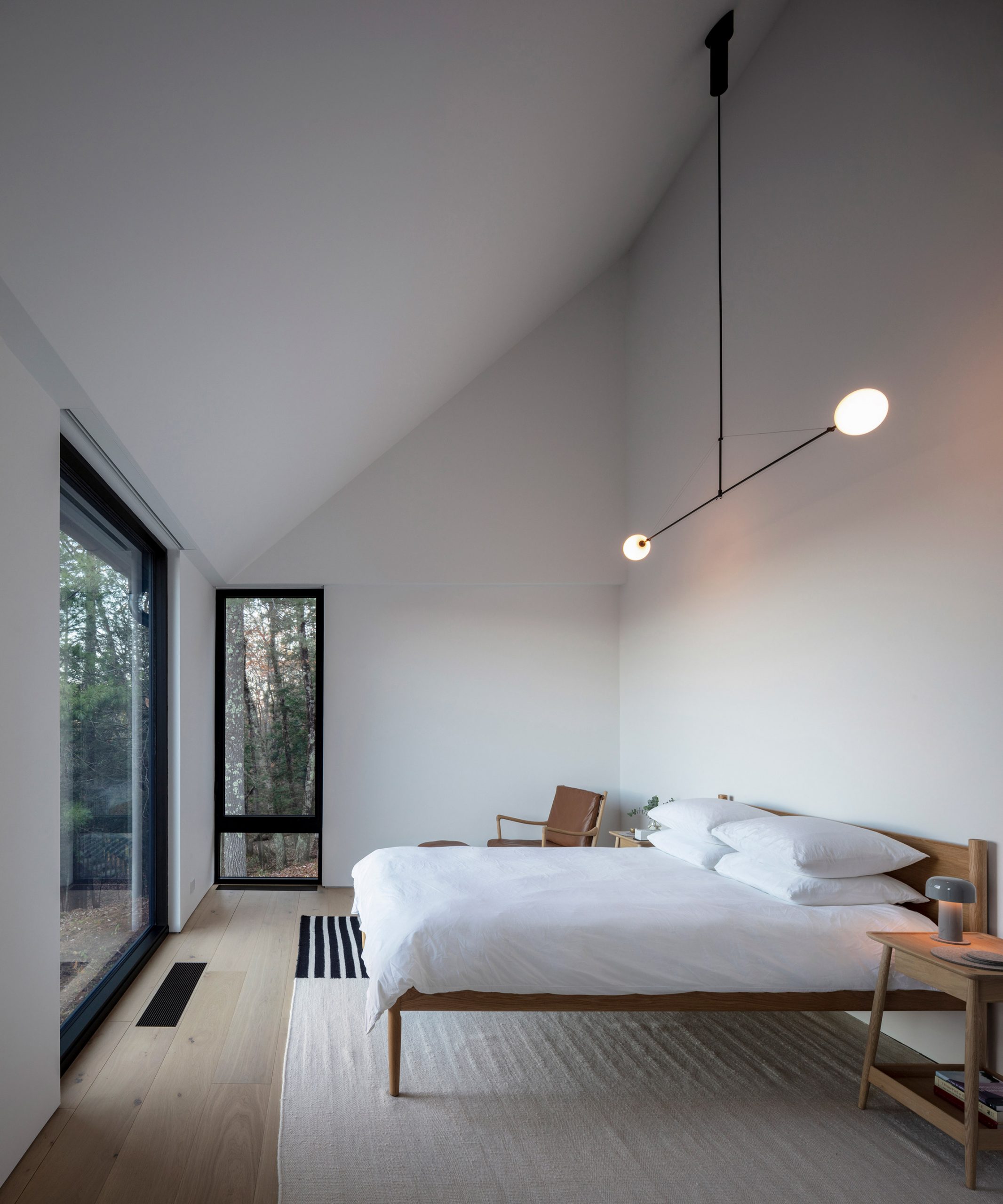
Ledge House is located in Cornwall, Connecticut on a site that is occupied by a large boulder deposited on the hillside hundreds of thousands of years ago when the nearby Appalachian Mountains were forming.
The 2,400-square-foot (223-square-metre) house features a gabled roofline that takes cues from traditional barn architecture and the historic covered bridge in West Cornwall.
Its facade is clad with charred cedar, which is darkened using the Japanese technique shou sugi ban, and it is topped with aluminium roof.
"The Ledge House clients asked us to design a new home that would resonate with the history of the Connecticut Valley, include a material palette that is environmentally friendly, and work with the challenging site on a large rock ledge," Desai Chia Architecture said.
"The boulder is a rugged companion to the house and acts as a muse for the uphill forest views," it added.
To construct the one-storey structure the studio removed an existing cabin on the property, leaving only its foundation that was then expanded to bring the house closer to the rugged ledge. Reusing the existing foundation saved the project money and also reduced construction waste.
To eliminate the need for cross bracing the studio has used balloon framing, a method that involves long studs spanning foundation to the roof that are fixed with nails instead of joinery. It takes its name balloon from being lightweight.
Large rectangular windows and glass doors span the length of the house on two sides providing views of the hilly landscape and boulder, while also allowing for cross-ventilating breezes to cool the house.
A wood deck attached to the back of the house overlooks the valley and is surrounded with grated metal fencing and railings. The space is furnished with chairs and a picnic table for enjoying the view from the outdoors.
On the opposite elevation, an additional terrace faces a wooded forest and has pale gravel stones.
Inside, Ledge House comprises an open-plan living and kitchen painted white with light hardwood floors that contrast the black exterior cladding. Tall vaulted ceilings make the space feel larger.
Black track lighting wraps around the open-plan room and connects to the outdoor terraces that overlook the forest and valley.
The master bedroom is situated at one end of the house, and two smaller bedrooms are at the other end.
"The nucleus living area between [the bedrooms] allows the owners and their guests to merge and socialise together in a lofted, open area that connects across the ledge to a forest terrace and a valley terrace: indoor and outdoor living flow seamlessly through," the studio said.
In the kitchen, a long island counter with black stools faces a wall of white cabinetry.
To separate the cooking and dining area from the sitting room, Desai Chia Architecture inserted a tunnel fireplace into a rectangular concrete volume. A black chimney pipe extends out from the long structure and up to the ceiling.
Desai Chia Architecture was established in 1996 by Arjun Desai and Katherine Chia. Other residences by the studio also use blackened wood, including a holiday home on Long Island and a dwelling on Lake Michigan with an angular roof.
Mexican artist Héctor Zamora has created a perforated brick wall to frame views of New York's skyline for an installation on the roof of the Metropolitan Museum of Art.
Zamora's Lattice Detour compries a gridded brick wall that is 11 feet (3.3 metres) tall on the rooftop of the Metropolitan Museum of Art, also known at The Met.
The wall gently curves in an arc and spans approximately 100 feet (30 metres) in length.
It is built with terracotta bricks made from Mexican earth laid out a lattice-like construction with thousands of hollow squares to frame views of the city skyline and Central Park.
The perforated chunks of Lattice Detour allow air to flow through space and also creates shade and filters sunlight.
Zamora referenced the perforated screens found in Middle Eastern and African architecture to create the design. Known as celosía walls, the dividers are often made with natural materials and provide ventilation and shade naturally.
"Using modest material, Hector Zamora's Lattice Detour interrupts and refocuses how visitors interact with this beloved space, situated atop The Met and surrounded by the Manhattan skyline, creating a meditation on movement, transparency, and interference," said The Met director Max Hollein.
"Manifesting itself as a protective wall, curved artwork, and permeable screen, Lattice Detour is a transformative, charged, and timely intervention."
Designed for a young family of four, St Joseph Beach Residence is located on a waterfront plot on Lake Michigan in the town of St Joseph.
Wheeler Kearns Architects created a series of gabled volumes wrapped in horizontal wooden boards for a unified aesthetic. When viewed from the side, three of the rooflines appear to connect in a zig-zagging formation.
The studio built four structures for the residence, two of which are connected to form the main house, in order to create a series of intimate outdoor spaces.
"To break down the massing and scale of both the enclosures and the open site, an arrangement of volumes purposely shapes different outdoor rooms and creates smaller, defined interior living spaces," said Wheeler Kearns Architects.
A grassy front lawn, one-storey garage and a two-storey guesthouse define the front-half of St Joseph Beach Residence, while the rear has an outdoor swimming pool and a partially-covered patio. Glass walls present wide views of the lakefront at the back.
"The site offers two distinct environments, street side and lake side," the studio said. "The street-facing 'neighbourhood' facade is expressed with crisp black-steel, punched openings and a formal entry court."
"By contrast, on the lakeside, floor-to-ceiling glass provides panoramic westward views to the dunes and Lake Michigan."
The timber exterior of the house was chosen to withstand harsh winter winds while still having a traditional and maritime feel. Gridded black windows offer a contemporary flair.
Rather than using local or endangered hardwood siding, however, Wheeler Kearns Architects opted for an acetylated or compound wood material for siding called Radiata Accoya, which is known for being more sustainable and rot-resistant.
"Horizontal shiplap wood-cladding and cedar shingles are detailed in a taut, minimal way, and are designed to both protect and weather gracefully in the constant wind coming off the lake," the studio said.
Upon entering the home from the front garden is an entry with a stairwell and a dining room beyond. To one side is a living room, while another portion of the ground floor has a kitchen with another dining space.
The ground floor layout is formed by two rectangular structures that are offset from each other but linked together to form a Z-shaped layout. Upstairs includes a master suite located above the entry and kitchen, and two bedrooms with ensuites and a study above the living and dining room.
The smaller, two-story structure on the property has a two-car garage, mudroom and bathroom on the ground level, and an office, bathroom, guest bedroom upstairs. On this level, a terrace acts as a walkway between the upper levels of the two volumes.
For interiors, the home features ceilings and matching floors and built-ins of white oak. The golden hue contrasts with the grey wood exterior to allude to a sense of warmth.
"Throughout the home, inside and out, finished or exposed, wood captures the ever-changing dance of light, wind, sand and water," said the studio.
White walls and ceilings are interspersed throughout alongside large portions of windows with black steel frames. Munich-based designer Stephanie Thatenhorst created the decor based on wood furniture pieces and accents in black leather, blue and grey tones.
A basement completes the project and includes a den, wine room, storage area, laundry room, sauna and gym.
Leather designer Cecilio Castrillo hand-modelled the pink face mask that American singer Lady Gaga wore with a laser-cut Iris van Herpen dress at the MTV Video Music Awards this year.
Based on the shape of a gas mask Castrillo's design was strapped to Lady Gaga's head with buckle and had goggle-like frames around the eyes with a mesh-covered hole for the mouth. The chin piece was decorated with curved cables that protrude in different directions.
"When I designed this piece I got inspired by gas masks, but wanted to make something a little bit different, so I included cables and I left free the eyes area with a big opening," Castrillo told Dezeen.
"That's because when I designed it I was thinking to be worn by a woman, so she could show the eyes enough."
Castrillo's handmade design is based on the shape of a gas mask
To contrast with the gas mask's more sinister connotations, Castrillo hand-made the mask from a bright pink leather material.
"My work is always inspired by horror films as it was my favourite entertainment when I was a child," he explained.
"The concept was something industrial, a bit gothic, but still different as that kind of colour reminds me of something sweet. I like mixing different concepts as in this case, a gas mask, that is something scary with a concept of something visually sweet."
The pink mask was paired with a technicolour dress made by fashion designer Iris van Herpen from laser-cut multi-coloured duchess satin, which was hand-stitched onto a corseted body.
"The otherworldly gown radiates in fringed coils that drip off Lady Gaga's body like raindrops," said Iris van Herpen.
Lady Gaga wore the ensemble to accept her artist of the year award, as one of five outfit changes she wore during the MTV Video Music Awards (VMAs) on 30 August.
Lady Gaga teamed the mask with an Iris van Herpen dress
Castrillo, who has previously made designs for Madonna and Marilyn Manson, said that as face masks become a more common part of everyday life due to the coronavirus pandemic, they are in turn becoming seen as a fashion accessory.
"I remember when some years ago saw people on the underground wearing masks I thought, wow, so strange ," he explained.
"We are all wearing masks, covering a part of our faces," he added. "We all need them to protect ourselves and others, so I think definitely it's now a fashion accessory."
The workplace enables Barry X Ball to run his business from start to finish, including storing massive stones imported from around the world, cutting them with high-end machinery, photographing the finished pieces and shipping them to clients, museums and galleries.
"This project was the opportunity for the artist's entire workflow to be brought onto one site for the first time in his career," said Andrew Berman Architect.
The studio designed the facility by working off an existing 10,000-square-foot (929-square-metre) warehouse in Brooklyn neighbourhood Greenpoint and building additional spaces on adjacent lots.
The result is a tiered, three-storey studio that spans 20,000 square feet (1,858 square metres). A series of flat-roofed, black and grey volumes combine together to form the complex, which is concealed mostly from the sidewalk via a dark corrugated-metal screen.
The wall encloses an outdoor stone yard designed like a courtyard to house massive marble blocks imported from places including Iran, Mexico and Italy. Each weighs up to 20 tons (18,144 kilograms).
"The exotic material that I have been accumulating for over 20 years, hundreds of tons of stone that was formerly held in multiple storage deposits in the US, Mexico and Europe, is for the first time consolidated in Brooklyn, at the same site where my sculptures are created," said Ball told Dezeen.
"I can now walk among my blocks as I conceive of my works."
A row of white pivoting walls with windows allows for easy movement between the outside and interior work stations, and bring natural light into the indoor workspace. Designed like a large hall for rough stonework, the area is outfitted with twin cranes overhead by Konecranes to transport the enormous rocks across the space.
"The design allows for flatbed trucks to drive into the building to offload stone, and accept crated completed work," said the studio.
"The raw stone can be manoeuvred through the complex via two 20-ton bridge cranes," it added. "Stone wire saws and CNC mills are used to cut and rough shape the stone prior to hand carving and finishing.
To accommodate the incredible weight of the stones, the building also has a strong foundation with a dense grid of concrete grade beams and over 200 50-foot-long piles. It is also elevated from the sidewalk to account for flooding that is common to the area.
Another key feature of the project is a digital studio where Ball's sculptures can be conceived using full-body digital scans. The artist creates stone sculptures that fuse digital technologies like CNC milling with traditional techniques to create copies of iconic artworks, such as Michelangelo's Envy and Pieta Rondanini.
Other rooms include a woodshop, metal shop, a studio for photographing the completed sculptures and space for crating and shipping the art. Additional spaces are for handwork, grinding, sandblasting and washing.
The first floor has a staff breakroom, library and bedrooms for visiting artists and friends, while the top storey is outfitted with an open-plan kitchen and living room for hosting events and office meet-ups. Glass doors access a covered patio and a green roof overlooking the city.
Across the interiors, walls are white and floors are concrete to enhance the industrial feel of the project.
Fashion designer Virgil Abloh has teamed up with Mercedes Benz to create a conceptual version of the Mercedes‑Benz G‑Class car called Project Geländewagen.
Abloh and Mercedes-Benz chief design officer Gorden Wagener's one-off redesign of the four-wheel drive luxury SUV, which dates back to the 1970s, reinterprets the vehicle as a race car.
Project Geländewagen has a boxy form. Top image: Abloh's car is an art piece
Project Geländewagen retains the G‑Class's iconic boxy form but is lower and wider to give it a more sporty look.
The exterior was painted white and sanded by hand to emphasis its monolithic shape. Other adaptations to the traditional design include the removal of indicators, outside mirrors and bumper bar.
"With Project Geländewagen we create a unique artwork that showcases future interpretations of luxury and the desire for beauty and the extraordinary," said Wagener. "The result is something between reality and future."
It is painted mostly white to give it a monolithic look
The stripped-back aesthetic continues with the design of the interior where the dashboard is reduced and fitted with analogue speedometer and fuel gauges.
A safety frame, which was coloured baby blue has been added, while bold red pops were used to give the design a racing aesthetic. The five-point seat belts are also bright red and emblazoned with the designers' surnames – Abloh and Wagener.
Pops of colour are provided by baby blue and bold red details
"The collaboration with Virgil has seen two distinct design philosophies unite, for a one-of-a-kind re-imagination of the G that continues to celebrate the extraordinary at its core," Wagener added.
Mercedes‑Benz G‑Class, also known as G-Wagen, was first created to be a military vehicle in 1972 at the request of the Shah of Persia. It was turned into civilian version in 1979, and has been redesigned a number of times in the years since.
The interior is designed to offer a racing car aesthetic
Described as an art piece, Project Geländewagen is the first example of the vehicle as a race car. A replica of the project will be sold in Sotheby's Contemporary Curated auction, with proceeds going towards a charity that supports international creative communities.
The dashboard fitted with analogue speedometer and fuel gauges
"My ultimate goal in this project with Mercedes-Benz is inspiring young artists, engineers, designers to question the status quo, in addition to experimenting with my own design abilities," said Abloh.
"For me it's all about providing opportunities for those coming after me and giving this next generation a foundation for success, both here with Mercedes-Benz and through my own Virgil AblohTM 'Post-Modern' Scholarship Fund."
Five-point seat belts are bright red and emblazoned with the designer's surname's
This is the latest high-profile collaboration for Abloh, who originally trained as an architect before turning to fashion, after projects with IKEA and Nike.
Preservation groups are fighting to save Paul Rudolph's Burroughs Wellcome building in North Carolina, one of his "most significant projects", after discovering its current owner had secured a demolition permit.
Kelvin Dickinson, president of Paul Rudolph Heritage Foundation, which is based in New York City, said he first learned of the plan following a tip-off from a local resident.
Local tip "sent the alarm bells off"
He initially thought the owner, biotechnology company United Therapeutics, was undertaking asbestos abatement but discovered it secured a demolition permit on 4 September.
"A guy down in North Carolina who lives down the street from the building reached out to me and said, I see that there's a construction fence and there's construction equipment going up," Dickinson told Dezeen.
Rudolph completed Burroughs Wellcome in 1972. Top image: Photo by PJ McDonnell
"Somebody from the demolition crew also posted some pictures on Google Maps, saying this a beautiful building, it's a shame it's going to be demolished," he added.
"That sent the alarm bells off."
Owner originally planned to turn building into museum
According to Dickinson, United Therapeutics filed for the permit after it was advised by a construction department that restoring the building, including removing asbestos, would require significant work.
Dezeen contacted United Therapeutics for comment but is yet to receive a response.
"United Therapeutics... told me that they had spent a lot of effort on trying to save the building but that the asbestos abatement was too much," Dickinson said. "It was going to be too expensive. The building was not designed in a way that they were it was going to be useful to them. "
United Therapeutics originally planned to demolish Burroughs Wellcome when it first purchased the building in 2012, but curtailed these plans so that only part of the structure was torn down in 2014.
Dickinson said the company told him the rest of the existing building would be transformed into "a mini museum".
Preservationists respond to demolition permit
As the building is privately owned and is not recognised as a landmark, the foundation and preservation groups are now working to save the building and encourage United Therapeutics to take alternative options by raising awareness of its demolition and cultural history.
"Reacting to a demolition permit is not how any of us like to work," added Docomomo US executive director Liz Waytkus.
It is designed so it can be easily extended. Photo by GE Kidder Smith, courtesy of Massachusetts Institute of Technology
"We are trying to get to the bottom of why United Therapeutics changed the scope of the work from asbestos abatement to full demolition," she continued. "I don't know if anyone has talked to them about the tax benefit of adding the building to the national register and future additions."
"Other than standing in front of bulldozers, there's nothing we're going to be able to do other than just raise awareness," Dickinson added. "I would appreciate it if there was all this effort put into it to try to save the building before it's demolished. Let's see it, let's share it."
"One of Rudolph's most well known, most loved and most significant projects"
Burroughs Wellcome was completed in 1972 for a pharmaceutical company of the same name. Measuring 312,303 square feet, it marks one of Rudolphs's largest buildings.
The American architect was asked to design a building that would be flexible and so created a series of volumes with hexagonal ends that could be added to over time. The exterior has a textural finish formed of limestone aggregate that is also partially used inside.
"It is one of Paul Rudolph's most well known, most loved and most significant projects," said Waytkus.
The building was the location for Burroughs Wellcome's development of AZT, the first drug approved by the US Food and Drug Administration for the treatment of Acquired Immune Deficiency Syndrome (AIDS). It also provided the set for 1983 American science fiction film Brainstorm.
"In this case, we've got several examples at the building was the setting for several cultural events that would make anybody, anywhere else nominate the building as a landmark, for several reasons," Dickinson added."We believe that this is why the building is getting so much support from the community."
"This doesn't normally happen with a Rudolph building," Dickinson added. "It is normally saved because the building is good and of Paul Rudolph."
Born in Kentucky in 1918, Rudolph studied architecture at Alabama's Auburn University, formerly known as Alabama Polytechnic Institute, and at Harvard Graduate School of Design (GSD) under Walter Gropius of the Bauhaus school.
Limestone stone aggregate covers the exterior and part of the interior
Demolition work also started this year on Rudolph's 1970s brutalist housing complex Shoreline Apartments in Buffalo, New York. The work was initially halted two years ago when a resident refused to move off the premises.
Other brutalist buildings by Rudolph include Yale University's architecture and art building, which is celebrated as one of the earliest known examples of the style architecture in America, and Hong Kong's Lippo Centre.
He died in 1997 at the age of 78.
Photos are courtesy of Paul Rudolph Heritage Found unless stated otherwise.
Abraham Thomas, former director of the Sir John Soane's Museum, has been named curator of architecture and design at The Metropolitan Museum of Art in New York.
Thomas said he was "thrilled and honored" to join The Met as Thomas in the newly created role, Daniel Brodsky Curator of Modern Architecture, Design, and Decorative Arts.
The role is an expansion of the position of Daniel Brodsky Associate Curator of Architecture and Design, which was first created in 2014 and held by British curator Beatrice Galilee.
Previous roles at Smithsonian Institution and V&A
The position follows a number of architecture and design curatorial roles Thomas has held at institutions in the US and UK – including the Smithsonian Institution, Sir John Soane's Museum and the V&A.
"He brings with him vast and varied experience and expertise, as well as a proven enthusiastic embrace of collaboration using an innovative approach," said The Met director Max Hollein.
"Abraham will be a driving force for our rethinking of how we best present, contextualise and collect the intersections, commonalities, and joint ambitions of art, architecture and design."
Thomas joins The Met at "critical moment"
In his new role, Thomas will be "re-envisioning a powerful programme" that responds to current global events, according to department chairman Sheena Wagstaff.
"Abraham joins the Department of Modern and Contemporary Art at a critical moment, as we develop vital new narratives around architecture and design – especially those that engage with a global context in dialogue with historical examples – drawing upon collections at The Met that are unparalleled in their scope and depth," she said.
"We are eager to set to work re-envisioning a powerful programme that fully integrates architecture and design into our display of the arts of the 20th and 21st century, using these practices as starting points for a new approach."
Thomas most recently worked at the Smithsonian Institution serving as its senior curator at the Arts & Industries Building in Washington DC, following a stint as a curator of the institute's Renwick Gallery American art museum.
Thomas was curator of designs at V&A
As director of the Sir John Soane's Museum – a London museum that was once the home of neoclassical architect John Soane in the 19th century – from 2013 to 2015 Thomas oversaw a redesign of the interiors. He also initiated programmes with educational institutions including MIT's School of Architecture and Planning, The Architectural Association, London School of Economics and the School of Art, Architecture and Design at London Metropolitan University.
Thomas was curator of designs at the Victoria and Albert Museum from 2005 to 2013, overseeing its Architecture Gallery and partnership with the Royal Institute of British Architects. Heatherwick Studio: Designing the Extraordinary and 1:1 - Architects Build Small Spaces were among the exhibitions he curated during his time there.
He also co-curated Superstructures: The New Architecture, 1960–1990 in 2018 for the Sainsbury Centre for Visual Arts in the UK, which is regarded as one of the first exhibitions to thoroughly explore High-tech architecture.
In addition, he has published works and lectured on architecture, decorative arts, craft, graphic design and photography.
Galilee, who left her position Daniel Brodsky Associate Curator of Architecture and Design last year, established and ran the architecture series In Our Time: A Year of Architecture in a Day event from 2016 to 2019.
Portrait of Abraham Thomas is courtesy of The Met.
Design agency Rapt Studio has used curved furnishings and soft colours to create a calming ambience inside the Santa Monica headquarters of lifestyle and wellness brand Goop.
The two-floor HQ measures 55,000 square feet (5,109 square metres) and provides a unified workspace for Goop, which was founded by actress Gwyneth Paltrow. Prior to this team members had been scattered between different buildings.
The lobby of Goop's Santa Monica headquarters
"We designed their new, light-filled headquarters in Santa Monica to preserve the buzz they'd maintained in close quarters, while giving big ideas room to roam," explained Rapt Studio.
"[Staff] needed a place to concentrate their energy and efforts to propel the brand into its next phase of development."
A corner of the lobby is dominated by a sculptural metal desk
Employees enter the head office via a spacious lobby. One corner of the room is dominated by a custom-made desk made by Los Angeles-based studio Artcrafters.
The desk comprises four bulky metal blocks which are meant to mimic the rounded shape of the letters that feature in Goop's company logo.
The headquarters includes a kitchen where staff can test recipes
Curved forms go on to feature in the adjacent waiting area where a pink, crescent-shaped sofa and bench seat perch on a woven circular rug. An oversized white pendant light is suspended overhead, while behind stands a golden wire-frame screen.
The lobby leads through to a sequence of work areas – this includes a lab for developing new products, a podcast-recording studio and a fashion workshop where designs for Goop's clothing line, G Label, will be drawn up.
There is also a product showroom on-site
A test kitchen finished with jet-black joinery offers a spot for staff to experiment with recipes and film cooking tutorials for Goop's YouTube channel.
There is also a small showroom on-site. At its centre is a chunky stone-topped counter inbuilt with a sink where the beauty and skincare products on display can be trialled out.
Goop staff work around bespoke desks
Staff have been given bespoke workstations. For formal meetings they can head to one of the conference rooms, which are decorated with past and present examples of Goop merchandise.
Expansive floor-to-ceiling panels of glazing flood spaces throughout the HQ in natural light.
This is seen best in what employees refer to as the "All Hands" area, which boasts views of the palm tree-lined LA skyline.
Conference rooms are decorated with framed Goop merchandise
The room is used for casual catch-ups or large-scale staff gatherings. It includes a light-hued timber kitchen and a trio of arched niches that accommodate tan-leather seating banquettes.
There are also a couple of grey modular sofas that can be rearranged to suit different-sized workgroups.
Light-hued timber lines the staff kitchen
"The intent of the material palette was to evoke a sense of calming familiarity," said Rapt Studio's president and creative director, Sam Farhang.
"Natural, warm materials and soft tones create a welcoming environment, allowing the Goop team to feel at home within the space," he told Dezeen.
This light-filled room can be used for informal meetings
Tapping into Goop's wellness-focused ethos, Rapt Studio also made sure to incorporate a yoga room and a number of secluded lounge spots and private booths for staff.
"These spaces – cocooned and concealed – are designed for reflecting, replenishing, and recharging," added the studio.
It features arched niches with tan-leather seating banquettes
Goop was launched by Paltrow in 2008, starting life as a weekly newsletter before growing into a brand that offers wellness, beauty and style advice.
Its trendy HQ is one of several that Rapt Studio has designed – back in 2017 it completed head offices for streetwear brand Vans, including meeting rooms lined with skateboards and huge graffiti wall murals.
Reintroducing the concept of crossroads into the discourse around public space could help make architecture more inclusive, suggests Aaron Betsky.
We are standing at a crossroads. We must make this country more just and a true home to all races. In addition to racial justice, access and support of African-Americans into the academy and the profession, and an end of the architecture profession's complicity with racial violence, one small thing we can also do is to develop other models and metaphors for space in this country – ones that would be open in every sense of the word, and offer alternatives to what we have today.
One of the inbred categories defining how we think about place in and through architecture is the separation between public and private space. This dichotomy is itself embedded with a particular manner of thinking about our bodies, our boundaries and our sense of kinship. We accept those notions as fundamental, or at least did until thinkers such as Frantz Fanon and, later, Donna Haraway, began to point out how they are socially constructed to reinforce ideas about race and gender.
We should be asking deeper questions about what privacy and publicity or publicness means
We should therefore be asking deeper questions about what privacy and publicity or publicness means. In the field of architecture, we could start with one distinction we take for granted: that our cities, suburbs and villages are made up of the building blocks of individual homes and other buildings, which either leave room for or actively create something we call public space.
In this country, that space is mostly what is left-over. It is the place of circulation more than anything else, as in American cities over 60 per cent and up to 80 per cent of all the built-up area is given over to roads and parking. Sprinkled through that emptiness are shaped, shared spaces: parks, meant for recreation; spaces for commemoration or civic gathering; and spaces of open or shared commerce.
The latter two often overlap, with our squares and plazas being places where you can also (though only at the margins) find outdoor dining, kiosks, and perhaps even markets. Recently, the first two parts of this triad have also become more coincident, as we think of our public spaces as being green and recreational, often with a little dose of art – think of the sculpture park in Seattle, the new civic space in Cleveland, or New York's High Line.
I would suggest another model for such public space, one that is inherent in the world of communication at the heart of our global economy and culture and might be a flip and reverse of all that paved quasi-public space. That is the crossroads. It is a space and a metaphor deeply rooted in most cultures around the world. It is where you meet, where you mingle, and where you make choices. The crossroads is of particular importance in West African and particularly Yoruba tradition as the place where you decide between good and evil, and where your world can also turn into another, mythical version of itself.
The crossroads is thus not quite a village and not quite a city, but rather the germ of both of them
As a majority of slaves forced to the United States came from this area, they brought the crossroads tradition with them, and we have long recognised the image in music: the crossroads is where the blues guitarist Robert Johnson met the devil and turned into the greatest musician that genre had seen. Bone Thugs N Harmony took up the theme recently, and it entered into white consciousness through Cream's song of that title.
But the crossroads is also a place, albeit one that is difficult to define. It is, in fact, one of the generators of settlement in this country. Crossroad settlements in the Colonial era (and in Europe before that) were places where a general store, a tavern, and a church might cluster around the meeting point of two highways. Later this site might also be where the gas station, by now a meeting point for many rural areas, would be built.
The crossroads is thus not quite a village and not quite a city, but rather the germ of both of them. At its edges an array of porches, hitching posts or watering points, as well as small memorials or shrines, appeared and later proliferated into more stalls, services, and small parts of our infrastructure. In the urban context, the corner store, the crosswalk, and the place where you are "standing on the corner, suitcase in my hand" in "different times" before you become a banker or a clerk. It is also, of course, the place of temptation, of drugs, and of the beginning point of a walk down the evil, or at least wild, side.
White people and capitalism took over the crossroads and internalised it into the atrium
In the pre-Civil War South, the crossroads and its community offered an alternative to the forced enclosure of the plantation dwellings and, later, tenements. It was a place of informal gathering and, for a few, the beginning of a trip to freedom. It is also, in a positive sense, exactly not the defined and socially limited public space circumscribed by its uses for leisure or commemoration with a little commerce mixed in. The crossroads is a fluid, amorphous and, exactly because of that condition, difficult to govern or police place. It is a space of freedom in all its possibilities and danger.
White people and capitalism took over the crossroads and internalised it into the atrium. The fake public space of the shopping mall is dominated by the crossroads where zigzagging escalators move past palm trees and kiosks to give you a sense of freedom while containing you within the framework set by the building.
Certain architects, such as, for instance, this year's Pritzker Prize winners, Yvonne Farrell and Shelley McNamara, have made the crisscrossing, three-dimensional crossroads as atrium the signature and dominant element in their buildings while denuding it of its power and possibilities.
This is as much an anodised version of the crossroads as the power rock anthem is the operatic burial ground of the blues. It is beautiful but safe and restricted in its emotions and reality.
Could crossroads be an alternative model for what we think of as public space?
Can we figure out how to reactivate the crossroads? Can we learn from the usually hidden traditions that course through the spaces of America without ever acknowledging their roots? Can we open up both our small communities and our cities at and through the crossroads? Could crossroads be an alternative model for what we think of as public space that might let us hang out in our individuality and could it take us down "ghost roads" into other and better possible futures?
Or must we sell our soul to the devil of surveillance and the eradication of space that could truly bring us together to enjoy those possibilities? And, would any attempt to use the crossroads as a building block for a new kind of shared space not be yet another appropriation of African-American culture?
I do not know the answers to these questions, but I would suggest that a serious acknowledgement and celebration of the fact that we do not suddenly stand at a crossroads in the country, but that African-Americans have stood there since the beginning of this republic, waiting to find out whether we can live up the dream of a true democracy, might be a good place to start.
Architecture firm Snøhetta has been announced as the winner of a competition to design the Theodore Roosevelt Presidential Library in Medora, North Dakota.
The Theodore Roosevelt Presidential Library will have a curved roof
Snøhetta's winning design is topped with a huge curved roof designed to act as an extension of the site in North Dakota city Medora, which is surrounded by Badlands, abuts Theodore Roosevelt National Park and has views of the Elkhorn Ranch.
Designed for the northeast edge of the butte, the building will be linked to a curved pathway that will lead visitors around the site, connecting to the Maah Daah Hey Trail and additional pavilions.
The building is intended to blend with the landscape
"When designing a new project, we think about how we can more give to the site or community more than is initially asked of us," said Craig Dykers. "We integrated the Theodore Roosevelt Presidential Library into the landscape of the North Dakota Badlands."
According to Snøhetta, the building will be built with "natural and renewable" materials and use energy systems that will set a "new standard for sustainable design in the region".
Visuals showing large expanses of wood and glass.
A meandering path leads around the site
Snøhetta was commended for drawing on, and highlighting, the rough terrain of the Badlands, as well as considering the conservation policies Roosevelt worked on while serving as president of the United States from 1901 to 1909.
"One of Theodore Roosevelt's most enduring legacies is conservation and our national parks," said Theodore Roosevelt V, a great-great-grandson and namesake of the 26th president.
"This will be the only presidential library alongside a national park and the only national park alongside a presidential library. It will invite visitors to see and experience the very cradle of conservation. That is why this location in North Dakota is perfect for the Theodore Roosevelt Presidential Library."
The building will be built with "natural and renewable" materials
The project is also intended to extend beyond its site, including connections to Little Missouri River, a former military camp called the Cantonment, and the original train depot in where Roosevelt first arrived in the area. There would also be a parking option near these external sites for visitors to catch an electric caravan to the site.
Studio Gang, Henning Larsen and Snøhetta were shortlisted for the project from 12 practices that applied to the Request for Qualifications (RFQ) that the Theodore Roosevelt Presidential Library Foundation made public in April to find a suitable architect for the project. The firm intends to continue to develop the design.
An outdoor deck will offer views of surroundings
"We still have much to learn about President Roosevelt, and we're looking forward to working with the Medora community and the broader project team to translate this knowledge into an immersive place to learn about TR's life and legacy," Dykers added.
Once completed it will join the 13 presidential libraries in the US that serve as archives and museums illustrating the life and work of each president since Herbert Hoover, who was in office from 1929-1933.
They were each built in their president's home state, with the most recent library completed for George W Bush in Dallas, Texas.
Pavilions will be integrated into the landscape
Architects Tod Williams and Billie Tsien are designing the 14th presidential library for Barack Obama, who ended his term in 2017. They were selected for the project in June 2016 from a list that included Snøhetta, Renzo Piano and David Adjaye.
Called the Barack Obama Presidential Center, the project has encountered controversy because of its siting in the historic Jackson Park, which was designed in 1871 by Frederick Law Olmsted and Calvert Vaux.
Woodwork form the frame of a gabled house inside this clothing store in New York designed by Japanese architect Taichi Kuma.
Tokyo-based Kuma designed the store cn the city's Soho neighbourhood for Japanese clothing brand Nanamica.
Large mirrors reflect the gabled structure
Marking its second outpost following another in Tokyo, the store was designed to draw on the brand's Nanamica, which means house of seven seas. Working with the brand founder, Eiichiro Hommam, Kuma developed the interior design to take cues from a Japanese beach house.
Shelving is made from matching wood
The aim is to express "the free and relaxed feeling of the seaside, but with a distinctly Japanese aesthetic sensibility meaning the true highlight is the nanamica products", according to the brand.
Shelving and clothing rails tucked outside the wood frame
A key part of this is a series of gabled structures made from light oak that are intended to outline a house. The frame is slightly smaller that the store to leave space on the outside for shelving for handbags and plants, and clothing rails built on the walls made out of matching wood.
Wooden shelving for clothing and benches for customers to relax are also arranged inside the house-like structure. The free-standing shelving is backed by a translucent, recycled corrugated plastic matching the wall of the material at the front of the store and the rear, where it shields changing rooms placed behind.
Corrugated plastic shields changing rooms at the rear
Two large mirrors are placed on columns that protrude into the space creating the illusion of more room. White spotlighting is arranged along the top of the gable running down the middle of the space.
Kuma and Hommam stripped back the initial space to create Nanamica New York, creating a bare backdrop for the simple intervention. Walls and ceiling beams are painted white, while the floor is polished concrete.
Nanamica is located on Wooster Street
Other recently completed stores in New York City include ONS Clothing store, which features a stage with a green curtain for hosting events, and Los Angeles clothing brand Lunya's space in Nolita, which takes cues from "upscale New York" apartments.
American practice CCY Architects has renovated and extended a house dating from the 1880s in Aspen, Colorado, adding a music room with a piano-themed perforated metal facade.
Cutouts in the facade are arranged to trace out the notes of Nocturne in E-Flat Major, Op 9, No 2 by famous Romantic-era composer Frédéric Chopin.
The project involved extensive restoration work as the original Victorian home had been damaged by fire and left empty for 10 years.
The extension houses guest rooms and a piano
CCY Architects preserved the original fire-charred beams in the main gabled house and redesigned the living spaces to feel more spacious.
The separate gabled extension, called Music Box, holds a guest house that doubles as a place to hold piano recitals.
Perforations in the facade are based off musical notes
Doors open out on to the patio between the annexe and the main house so the residents can hold outdoor performances with views of the mountains.
"The clients purchased an 1880s Victorian residence in Aspen's West End because of its proximity to the Benedict Music Tent and their affinity for historical architecture," explained CCY Architects.
"Both husband and wife are interested in classical architecture, design, and the arts; the wife is particularly passionate about music, especially classical piano."
Light filters through the perforations in the steel
The perforated metal facade allows light to filter in on three sides of the music room while screening less attractive views of the alleyway.
"This skin was inspired by one of the client's favourite piece of music," said CCY Architects.
"It stands off the structure through a batten system that leaves the perforated melody uninterrupted. The skin allows light to pass through, but it maintains privacy for those inside."
the piano recital room can open onto a patio
To create the musical mural, CCY Architects took Chopin's composition and transposed it onto metal.
"Using the same logic that informs a player piano to play music, each note, chord and the duration in which each are played were assigned a variable, in this case, the hole size and number of holes in a group," said the studio.
"The hole size indicates the pitch and the number of holes correlate to the duration the note is played for."
The staircase is made of perforated steel too
The material used in the facade is Galvalume, a thin sheet of steel with a protective coating of aluminium and zinc.
A perforated steel staircase allows the patterns of light formed from the facade to be visible from all three angles in the stairwell.
Light filters through gaps in the metal
CCY Architects were careful to keep the proportions of the Music Box similar to those of the main house, to preserve its 19th-century heritage.
A 1970s addition to the house was demolished. The original structure was briefly lifted up to make new foundations and a basement before being placed back down exactly where it was before.
The extension also has guest facilities
All of the house's original materials were left in place, including the beams that were scorched by a chimney fire, and sliding sash windows were carefully restored.
A new staircase was built out of metal mesh but in winder-style form of the house's old stairs.
"It pays homage to original stair design, and connects the Victorian’s three levels, while its materiality gives a nod to the Music Box's contemporary design with the use of the same steel and perforated metal," said CCY Architects.
American architecture studio SOM has created a design for a ventilated, high-ceilinged, modular classroom for schools that need temporary accommodation.
Named School/House, the pop-up classrooms were designed in response to the current coronavirus pandemic but are intended to provide a more healthy alternative to current options available for schools in need of additional classroom space.
"We designed School/House to address two key issues: an urgent need for temporary additional educational space as a response to the current pandemic, and to improve upon existing options for temporary classrooms, creating a temporary space that is truly intended for teaching and learning," said Jon Cicconi, an associate director at SOM.
Top: SOM has designed School/House. Above: the interior of the temporary classrooms
The modular classrooms are designed to be healthy indoor learning spaces for 25 students positioned 1.8 metres (six feet) away from each other, or up to 50 students in a regular configuration.
They would have pitched roofs creating classrooms with six-metre-high ceilings, while a raised floor would contain power sockets and ventilation to remove air from around each desk. The whole interior would be clad in easily sanitised finishes.
The classrooms would have high ceilings and air intakes to encourage airflow
"The design is intended to free the classroom from the spatial constraints of the traditional modular classroom building," Cicconi told Dezeen.
"The higher ceiling heights enhance air circulation," he continued. "Access to natural light and views offer a more human space for students and teachers. The footprint has been sized to accommodate a full class of 25 students at a six-foot distance for the pandemic."
Modular School/Houses would be able to be installed alongside schools
The walls and roof of each School/House would be assembled from seven folded modular panels, each featuring an aluminium frame filled with fibreglass reinforced panels (FRP). The floors would be a standard raised aluminium grid filled with vinyl composition tile (VCT) panels.
SOM is currently finishing the design of a fully engineered prototype of a classroom, which can be installed alongside existing schools, in parking lots or even on available roof space.
The modular buildings are made from seven folded panels
"If we've learned anything from this pandemic, it's that all schools need more space now," explained Cicconi. "With that in mind, School/House was designed for schools of all kinds, both in cities and rural areas –not intended as a permanent solution for campus expansions, but to solve the real and immediate needs schools are facing."
"Our hope is to make returning to school easier for teachers, offering a safe option for hybrid in-person and at-home learning for students everywhere," he continued.
The units can be combined
While the architecture studio envisions the classrooms as a rapidly installed, temporary solution, it has designed the schools with longevity in mind to acknowledge that buildings erected to be short-term solutions often stay at schools for many years.
"Traditional modular classrooms are not optimised for teaching and learning, and are often implemented as ad hoc solutions to unexpected challenges, oftentimes becoming permanent fixtures on campus," said Cicconi.
"Learning from that trend, we created a design that could still be implemented rapidly while addressing challenges of longevity – School/House can 'live' comfortably on campus for longer periods and blend into its surroundings, extending the classroom space beyond existing buildings while functioning as another building on campus, in turn creating a sense of familiarity for students and teachers, an essential part of early learning."
Architecture studio Adjaye Associates has revealed its design for a new art gallery at Princeton University that will have numerous entrances to connect it to the campus.
Adjaye Associates, working with Cooper Robertson as executive architect, has designed a series of pavilions wrapped in bands of alternating rough and polished stone for the art gallery.
The new building will replace the existing 1920s, 1960s and 80s structures and double the size of the Princeton University Art Museum.
Top: The museum will occupy a series of interlocked pavilions. Above: Galleries will be on the first floor
It will contain nine galleries and two large entrance halls in cuboid boxes wrapped around the McCormick Hall, which contains the Marquand Library and will be retained.
The majority of the gallery space will be raised up onto the first floor, with the ground floor given over to access routes across the site and public spaces to create a "campus within a campus".
The Grand Hall sits between the galleries
"The ground floor is designed to work with the campus's pre-existing paths and networks," said Adjaye Associates founder David Adjaye.
"We envisage it as a space that can be open 24 hours to students whilst the museum operates with its own time schedule above it," he told Dezeen.
The Grand Stair is the main route to the galleries
Adjaye Associates placed the galleries in a series of interlocking cubes to break down the scale of the museum and allow the collection's varied items to be displayed.
"The nine cubes create an eroded perimeter that dissolves the block and starts to correspond to the architecture and landscape of the site through its bars and volumes," said Adjaye.
"It allows people to meander and experience the different facets of the collections and exhibitions."
Alongside these galleries will be two large spaces called the Grand Hall, which will be used as a lecture hall and performance space, and the Grand Stair that is the main access to the gallery level.
"Between these pavilions are what we call the 'in-between galleries', which provides alternative moments for the collections to be displayed and changed over time," explained Adjaye.
Each gallery is in a cube
Adjaye Associates created a series of views out from the galleries to help tie the building to the campus.
"This is a museum that is both romantic and porous through a series of very specific framed views," said Adjaye.
"Numerous bronze and glass 'lenses' are positioned between the pavilions to shape framed glimpses into the Museum and extraordinary vistas out onto the Princeton campus," he continued.
"Each one of these windows has its own character which refers to its view out. There is a kind of archway effect that emphasizes the landscapes of the campus.”
Framed views overlook the campus
In total, the museum will have six ground-floor entrances, which not only helps to make it accessible from all directions but, according to the studio, mitigates the impact of future pandemics.
"One of the big things about large-scale museums is that people arrive and depart from the same entry," said Adjaye.
"To mitigate clustering and to ease movement flows, the provision of multiple entrances and exits is incredibly important. The way in which the sequence works is that we're able to very easily make a one-way system out of the museum."
Princeton University Art Museum entrance
Above the gallery floor, on the second level, the museum will have a cafe and outdoor terrace, as well as offices for the museum and the art and archaeology department.
Construction of Princeton University Art Museum is set to begin in 2021 with an opening scheduled for 2024.